
Comic fonts are pure joy in typographic form. They shout, they bounce, they make a birthday invite, a kids' app or a webcomic feel instantly playful.
The problem is that many 'free comic fonts' on random download sites come with murky licenses. Every free comic font below is different: each is hosted on Google Fonts, open-licensed and free for commercial use.
Comic lettering is its own craft, separate from elegant serif fonts or tidy UI sans-serifs. Good comic book fonts need loose, hand-drawn energy, strong legibility in small speech bubbles, and enough weight to read over busy artwork. We judged these free fonts on exactly those points.
You will find classic speech-bubble faces, explosive headline fonts for sound effects, and a respectable Comic Sans alternative that even designers will like. Scroll through the free previews, click any screenshot to open the source, and download the free comic font that fits your project.
Quick picks at a glance
| # | Resource | Style | Best for |
|---|---|---|---|
| 1 | Bangers | Comic headline | Sound effects and splash titles |
| 2 | Comic Neue | Comic Sans alternative | Friendly body text |
| 3 | Luckiest Guy | Chunky cartoon | Logos and game titles |
| 4 | Bubblegum Sans | Bubbly sans | Candy-sweet branding |
| 5 | Chewy | Gooey display | Snack, toy and party designs |
| 6 | Permanent Marker | Marker hand | Notes, doodles and street style |
| 7 | Patrick Hand | Hand lettering | Speech bubbles and dialogue |
| 8 | Fredoka | Rounded comic | Kids' apps and education |
| 9 | Boogaloo | Retro cartoon | Funky posters and labels |
| 10 | Bowlby One | Heavy comic caps | Bold callouts and stickers |
Bangers
Comic headline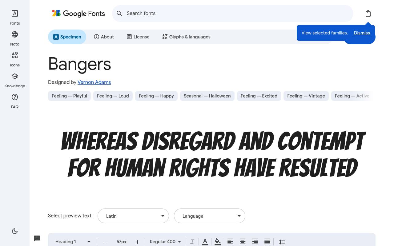
POW! Free fonts for fun!
ABCDEFGHIJKLM abcdefghijklm 0123456789
Tall, condensed capitals give Bangers the tilted urgency of mid-century superhero covers rather than ordinary handwritten dialogue. The free Bangers download credits Vernon Adams and supplies one upright style at weight 400 and no separate italic. Character coverage in Bangers extends to Latin, extended Latin and Vietnamese.
For a children's comic activity page, a large KAPOW headline or sticker-shaped action button makes better use of its energy than a full speech balloon. The apparent slant belongs to the drawing, not a separately supplied italic cut.
- Style
- Comic headline
- Best for
- Sound effects and splash titles
- License
- SIL Open Font License
- Price
- 100% free
Comic Neue
Comic Sans alternative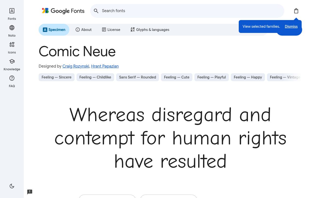
POW! Free fonts for fun!
ABCDEFGHIJKLM abcdefghijklm 0123456789
The casual skeleton of Comic Sans gets more orderly curves and spacing in Comic Neue, retaining friendliness without quite the same visual wobble. Google Fonts offers Comic Neue free with 6 styles spanning weights 300–700, including italics; the design credit goes to Craig Rozynski and Hrant Papazian.
The Comic Neue character set covers Latin. A classroom comic worksheet could separate dialogue, instructions, and emphatic words through its actual weights and italics instead of artificial styling. The lighter cuts offer a gentler classroom voice than the heavier display alternatives.
- Style
- Comic Sans alternative
- Best for
- Friendly body text
- License
- SIL Open Font License
- Price
- 100% free
Luckiest Guy
Chunky cartoon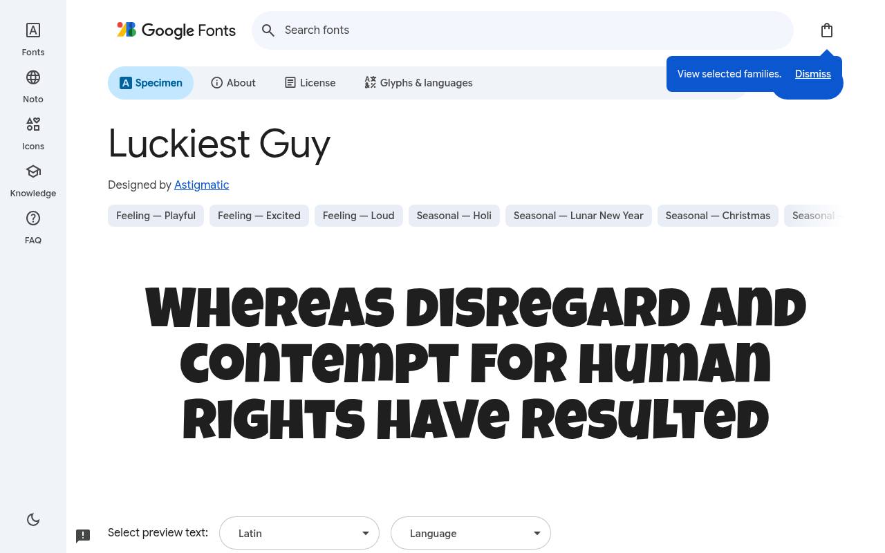
POW! Free fonts for fun!
ABCDEFGHIJKLM abcdefghijklm 0123456789
Bouncing, chunky capitals give Luckiest Guy the exuberance of 1950s advertising, with deliberately uneven rhythm across a word. Astigmatic designed the free Google Fonts release of Luckiest Guy, which includes one upright style at weight 400 and no separate italic.
Luckiest Guy includes Latin and extended Latin coverage. A cartoon mobile game's title screen could use that buoyant silhouette for its name, leaving mission instructions and small reward descriptions to a quieter companion.
Its visual weight is built in, despite the single style carrying weight 400.Like every free font in this list, it ships under the SIL Open Font License, so it is free for personal and commercial projects alike.
- Style
- Chunky cartoon
- Best for
- Logos and game titles
- License
- SIL Open Font License
- Price
- 100% free
Bubblegum Sans
Bubbly sans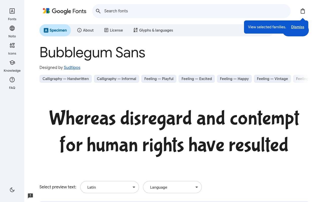
POW! Free fonts for fun!
ABCDEFGHIJKLM abcdefghijklm 0123456789
Soft, rounded strokes make Bubblegum Sans feel like cheerful sweet-shop lettering, with enough irregularity to suggest a human hand. The free Bubblegum Sans download credits Sudtipos and supplies one upright style at weight 400 and no separate italic.
Character coverage in Bubblegum Sans extends to Latin and extended Latin. For a children's party comic, it could label snack stations or introduce a friendly character without the shouting tone of superhero-cover capitals. That softer comic voice also suits speech-like headings above illustrated recipes or puzzles.
- Style
- Bubbly sans
- Best for
- Candy-sweet branding
- License
- SIL Open Font License
- Price
- 100% free
Chewy
Gooey display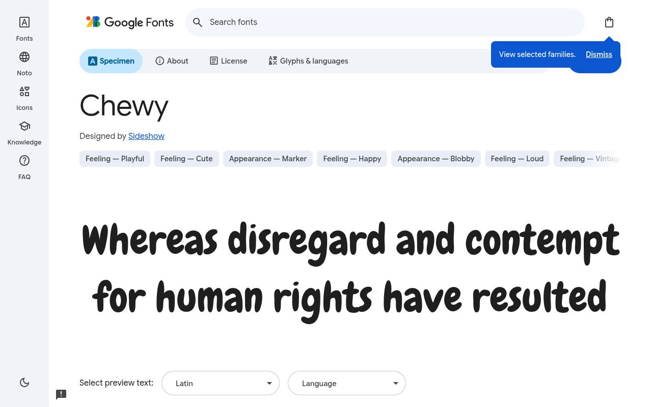
POW! Free fonts for fun!
ABCDEFGHIJKLM abcdefghijklm 0123456789
Chewy's thick, gummy shapes have a hand-cut looseness that makes short words feel almost edible. Google Fonts offers Chewy free with one upright style at weight 400 and no separate italic; the design credit goes to Sideshow. The Chewy character set covers Latin.
An ice-cream mascot comic could put flavor names or episode titles in this plump lettering, with a simple text face handling ingredients and longer speech beneath the illustrated heading. The substantial curves are intrinsic to the design, not a selectable bold weight.
- Style
- Gooey display
- Best for
- Snack, toy and party designs
- License
- SIL Open Font License
- Price
- 100% free
Permanent Marker
Marker hand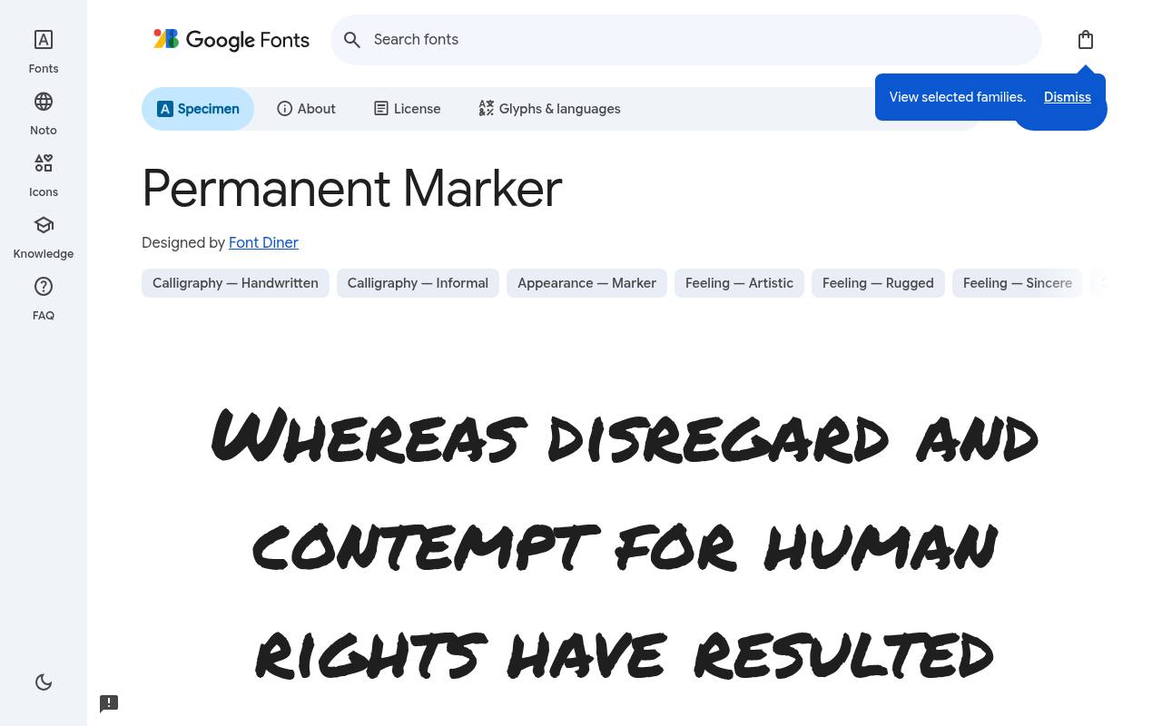
POW! Free fonts for fun!
ABCDEFGHIJKLM abcdefghijklm 0123456789
Broad felt-tip strokes give Permanent Marker the immediacy of a handwritten whiteboard note, including the unevenness of a physical pen. Font Diner designed the free Google Fonts release of Permanent Marker, which includes one upright style at weight 400 and no separate italic.
Permanent Marker includes Latin coverage. In a comic-making worksheet, it can identify a character's dramatic aside or a scribbled correction, visually separating annotations from the finished dialogue lettering. Its drawn texture provides emphasis without needing a separate bold or italic companion.
- Style
- Marker hand
- Best for
- Notes, doodles and street style
- License
- SIL Open Font License
- Price
- 100% free
Patrick Hand
Hand lettering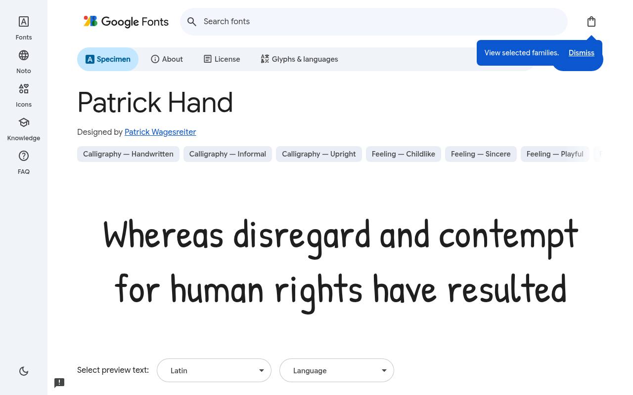
POW! Free fonts for fun!
ABCDEFGHIJKLM abcdefghijklm 0123456789
Real handwriting lies behind Patrick Hand's even, informal rhythm, which feels closer to speech-bubble lettering than decorative calligraphy. The free Patrick Hand download credits Patrick Wagesreiter and supplies one upright style at weight 400 and no separate italic.
Character coverage in Patrick Hand extends to Latin, extended Latin and Vietnamese. A webcomic could use it for conversational exchanges and handwritten captions, reserving a separate, heavier display font for the episode's title or exaggerated sound effects. The consistent handwritten rhythm helps several exchanges feel part of one illustrated conversation.
- Style
- Hand lettering
- Best for
- Speech bubbles and dialogue
- License
- SIL Open Font License
- Price
- 100% free
Fredoka
Rounded comic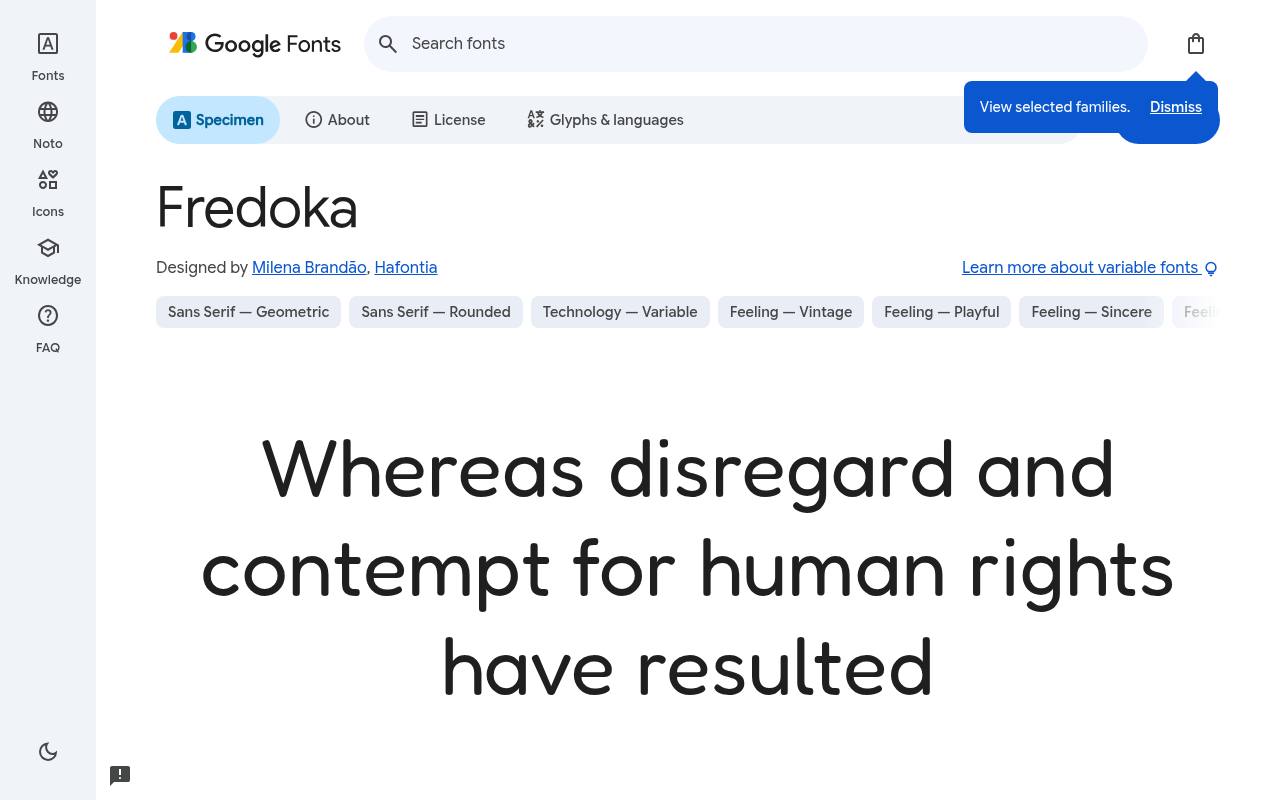
POW! Free fonts for fun!
ABCDEFGHIJKLM abcdefghijklm 0123456789
Rounded forms and soft terminals give Fredoka a cheerful, toy-like presence rather than the sharp edges of action-comic lettering. Google Fonts offers Fredoka free with 5 styles spanning weights 300–700, with no italics; the design credit goes to Milena Brandão and Hafontia.
Variable controls cover Width 75–125, Weight 300–700. The Fredoka character set covers Hebrew, Latin and extended Latin. For a children's story app, broader headings can introduce characters while lighter, narrower settings keep activity labels within small interface panels.
- Style
- Rounded comic
- Best for
- Kids' apps and education
- License
- SIL Open Font License
- Price
- 100% free
Boogaloo
Retro cartoon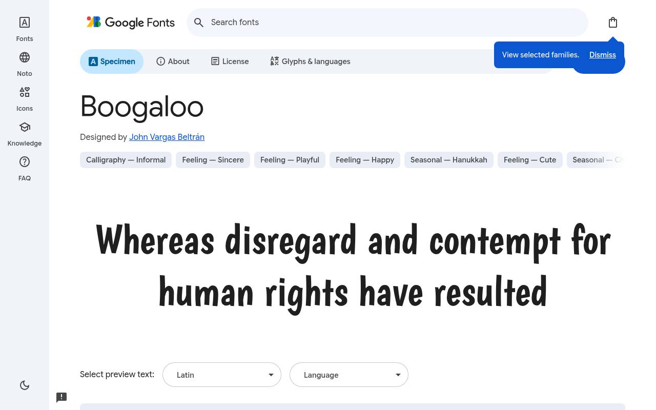
POW! Free fonts for fun!
ABCDEFGHIJKLM abcdefghijklm 0123456789
Hand-painted 1960s signage informs Boogaloo's springy, condensed rhythm, bringing a little dance-poster energy to cartoon lettering. John Vargas Beltrán designed the free Google Fonts release of Boogaloo, which includes one upright style at weight 400 and no separate italic. Boogaloo includes Latin coverage.
A food-truck comic or illustrated festival flyer could use its narrow forms for lively menu headings, keeping prices and event details in a steadier supporting face. Its compact construction leaves more horizontal room for illustrated characters beside a short title.
- Style
- Retro cartoon
- Best for
- Funky posters and labels
- License
- SIL Open Font License
- Price
- 100% free
Bowlby One
Heavy comic caps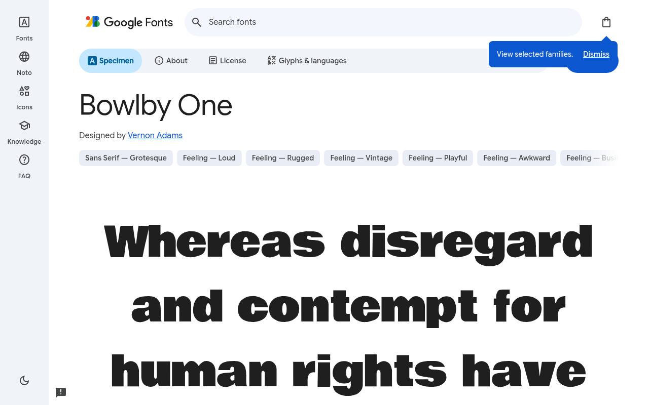
POW! Free fonts for fun!
ABCDEFGHIJKLM abcdefghijklm 0123456789
Broad, weighty forms give Bowlby One the blunt impact of a vintage comic cover, with little need for added outlines or shadows. The free Bowlby One download credits Vernon Adams and supplies one upright style at weight 400 and no separate italic.
Character coverage in Bowlby One extends to Latin. A children's promotional comic could use it for a NEW badge or a giant prize announcement, keeping the surrounding dialogue considerably lighter.
Although labeled Regular, the sole cut already delivers the weight of a display headline.Like every free font in this list, it ships under the SIL Open Font License, so it is free for personal and commercial projects alike.
- Style
- Heavy comic caps
- Best for
- Bold callouts and stickers
- License
- SIL Open Font License
- Price
- 100% free
Tips for using free comic fonts
Comic fonts are spices, not the main dish. Use one free comic font for headlines or speech bubbles and pair it with a neutral sans for paragraphs. Bangers or Luckiest Guy for titles, Comic Neue or Patrick Hand for dialogue, is a combination that rarely fails.
Give comic lettering room: slightly larger sizes, generous line height and high contrast against artwork. And since every font here is free under the Open Font License, you can embed it in apps, print it on merch or sell the comic itself without paying a cent.
Free comic fonts vs. Comic Sans
Comic Sans gets mocked mostly because it is overused in serious contexts. The free comic fonts above give you the same warmth with better craft — and choosing one on purpose instantly signals that your design is fun by intent, not by accident.
Where free comic fonts work best
Comic fonts shine wherever the goal is delight: children's books and apps, birthday and party invitations, toy and snack packaging, YouTube thumbnails, Twitch overlays, classroom worksheets and, of course, webcomics. They also work surprisingly well on 404 pages and empty states, where a moment of humour softens a dead end.
They work badly on legal pages, financial dashboards and anywhere people need to trust the numbers. Keep your free comic font for headlines, badges and dialogue, and let a calmer typeface handle the serious information.
Lettering a webcomic with free fonts
Professional comic letterers use all-caps for dialogue, with bold italic for emphasis and a separate, louder font for sound effects. You can recreate that workflow for free: Patrick Hand or Comic Neue for speech, Bangers or Luckiest Guy for the 'BOOM!' moments, and Permanent Marker for handwritten notes and signs inside the art.
Set balloon text around 8–9 points at print size, keep line spacing tight but not touching, and centre each line inside the bubble. These free comic book fonts include enough punctuation and accented characters to letter in most European languages.
Frequently asked questions
Can I sell a comic that uses these free fonts? Yes. The Open Font License lets you publish and sell comics, print merchandise and ship games that use these free comic fonts. You just cannot sell the font files on their own.
What is the best free alternative to Comic Sans? Comic Neue is the closest match in spirit and is better crafted. For handwritten dialogue, Patrick Hand is a lovely alternative too.
Give every character a consistent lettering voice
When you use free comic fonts for a recurring story, write down a few lettering rules alongside your character notes. Decide how you represent ordinary speech, a whispered aside, a shouted interruption and a written message inside the scene.
You do not need a new typeface for every speaker. Consistent placement and a restrained approach to emphasis can make the narrative clearer than a page full of competing voices.
Try Patrick Hand for a sample conversation and Permanent Marker for a note that a character discovers. Then read the scene without the artwork. Can you still follow the order and distinguish dialogue from objects within the story?
Keep those roles stable across later pages. This gives your free lettering a deliberate system and helps readers concentrate on the joke, the action or the emotional turn rather than decoding changes in typography.
Make dramatic words work with the illustration
Sound effects are part of your composition, so position them while you are still planning the artwork. A Bangers title can echo the direction of movement, while a broad Bowlby One callout needs a different amount of horizontal room.
Test the actual word rather than a placeholder: a short impact and a long rumble create very different shapes, even when they use the same free font at the same size.
Avoid covering a character's expression or an important visual clue just to fit a dramatic effect. Move the lettering, change the line break or simplify the surrounding decoration before distorting the letters.
Cartoon fonts already carry plenty of personality. If you add outlines and shadows, check that their counters remain open and the word still reads when the panel is reduced to the size at which somebody will actually encounter it.
Choose classroom lettering by testing the worksheet
A search for a comic sans alternative should lead to a practical reading test, not simply a more fashionable choice. Set a real instruction in Comic Neue, then compare it with a playful heading in Fredoka.
Ask whether pupils can distinguish the important words, find the next activity and read the punctuation. No typeface alone makes a worksheet accessible; clear language, useful spacing and a sensible information order matter too.
For material that will be photocopied, review a plain black-and-white version before distributing it. Soft colours and textured backgrounds may look cheerful on screen yet compete with small instructions on paper.
Keep the task wording visually separate from decorative labels. Free comic fonts give you room to experiment without a purchase, but the final decision should reflect the age, reading confidence and needs of the people using your material.
Keep a reusable lettering proof for future projects
Create a proof sheet containing names, numbers, punctuation and the expressions you frequently use. Include a long title in Luckiest Guy, a short label in Bubblegum Sans and a conversational sentence in Comic Neue.
Save the settings as well as the font names. If you later search for comic book fonts free of charge, this sheet gives you a useful baseline instead of starting the selection process from scratch.
Treat a fun fonts free download search as the beginning of your workflow, not the final quality check. Open the source page, download the files you need and keep the accompanying licence information with the project.
After installing your chosen free font, reopen your design application if it does not appear immediately. Finally, export a sample and inspect it elsewhere to confirm that the finished lettering matches what you intended.