
Serif fonts carry centuries of printing history in their little feet. They signal trust, craft and literacy, which is why newspapers, publishers and luxury brands keep coming back to them.
The good news: you do not need an expensive foundry license to get a beautiful serif. These ten free serif fonts are open source and free for commercial use.
This collection is deliberately different from our free comic fonts round-up. Here the goal is refinement — comfortable reading at small sizes and graceful headlines at large ones. We mixed revivals of historic faces like Garamond and Baskerville with modern serifs designed specifically for screens.
Each free serif font below includes a live sample, a screenshot of its source page and an honest note on where it shines. Every download button goes straight to Google Fonts, where the files are free forever.
Quick picks at a glance
| # | Resource | Style | Best for |
|---|---|---|---|
| 1 | EB Garamond | Garalde revival | Books and literary sites |
| 2 | Cormorant Garamond | Display Garamond | Luxury headlines |
| 3 | Libre Baskerville | Transitional serif | Body text on screens |
| 4 | Merriweather | Screen serif | Blogs and news sites |
| 5 | Crimson Pro | Old-style text | Novels and essays |
| 6 | Source Serif 4 | Transitional text | Documentation and reports |
| 7 | Spectral | Screen-first serif | Digital publishing |
| 8 | Newsreader | Editorial serif | Magazines and newsletters |
| 9 | Bodoni Moda | Didone | Fashion and beauty |
| 10 | Cardo | Scholarly serif | Classical and academic texts |
EB Garamond
Garalde revival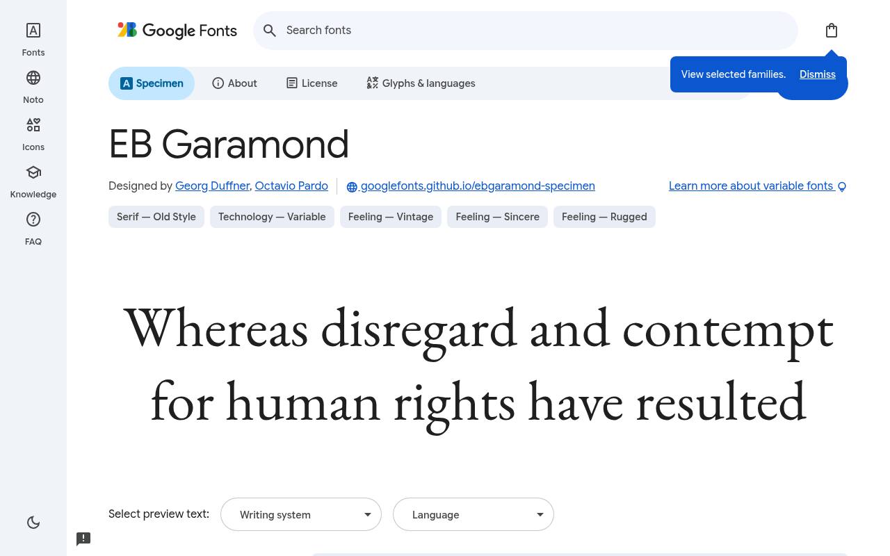
Elegant type, entirely free
ABCDEFGHIJKLM abcdefghijklm 0123456789
Claude Garamont's 16th-century types underpin EB Garamond's bookish proportions, complemented by old-style figures and true small capitals. Google Fonts offers EB Garamond free with 10 styles spanning weights 400–800, including italics; the design credit goes to Georg Duffner and Octavio Pardo.
Variable controls cover Weight 400–800. The EB Garamond character set covers Cyrillic, extended Cyrillic, Greek, extended Greek, Latin, extended Latin and Vietnamese. An online poetry collection could combine its upright text with italic titles and small-cap section labels, maintaining a literary atmosphere across the reading pages.
- Style
- Garalde revival
- Best for
- Books and literary sites
- License
- SIL Open Font License
- Price
- 100% free
Cormorant Garamond
Display Garamond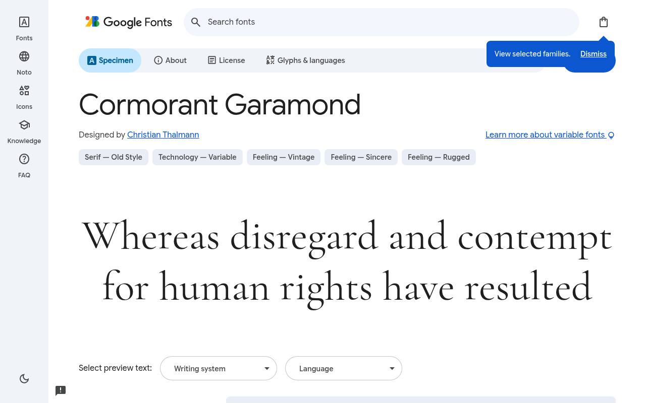
Elegant type, entirely free
ABCDEFGHIJKLM abcdefghijklm 0123456789
Garamond-inspired forms become more dramatic in Cormorant Garamond, where fine serifs and small counters favor expansive display settings. Christian Thalmann designed the free Google Fonts release of Cormorant Garamond, which includes 10 styles spanning weights 300–700, including italics. Variable controls cover Weight 300–700.
Cormorant Garamond includes Cyrillic, extended Cyrillic, Latin, extended Latin and Vietnamese coverage. For boutique-hotel stationery, a large property name and italic location line can express refinement while a sturdier companion handles reservation details and small-print conditions. Its display character comes from delicate proportions as much as from stroke contrast.
- Style
- Display Garamond
- Best for
- Luxury headlines
- License
- SIL Open Font License
- Price
- 100% free
Libre Baskerville
Transitional serif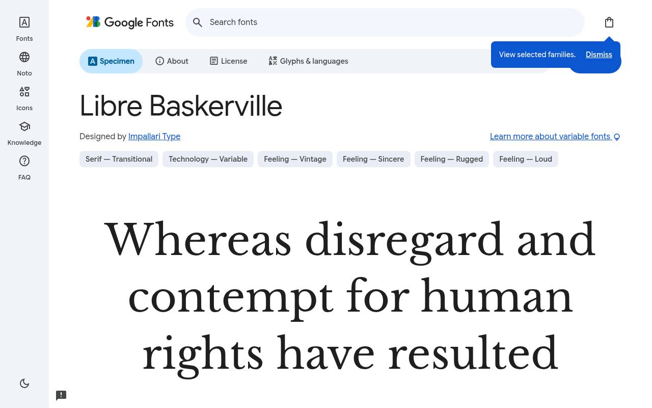
Elegant type, entirely free
ABCDEFGHIJKLM abcdefghijklm 0123456789
A larger x-height and broader proportions adapt Baskerville's formal character for screen reading in Libre Baskerville. The free Libre Baskerville download credits Impallari Type and supplies 8 styles spanning weights 400–700, including italics. Variable controls cover Weight 400–700. Character coverage in Libre Baskerville extends to Latin and extended Latin.
An academic essay site could use it for sustained argument, italic book titles, and bolder subsection headings, keeping the dignified serif voice consistent through the reading column. The upright and italic supply a useful contrast without abandoning the same historical model.
- Style
- Transitional serif
- Best for
- Body text on screens
- License
- SIL Open Font License
- Price
- 100% free
Merriweather
Screen serif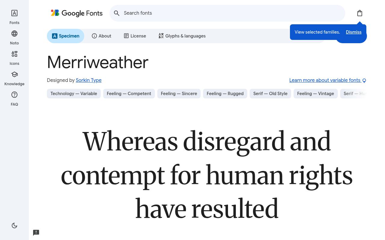
Elegant type, entirely free
ABCDEFGHIJKLM abcdefghijklm 0123456789
Sturdy serifs, open forms, and economical proportions explain Merriweather's screen-oriented character, but its current variable controls offer more than a single compact texture. Google Fonts offers Merriweather free with 14 styles spanning weights 300–900, including italics; the design credit goes to Sorkin Type.
Variable controls cover Optical Size 18–144, Width 87–112, Weight 300–900. The Merriweather character set covers Cyrillic, extended Cyrillic, Latin, extended Latin and Vietnamese. A digital journal could give article titles a wider setting and keep the main reading column more restrained within the same family.
- Style
- Screen serif
- Best for
- Blogs and news sites
- License
- SIL Open Font License
- Price
- 100% free
Crimson Pro
Old-style text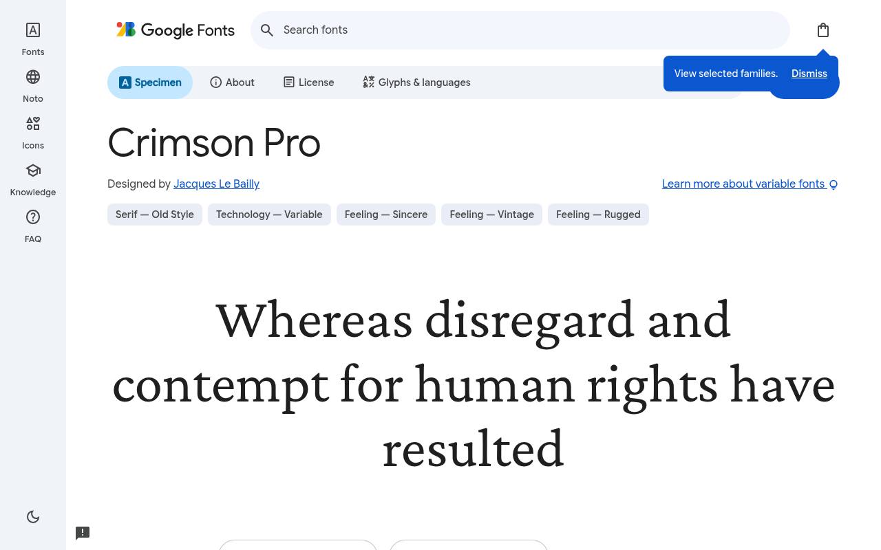
Elegant type, entirely free
ABCDEFGHIJKLM abcdefghijklm 0123456789
Classic book faces from Jan Tschichold's era inform Crimson Pro's calm proportions and literary color. Jacques Le Bailly designed the free Google Fonts release of Crimson Pro, which includes 16 styles spanning weights 200–900, including italics.
Variable controls cover Weight 200–900. Crimson Pro includes Latin, extended Latin and Vietnamese coverage. A collection of historical essays could move from light introductory passages to firm chapter headings, using the real italic for cited titles and short editorial asides throughout the text.
The upper weights bring firmer structure without replacing the underlying book-text character.Like every free font in this list, it ships under the SIL Open Font License, so it is free for personal and commercial projects alike.
- Style
- Old-style text
- Best for
- Novels and essays
- License
- SIL Open Font License
- Price
- 100% free
Source Serif 4
Transitional text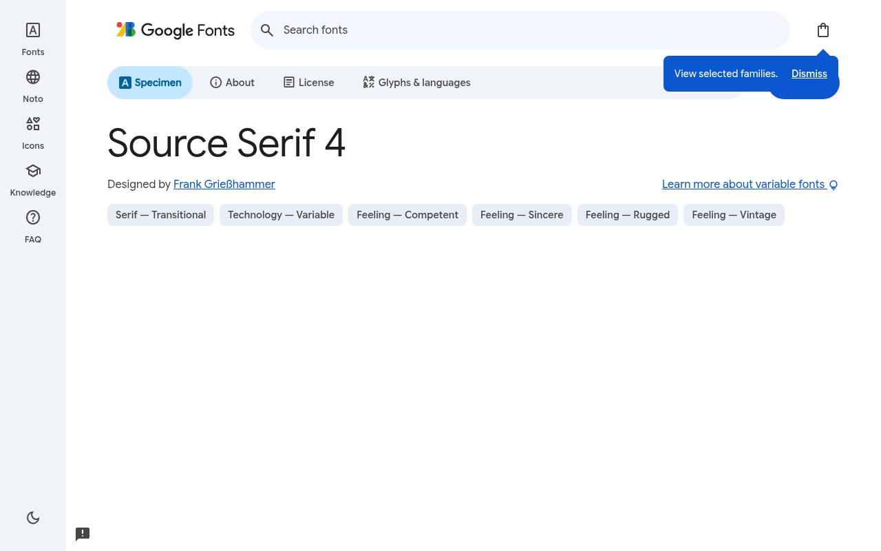
Elegant type, entirely free
ABCDEFGHIJKLM abcdefghijklm 0123456789
Adobe's Source family supplies the context for Source Serif 4, a measured text serif with size-sensitive forms rather than one display treatment for every scale. The free Source Serif 4 download credits Frank Grießhammer and supplies 16 styles spanning weights 200–900, including italics.
Variable controls cover Optical Size 8–60, Weight 200–900. Character coverage in Source Serif 4 extends to Cyrillic, extended Cyrillic, Greek, Latin, extended Latin and Vietnamese. In an annual report, sturdier captions and finer large headings can accompany the narrative, with Source Sans handling charts and labels.
- Style
- Transitional text
- Best for
- Documentation and reports
- License
- SIL Open Font License
- Price
- 100% free
Spectral
Screen-first serif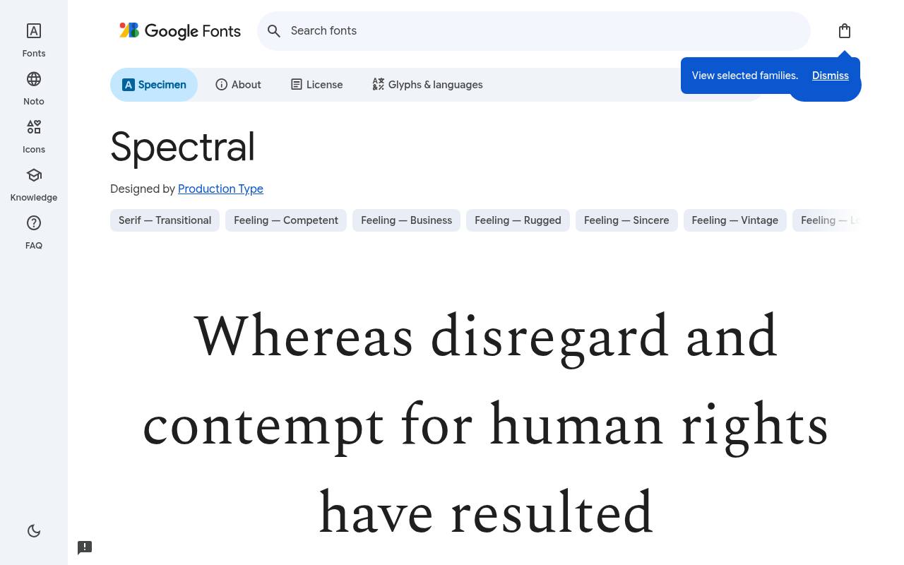
Elegant type, entirely free
ABCDEFGHIJKLM abcdefghijklm 0123456789
Created by Production Type for Google, Spectral aims for the sustained reading rhythm of documents and e-readers rather than decorative headline effects. Google Fonts offers Spectral free with 14 styles spanning weights 200–800, including italics; the design credit goes to Production Type.
The Spectral character set covers Cyrillic, extended Cyrillic, Latin, extended Latin and Vietnamese. An essay archive could set its main text, italic quotations, and bold section breaks within this quiet serif, keeping attention on the writing itself. Separate italic drawings add editorial emphasis while preserving the overall restrained reading texture.
- Style
- Screen-first serif
- Best for
- Digital publishing
- License
- SIL Open Font License
- Price
- 100% free
Newsreader
Editorial serif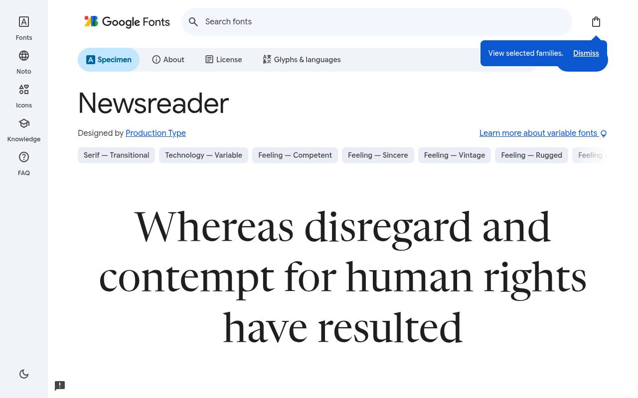
Elegant type, entirely free
ABCDEFGHIJKLM abcdefghijklm 0123456789
Digital news is Newsreader's home territory, with optical sizing that accommodates both small editorial text and prominent story titles. Production Type designed the free Google Fonts release of Newsreader, which includes 14 styles spanning weights 200–800, including italics. Variable controls cover Optical Size 6–72, Weight 200–800.
Newsreader includes Latin, extended Latin and Vietnamese coverage. A newsletter could use its restrained serif forms for the lead story and body paragraphs, changing optical treatment rather than importing an unrelated display face. Size-sensitive variation gives this editorial family a purpose beyond simply supplying bold text.
- Style
- Editorial serif
- Best for
- Magazines and newsletters
- License
- SIL Open Font License
- Price
- 100% free
Bodoni Moda
Didone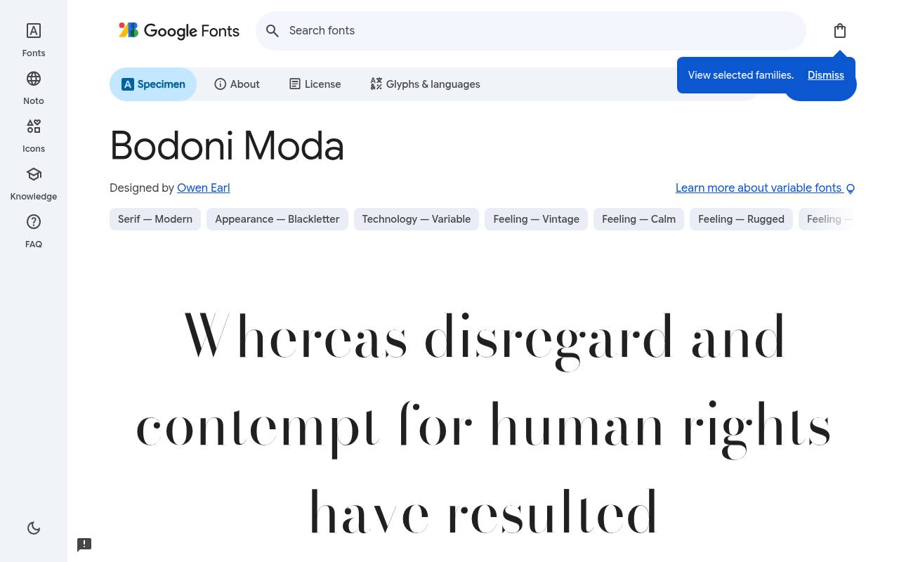
Elegant type, entirely free
ABCDEFGHIJKLM abcdefghijklm 0123456789
Hairline serifs and forceful verticals connect Bodoni Moda to the dramatic Didone tradition of the 18th century. The free Bodoni Moda download credits Owen Earl and supplies 12 styles spanning weights 400–900, including italics. Variable controls cover Optical Size 6–96, Weight 400–900.
Character coverage in Bodoni Moda extends to Latin, extended Latin, math and symbols. A fashion editorial could make an oversized collection title its centerpiece, using the family's italic for a designer quotation and a sturdier companion for dense product specifications.
- Style
- Didone
- Best for
- Fashion and beauty
- License
- SIL Open Font License
- Price
- 100% free
Cardo
Scholarly serif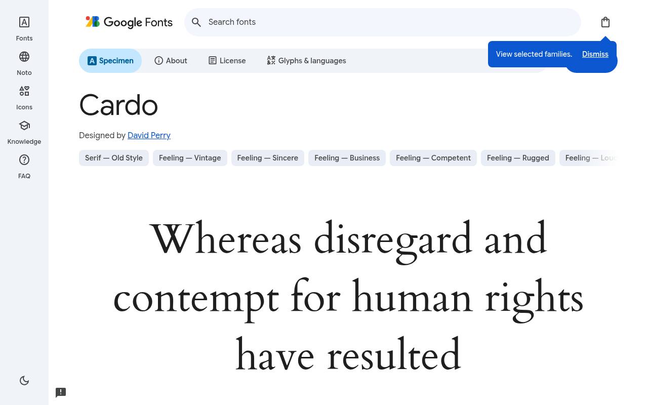
Elegant type, entirely free
ABCDEFGHIJKLM abcdefghijklm 0123456789
Classical scholarship shapes Cardo's dignified appearance and unusually broad historical character coverage, extending well beyond everyday Western European text. Google Fonts offers Cardo free with 3 styles spanning weights 400–700, including italics; the design credit goes to David Perry.
The Cardo character set covers Gothic, Greek, extended Greek, Hebrew, Latin, extended Latin, Old Italic and Runic. A museum's annotated translation could combine Greek or Hebrew passages with Latin commentary, while the restrained serif structure keeps the page closer to a scholarly edition than a novelty display.
- Style
- Scholarly serif
- Best for
- Classical and academic texts
- License
- SIL Open Font License
- Price
- 100% free
Choosing the right free serif font
Ask one question first: headline or body? Display serifs like Cormorant and Bodoni Moda need large sizes to show off their fine details. Text serifs like Merriweather, Libre Baskerville and Spectral are built to stay sharp at 16–18px.
For a classic free font pairing, put a high-contrast serif headline over a clean sans body, or flip it: a geometric sans headline with a serif for reading. Either way, all ten of these free serif fonts are open-licensed, so you can test freely before you commit.
Serif vs. sans-serif: when to choose a serif
Serif fonts suggest heritage, authority and care. Law firms, universities, publishers, wineries and luxury brands lean on them for exactly that reason. On screens, a well-designed text serif such as Merriweather or Source Serif 4 is every bit as readable as a sans-serif, and arguably more comfortable for long articles.
Choose a free serif font when your content is meant to be read, not just scanned: essays, newsletters, recipes, case studies and books. Choose a sans when your design is mostly interface — buttons, menus and tables.
Typesetting tips for free serif fonts
Give serif body text a comfortable measure of 60–75 characters per line and a line height of around 1.6. Turn on old-style figures where available (EB Garamond and Crimson Pro have them) so numbers sit naturally within sentences.
Use true italics for emphasis rather than bold — serifs have gorgeous italics, and every family here includes them for free.
For headlines, display serifs like Cormorant Garamond and Bodoni Moda look best with slightly tighter letter-spacing and plenty of white space around them.
Frequently asked questions
What is the most readable free serif font for websites? Merriweather and Libre Baskerville are the safest choices for body text on screens; Newsreader and Spectral are excellent too.
Is EB Garamond free for commercial use? Yes. Like every free serif font here, it uses the SIL Open Font License, so it is free for books, websites and branding.
Compare serifs with a complete editorial page
Build your comparison around a real page containing a headline, introduction, body paragraphs, a quotation and a caption. Free serif fonts can feel quite different once they have to handle all those roles together.
Try Newsreader and Spectral on the same article, keeping the content and column width constant. Judge how easily your eye moves from the title into the opening sentence rather than choosing solely from the shape of one attractive capital.
Include a section with bold emphasis, links and a list, because most published articles contain more than uninterrupted prose. The best serif fonts for your project should make these changes of pace feel natural.
If a link becomes hard to distinguish or a caption feels cramped, adjust that role separately before rejecting the whole family. Your comparison will be more useful when it reflects an actual reading journey rather than an isolated specimen.
Prepare a book proof before committing to pagination
When assessing free book fonts, create several consecutive pages rather than one perfect spread. Include a chapter opening, a dense passage, dialogue and any notes your manuscript requires.
EB Garamond and Crimson Pro are sensible candidates to compare using that material. Watch for uneven pages and distracting breaks, but resist manually fixing every line until you have settled on the overall text settings and page dimensions.
Print your sample at its intended size and read it away from your design screen. You may notice that a comfortable digital preview feels smaller on paper or that your margins need rebalancing.
If the book also has a digital edition, test that separately rather than assuming the print layout will transfer unchanged. Free fonts remove a purchasing barrier, but careful proofing is still what turns a promising choice into a comfortable publication.
Handle names, references and specialist characters carefully
A scholarly project asks more of a typeface than an ordinary headline does. Gather the names, language samples, symbols and reference styles your publication will actually contain, then test them early.
Cardo is particularly relevant to the academic uses described above, but you should still inspect your own text. A broad character repertoire is valuable only when the downloaded files and your publishing software deliver the characters you need.
Check punctuation around quotations and footnote markers as closely as the main alphabet. For reports using Source Serif 4, include a table heading, a numbered reference and a short caption in the proof.
If anything falls back to a different typeface, investigate before exporting the full document. This is a useful habit with all free serif fonts, especially when several contributors supply text from different applications or use different language settings.
Protect fine details in branded layouts
If you are browsing elegant fonts free of charge for a brand project, test the least flattering application as well as the hero image. Cormorant Garamond might look beautiful across a spacious cover, while the same word on a narrow label needs a different treatment.
Compare it with Bodoni Moda using the actual brand name, surrounding imagery and available space. Their elegance should support recognition rather than depend on ideal viewing conditions.
Avoid judging these display choices through colour alone. Review a plain single-colour version, a reversed version and an example placed near a photograph. Fine strokes can lose definition against busy areas even when the overall palette looks sophisticated.
If the design fails, try repositioning the type or simplifying the background before adding effects. A carefully chosen free serif often needs less decoration, not more, to look considered and distinctive.
Keep editorial typography reliable as your site grows
Choosing serif fonts for websites also means planning for content changes. An editor may add a longer title, a translated quotation or a table that was missing from the original design.
Create reusable text styles for those situations rather than leaving each page to individual judgement. Merriweather or Libre Baskerville can form the centre of that system, but the supporting rules matter as much as the name of the family.
After a redesign, inspect older articles as well as the homepage. Look for italic passages, nested lists and captions that no longer sit comfortably with the new settings.
Check the browser's enlarged-text view and confirm that links remain clear without relying only on colour. These routine checks help your free serif selection remain consistent over time, even as the people publishing the content and the subjects they cover continue to change.