
The best free mobile app UI kits shorten the distance between a product idea and a prototype people can discuss. They provide a visual foundation for navigation, forms, content cards, and common screen patterns, but they are not interchangeable.
An official iPhone resource serves a different purpose from a travel-booking concept or a hybrid-framework component file. This selection separates those uses so you can choose a starting point that fits the platform, the product problem, and the implementation team.
Begin with platform conventions before judging decorative details. Android and iOS differ in navigation expectations, system controls, safe areas, and interaction behavior. A kit advertised for both platforms may still require substantial adaptation.
The resources below include official ecosystems, general mobile components, and narrower app concepts available from their creators or source platforms. Some open directly in Figma; others lead through a resource page to the appropriate file. Review the download format and account requirements before scheduling collaborative work.
A useful free Figma UI kit also needs a workable licence and enough structure to survive real content. Check whether the creator allows commercial use, requires attribution, or limits assets to a particular platform.
Keep fonts, icons, and photographs in that review rather than treating them as automatically cleared. Once a file is duplicated, inspect its components and test one representative task before redesigning every screen. That small investment reveals whether the kit genuinely accelerates your app or simply looks attractive.
Quick picks at a glance
| # | Resource | License | Best for |
|---|---|---|---|
| 1 | Apple Design Resources | Apple design-resource licence; platform restrictions apply | Accurate iPhone interfaces and native platform conventions |
| 2 | Material 3 Design Kit | Google kit terms; check linked asset licences | Android prototypes grounded in Material component patterns |
| 3 | Appzio | Creative Commons Attribution; credit required | Cross-platform screen planning with reusable app patterns |
| 4 | Figma Mobile UI Kit | Free template; review linked file terms | Exploring everyday chat, calendar, and social interfaces |
| 5 | AI ChatBot Mobile App | Free for personal and commercial use | Prototyping AI assistants and customer-support conversations |
| 6 | Bookingspace | Free for personal and commercial use | Travel booking concepts with reusable flight-information components |
| 7 | Nestory | Personal and commercial use; attribution optional | Property-listing prototypes with a consistent mobile aesthetic |
| 8 | HealCare | Free for personal and commercial use | Early doctor-directory and healthcare-service mobile concepts |
| 9 | Appetite UI | Free for personal and commercial work | Testing token-driven financial dashboards and payment flows |
| 10 | Ionic Material UI Kit | Community file terms; verify reuse and attribution | Aligning hybrid mobile designs with Ionic component vocabulary |
Apple Design Resources
Official platform design files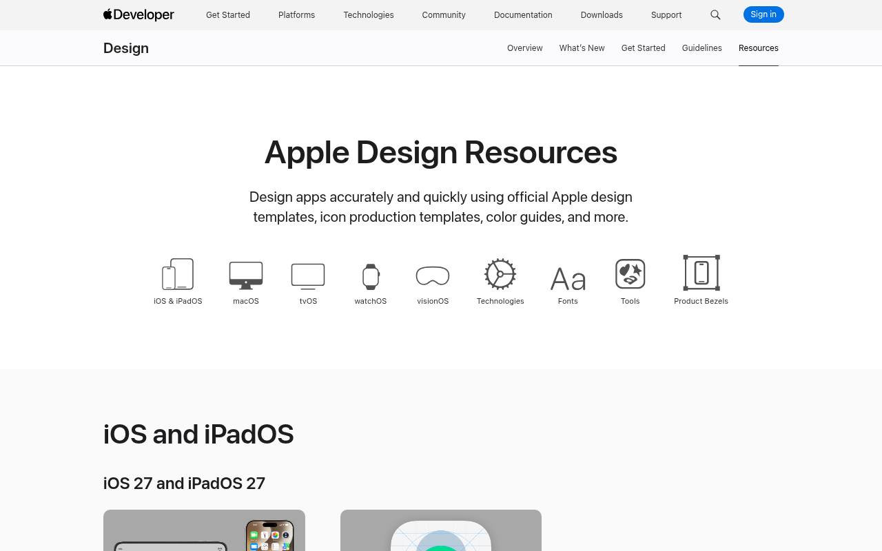
Apple Design Resources is the strongest starting point when a mobile concept needs to feel genuinely native to iPhone. The official collection provides platform UI resources alongside production tools, with download choices varying by platform and design application.
Start with the iOS materials rather than adapting a desktop kit to a smaller frame. These are Apple-specific design assets, not an unrestricted illustration library: read the agreement attached to the download before using or redistributing components. Keep the resource release aligned with the operating-system experience your development team actually supports.
- Type
- Official platform design files
- Best for
- Accurate iPhone interfaces and native platform conventions
- License
- Apple design-resource licence; platform restrictions apply
- Price
- 100% free
Material 3 Design Kit
Official Material design system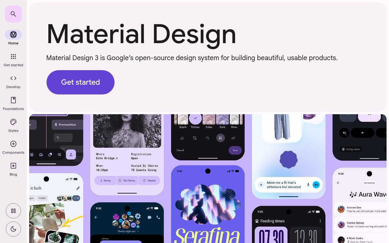
Google’s Material site connects the visual system, component documentation, and design resources behind many Android interfaces. Its official Figma kit is useful for establishing a shared vocabulary around buttons, navigation, surfaces, and states before implementation begins.
Follow the design-kit link from the official resource navigation, and consult the documentation whenever a component’s behavior is unclear. Material styling is a starting framework, not a complete app flow or a guarantee of accessibility. Review the linked file terms and any separate font or icon licences when assembling your final handoff package.
- Type
- Official Material design system
- Best for
- Android prototypes grounded in Material component patterns
- License
- Google kit terms; check linked asset licences
- Price
- 100% free
Appzio
Mobile screen UI kit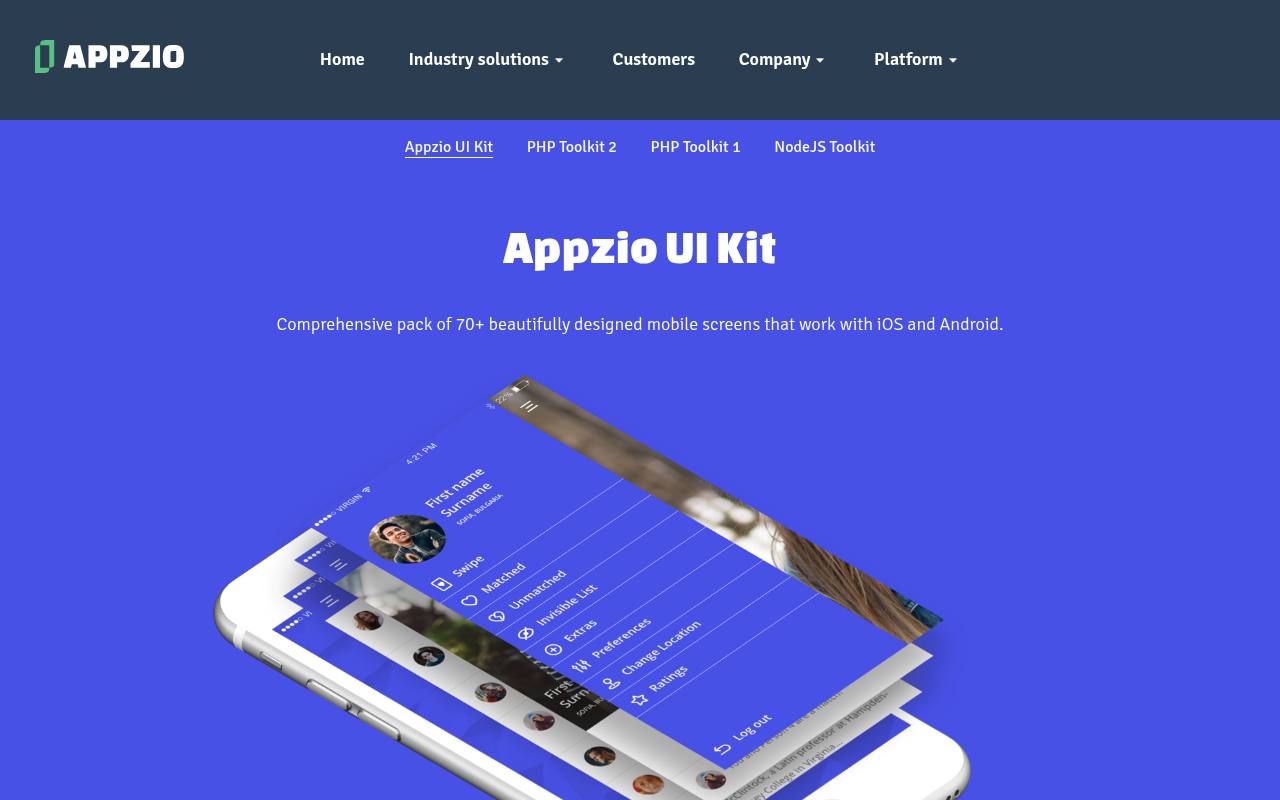
Appzio offers a mobile UI kit expressly intended to work with both iOS and Android projects. The source page connects its screen designs to Appzio’s own component approach, making it particularly relevant when that platform is part of the implementation plan.
The Creative Commons Attribution licence permits editing and use beyond Appzio, provided you supply the required credit. Its typography uses publicly available fonts, with a font-package link supplied separately. Treat this as a screen-pattern collection to adapt thoughtfully, rather than assuming every layout reflects the latest native convention on either operating system.
- Type
- Mobile screen UI kit
- Best for
- Cross-platform screen planning with reusable app patterns
- License
- Creative Commons Attribution; credit required
- Price
- 100% free
Figma Mobile UI Kit
Customizable Figma components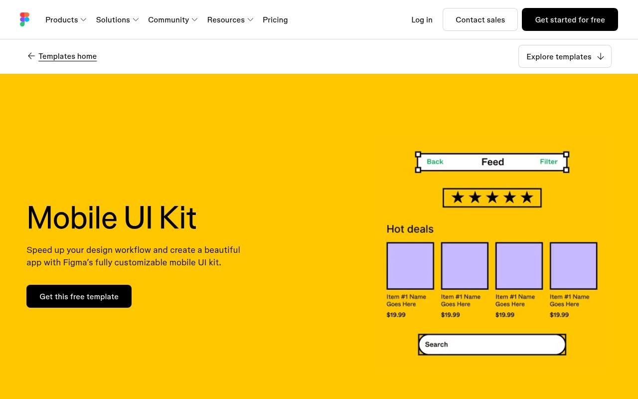
Figma’s mobile template page introduces a free kit created by designer Joey Banks, with components intended for chat applications, social networks, calendars, and related interfaces. Its editable screen structure includes customizable text, color, sizing, styles, and components, so it suits early product exploration rather than presentation-only mockups.
Figma highlights layered, grouped content and browser-based collaboration as part of the workflow. Open the linked file to inspect its current terms before sharing derivatives. For a collaborative first prototype, it offers a practical middle ground between blank frames and a highly specialized industry template.
- Type
- Customizable Figma components
- Best for
- Exploring everyday chat, calendar, and social interfaces
- License
- Free template; review linked file terms
- Price
- 100% free
AI ChatBot Mobile App
Figma mobile app screens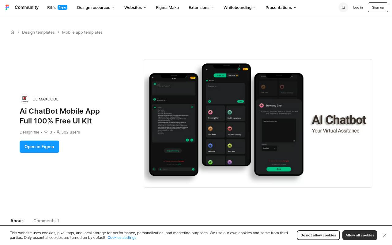
CLIMAXCODE’s AI ChatBot file focuses on the screens around a conversational product, including authentication, chat, profile, and settings. The listing explicitly permits personal and commercial use and describes editable Figma frames and components. Quick replies, response bubbles, and a typing-animation placeholder help communicate conversational states without building a functioning assistant.
That distinction matters: a visual placeholder does not supply streaming behavior or an AI service. Use its conversation interface patterns to explore message hierarchy, then add your own failure, privacy, and long-response states before testing a realistic mobile support journey.
- Type
- Figma mobile app screens
- Best for
- Prototyping AI assistants and customer-support conversations
- License
- Free for personal and commercial use
- Price
- 100% free
Bookingspace
Figma flight-booking UI kit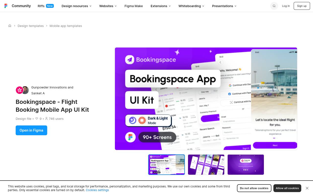
Bookingspace by Gunpowder Innovations concentrates on mobile flight-booking experiences instead of a generic collection of unrelated screens. The creator describes light and dark themes, Auto Layout, organized layers, and reusable buttons, search bars, tab bars, cards, and flight-information blocks.
The file is offered for personal and commercial projects, with editable typography, icons, and colors. Its travel-specific building blocks make it useful for evaluating search and selection hierarchy quickly. Extend the supplied patterns with realistic baggage rules, unavailable fares, passenger details, and pricing disclosures before presenting a complete booking concept to stakeholders.
- Type
- Figma flight-booking UI kit
- Best for
- Travel booking concepts with reusable flight-information components
- License
- Free for personal and commercial use
- Price
- 100% free
Nestory
Figma home-rental screen kit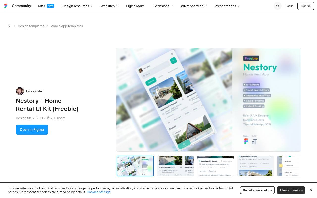
Nestory is a home-rental UI kit whose creator lists editable mobile screens for property and rental experiences. The file description specifies Auto Layout organization and the Outfit typeface, providing a clear starting point for adapting listing layouts to a different brand.
It is offered for personal and commercial use, with attribution appreciated rather than required. Because the creator positions it for both iOS and Android, check platform navigation details yourself. Its rental-focused screen designs are especially useful for discussing property discovery, while policies, availability conflicts, and accessible map alternatives require additional product work.
- Type
- Figma home-rental screen kit
- Best for
- Property-listing prototypes with a consistent mobile aesthetic
- License
- Personal and commercial use; attribution optional
- Price
- 100% free
HealCare
Figma healthcare UI kit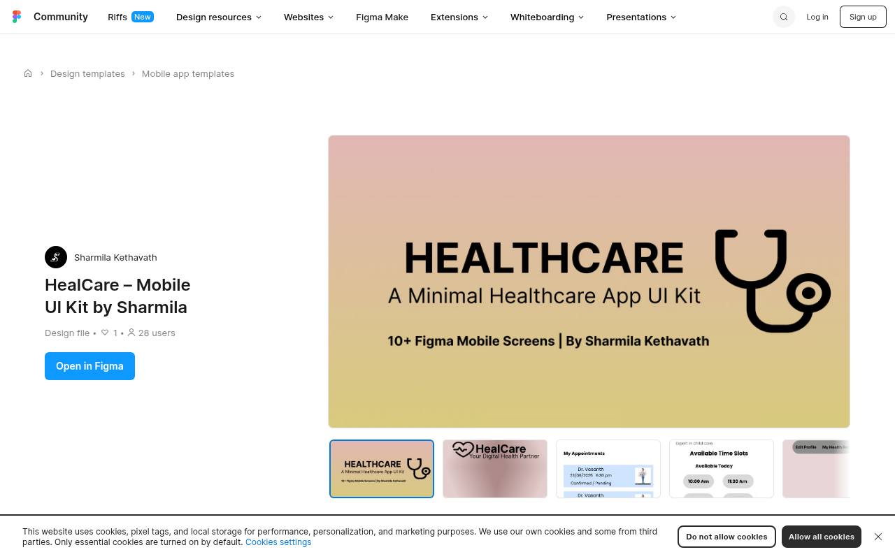
Sharmila Kethavath’s HealCare offers a deliberately compact healthcare starting point, with splash, login, doctor-list, and profile screens among the examples listed. Reusable buttons, cards, and input fields support consistent healthcare layouts without forcing a team to define every visual detail immediately. The creator explicitly allows personal and commercial use.
Its clean visual direction is appropriate for early service concepts, but the download is not a clinical workflow specification. Add privacy-sensitive interaction states, clear emergency messaging where relevant, and tested form labels before treating these screens as the basis of a real patient-facing product.
- Type
- Figma healthcare UI kit
- Best for
- Early doctor-directory and healthcare-service mobile concepts
- License
- Free for personal and commercial use
- Price
- 100% free
Appetite UI
Figma finance screen sample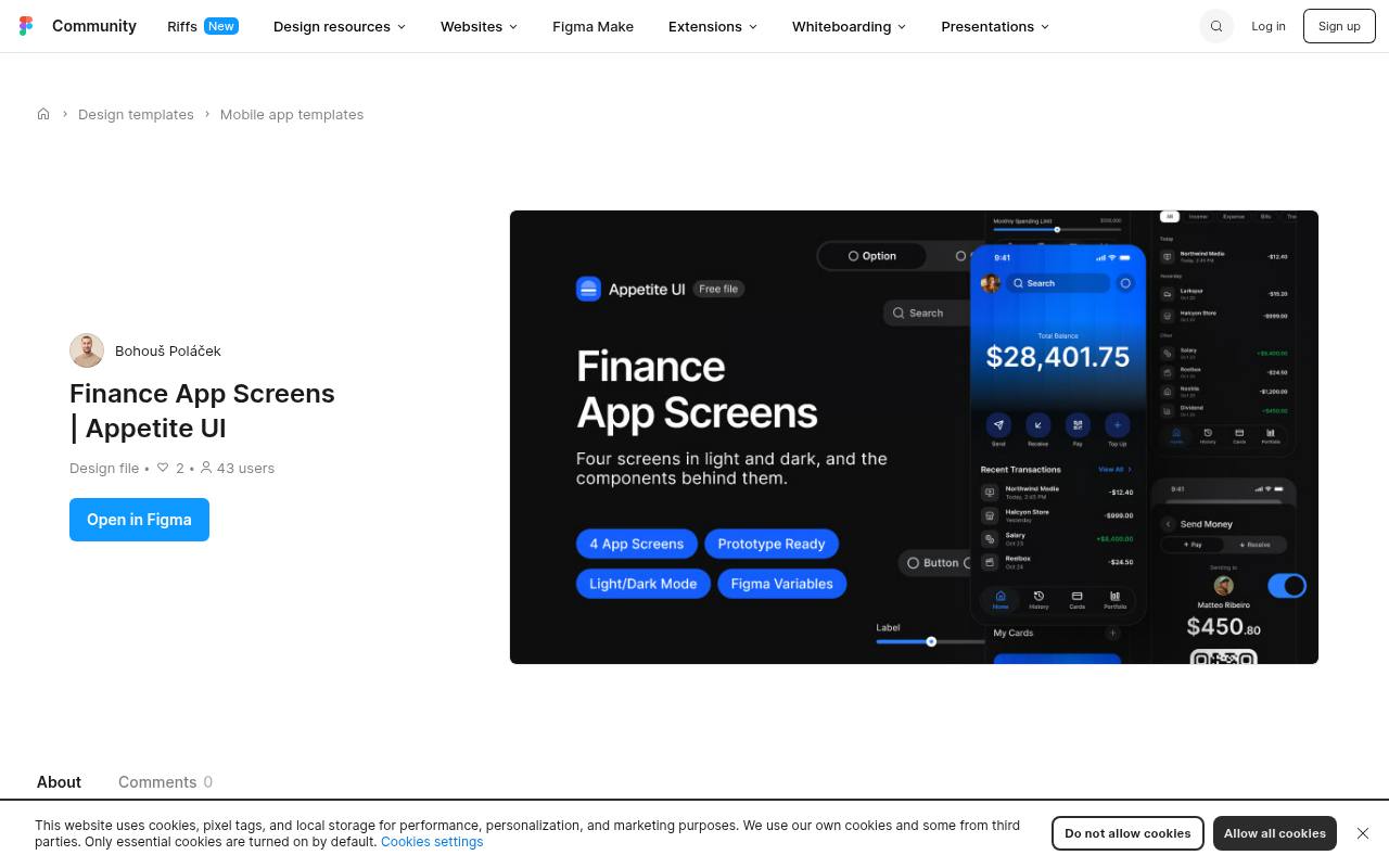
Appetite UI’s free finance file contains a dashboard, transaction-history states, and a payment flow for iPhone. The listing describes connected Figma components rather than flattened mockups, with variables, text styles, effect styles, and Lucide icons supporting the screens.
Light and dark modes and wired prototype connections make the sample useful for evaluating how a small system behaves under change. Personal and commercial work is permitted, while the broader system is promoted separately. Use this finance-focused free sample to examine token propagation and transaction hierarchy before deciding whether you need a much larger screen library.
- Type
- Figma finance screen sample
- Best for
- Testing token-driven financial dashboards and payment flows
- License
- Free for personal and commercial work
- Price
- Free + full system
Ionic Material UI Kit
Community Figma component kit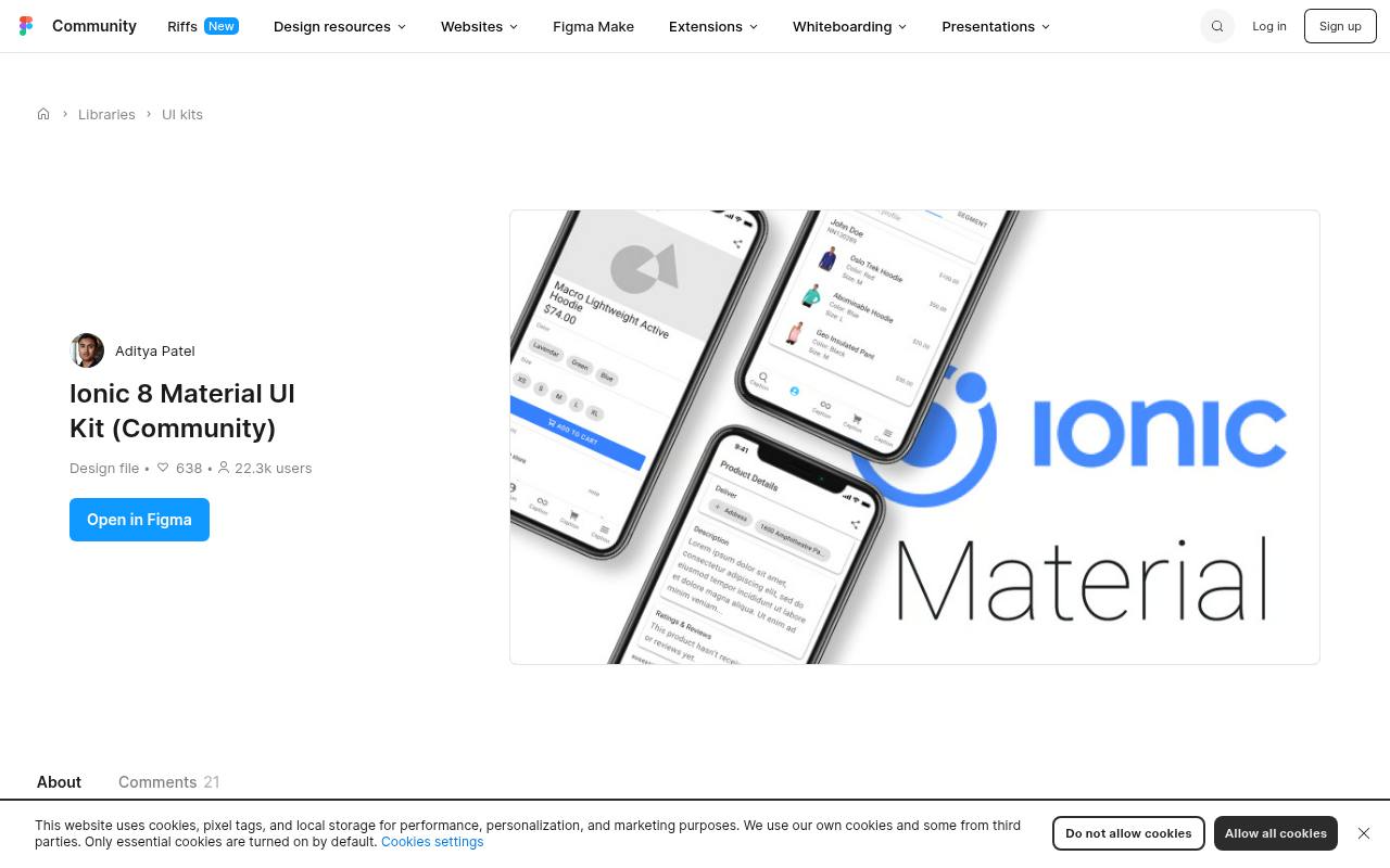
Aditya Patel’s community Ionic kit addresses a specific handoff problem: generic platform components do not always map neatly to Ionic’s implementation vocabulary. The file describes nested components, swapping, configurable item labels, and enterprise application examples, with update notes explaining its evolution.
Its Ionic-oriented component structure is useful when designers and developers need to discuss the same controls. This is a community contribution rather than an official Ionic asset release. Check the file’s Community licence details before reuse, and compare each chosen control against the Ionic release and customization strategy used in your application.
- Type
- Community Figma component kit
- Best for
- Aligning hybrid mobile designs with Ionic component vocabulary
- License
- Community file terms; verify reuse and attribution
- Price
- 100% free
Choose a foundation before a visual style
Match the kit’s actual scope to your next decision. Apple and Material resources are best for platform vocabulary; a booking or healthcare kit helps communicate a specific product scenario. Neither replaces user research.
List the screens and states needed for your first task, then check that the download reduces work on those exact requirements rather than merely adding attractive frames to your workspace.
Check licences and third-party assets
Save the download licence and creator’s source link with your project notes. An explicit personal-and-commercial-use statement is more informative than a free badge alone.
Community file terms can differ between publishers, while official platform resources may have narrower purposes. If the licence is unclear, ask before shipping client work, and separately confirm the permissions for fonts, sample photography, logos, and included icon sets.
Inspect components before duplicating screens
Use component instances to change a button label, card width, and input state before committing to a file. Auto Layout is helpful, but its presence does not prove that every nested element resizes correctly.
Try a long surname, a multiline heading, and an empty list. A kit that responds predictably to those changes is easier to maintain than one requiring repeated manual adjustments across each screen.
Design beyond the happy path
Build loading and error states alongside the polished examples. A payment screen needs declined-payment feedback; a flight search needs no-results and fare-change handling; a doctor directory needs unavailable appointments.
Use realistic content lengths and explain what happens after every important action. These additions turn a visual template into a discussion tool for developers, researchers, and support teams rather than a gallery of idealized screenshots.
Test mobile accessibility early
Review touch target sizes, text contrast, and the clarity of labels on representative devices. Dark mode needs independent review because changing surface colors can obscure boundaries and disabled states.
Check text enlargement and alternative ways to complete tasks that rely on maps or gestures. Figma prototypes can expose some usability problems, but screen-reader behavior and operating-system text settings must also be evaluated in the implemented app.
Prepare a realistic developer handoff
Document platform-specific decisions next to the relevant component rather than expecting engineers to infer them from pixels. Specify keyboard type, validation timing, scrolling, navigation transitions, and safe-area behavior. For Ionic work, align the design vocabulary with available controls.
For native apps, identify where the kit’s visual treatment should yield to system behavior. Keep the original resource link available so future maintainers can distinguish inherited patterns from deliberate product changes.
Can a free kit become a production app?
A production-ready experience requires implementation, content, testing, and appropriate legal review, even when the source file is exceptionally polished. Use the kit to accelerate decisions, not to promise that an app is almost finished.
Validate a small end-to-end flow with users, fix confusing steps, and only then expand the system. This keeps the benefits of free mobile resources while avoiding expensive commitments to patterns that do not suit your audience.