
Good free Tailwind CSS component libraries remove repetitive layout work without requiring you to surrender control over a site’s design. The strongest options range from plain HTML snippets to React components and JavaScript-powered controls.
That variety is useful, but it also makes comparison tricky: a collection of hero sections solves a different problem from a library of accessible modal interactions. Start by deciding whether you need page composition, application primitives, or working behavior, then compare the resources that actually address that need.
This selection focuses on free components and blocks that can support real development rather than paid-only template catalogues. Several providers also sell larger collections, so a free download should not be interpreted as access to the whole product range.
Licensing needs similar care. MIT is common, but some libraries add specific redistribution conditions, and included photography may use different terms. The descriptions below call out those boundaries so a promising visual example does not become an unexpected integration or compliance problem.
Before copying code, check Tailwind compatibility against your existing project. Configuration styles, utility names, theme setup, and package expectations can change between major releases. Also identify JavaScript dependencies: a dropdown with attractive classes may rely on Alpine, a vendor plugin, or your own event handling.
The most useful free library is the one your team can understand and maintain after the prototype stage. Test one representative component with your actual framework, content, and accessibility requirements before committing to a wider migration.
Quick picks at a glance
| # | Resource | License | Best for |
|---|---|---|---|
| 1 | Flowbite | MIT library; Pro has separate terms | Styled interactive controls with extensive implementation documentation |
| 2 | Preline UI | MIT plus Preline UI Fair Use terms | Feature-rich application interfaces with documented interaction plugins |
| 3 | HyperUI | MIT | Owning lightweight markup for marketing and application layouts |
| 4 | Meraki UI | MIT components; templates separate | Responsive interfaces requiring right-to-left layout consideration |
| 5 | Sailboat UI | MIT | Simple interface elements with editable utility-first styling |
| 6 | Float UI | MIT; review bundled asset terms | Responsive startup pages with framework-specific code examples |
| 7 | Kutty | MIT | Small projects comfortable with Alpine-powered interactive behavior |
| 8 | Tailblocks | MIT | Rapidly composing marketing pages from larger sections |
| 9 | Material Tailwind | MIT free components; paid products separate | React interfaces seeking a coherent Material-inspired visual language |
| 10 | TailGrids | Free library MIT; paid assets have separate terms | Evaluating reusable sections before expanding into paid collections |
Flowbite
Tailwind components and JavaScript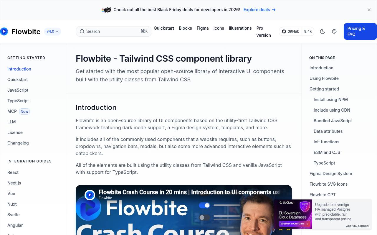
Flowbite combines Tailwind styling with JavaScript-driven components such as dropdowns, modals, accordions, and navigation elements. Its documentation separates installation, customization, and component examples, helping you move beyond a static screenshot.
The open-source library uses the MIT licence, while Pro products have separate terms; the free code should not be confused with every block promoted across the wider site. Choose Flowbite when documented interactive patterns matter more than simply collecting landing-page sections. Review the JavaScript initialization and your framework’s integration instructions before copying controls into an existing application.
- Type
- Tailwind components and JavaScript
- Best for
- Styled interactive controls with extensive implementation documentation
- License
- MIT library; Pro has separate terms
- Price
- Free + Pro
Preline UI
Components and JavaScript plugins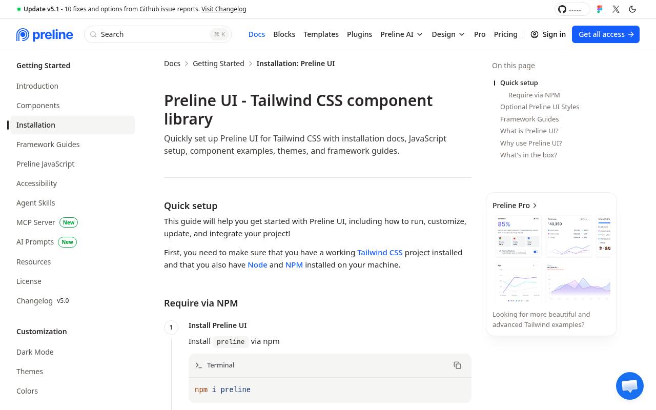
Preline UI provides styled Tailwind components and a substantial JavaScript plugin collection, with documentation covering setup, dark mode, layouts, forms, and interactive controls. The important distinction is its combined licence terms: the source states that users must comply with both MIT and the Preline UI Fair Use licence.
It is free for personal and commercial projects, but that does not mean every redistribution model is unrestricted. Explore its application-oriented component catalogue when you need controls beyond basic cards, and read the current restrictions before creating templates, builders, or competing component products.
- Type
- Components and JavaScript plugins
- Best for
- Feature-rich application interfaces with documented interaction plugins
- License
- MIT plus Preline UI Fair Use terms
- Price
- Free + Pro
HyperUI
Copy-and-paste Tailwind HTML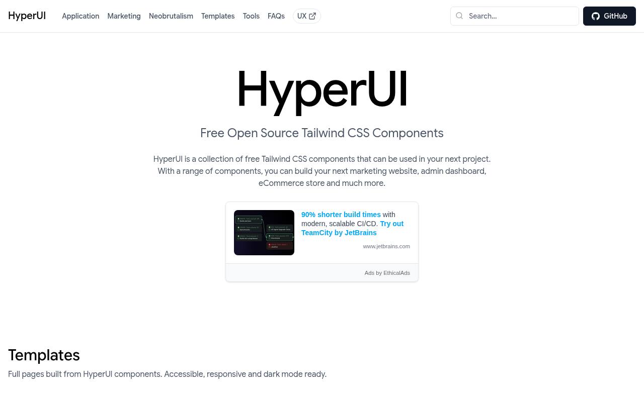
HyperUI organizes its free component collection around application interfaces, marketing layouts, and additional visual categories such as neobrutalism. The site identifies the components as MIT-licensed open source, making it a straightforward option for teams that want editable markup rather than another styled runtime dependency.
Browse by the section you need and integrate the relevant utilities into your own project conventions. Its copy-and-adapt approach works particularly well for assembling a distinctive site from small pieces. Any real form submission, business logic, or interactive behavior still needs appropriate implementation and testing.
- Type
- Copy-and-paste Tailwind HTML
- Best for
- Owning lightweight markup for marketing and application layouts
- License
- MIT
- Price
- 100% free
Meraki UI
Tailwind HTML components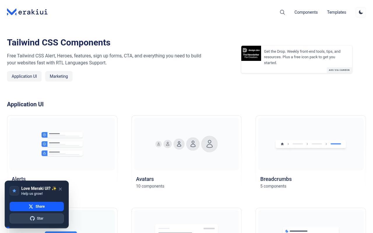
Meraki UI stands out for explicitly highlighting right-to-left language support alongside responsive layouts and dark mode. Its component categories include cards, inputs, breadcrumbs, blog sections, and calls to action, offering both application and marketing building blocks. Free components sit alongside separately promoted templates, so keep those two offerings distinct when choosing assets.
The RTL-aware starting point is particularly helpful for Arabic or Hebrew interfaces, although genuine localization still requires testing actual content and navigation direction. Inspect each example’s markup and dependencies instead of assuming every control includes a complete interaction layer.
- Type
- Tailwind HTML components
- Best for
- Responsive interfaces requiring right-to-left layout consideration
- License
- MIT components; templates separate
- Price
- Free + paid templates
Sailboat UI
Tailwind component snippets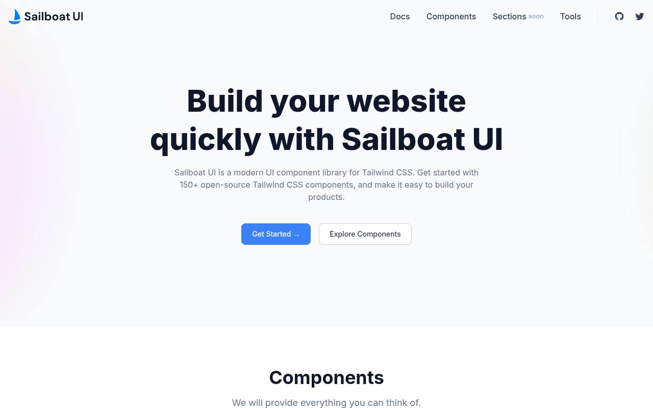
Sailboat UI supplies open-source Tailwind components including avatars, badges, buttons, cards, dropdowns, inputs, notifications, and pagination. Its repository identifies an MIT licence and documents setup through Tailwind configuration rather than a mandatory full application framework.
That makes the collection attractive when you want recognizable UI primitives while retaining ownership of the HTML. Review its configuration assumptions before adoption, especially in a project using a newer Tailwind setup. Copying an older example can require updates to configuration, utilities, or interaction behavior even when the visual pattern remains useful.
- Type
- Tailwind component snippets
- Best for
- Simple interface elements with editable utility-first styling
- License
- MIT
- Price
- 100% free
Float UI
Tailwind components and templates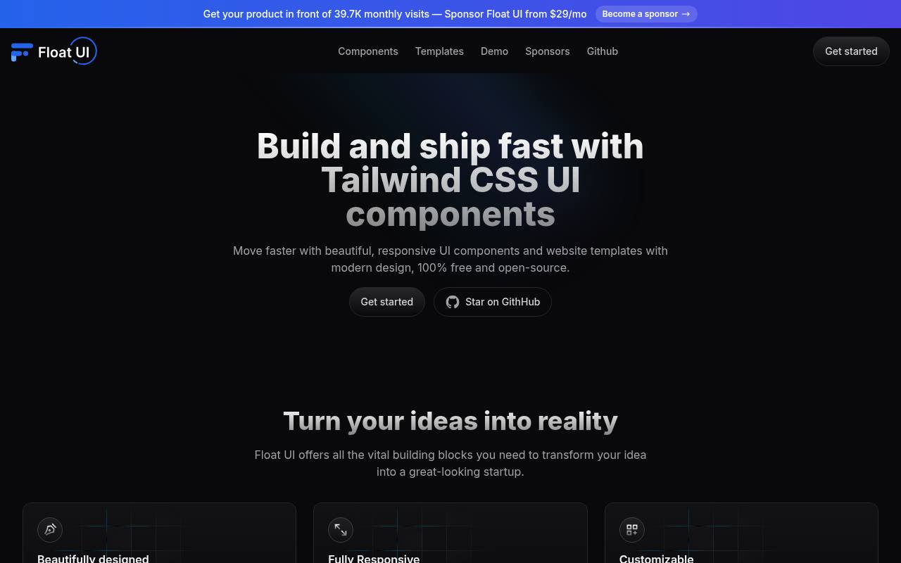
Float UI presents free, open-source components and website templates with a clear emphasis on responsive startup interfaces. Its source page offers framework-specific examples for React, Vue, and Svelte alongside HTML, reducing some of the translation work that comes with a markup-only collection.
Copyable components cover practical page-building needs rather than requiring adoption of an entire application architecture. Use its responsive layout examples to establish a visual direction quickly, then replace demonstration images, links, and content. Check the selected framework tab and any example-specific behavior before bringing code into a production repository.
- Type
- Tailwind components and templates
- Best for
- Responsive startup pages with framework-specific code examples
- License
- MIT; review bundled asset terms
- Price
- 100% free
Kutty
Tailwind and Alpine.js components
Kutty is a Tailwind component collection that pairs its styling approach with Alpine.js interactions where behavior is needed. It offers a useful alternative for projects that do not want a React-specific component system but still need more than decorative HTML.
Its open-source code is MIT licensed, with setup and component examples available from the source site. Treat Alpine as a dependency, not an invisible detail: directives will not function just because the Tailwind classes render correctly. Evaluate the documented setup against your project’s Tailwind generation and JavaScript policies before standardizing on these snippets.
- Type
- Tailwind and Alpine.js components
- Best for
- Small projects comfortable with Alpine-powered interactive behavior
- License
- MIT
- Price
- 100% free
Tailblocks
Ready-made Tailwind page blocks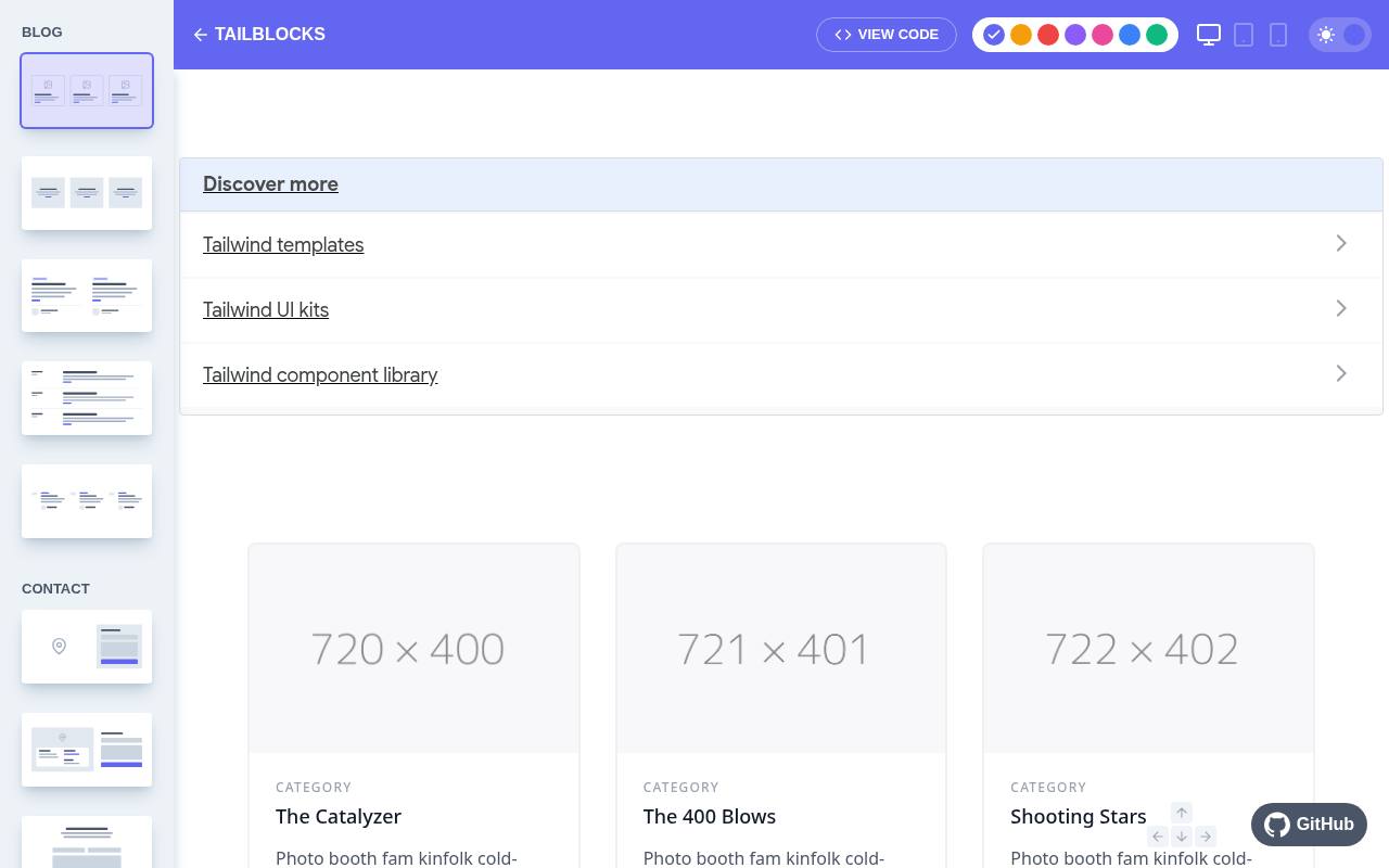
Tailblocks emphasizes complete page sections rather than a deeply abstracted application component system. Its interactive browser lets you explore ready-made Tailwind blocks, change presentation options, and view the code for a chosen section. This is useful for assembling a first marketing layout from recognizable content structures, including feature, contact, and pricing-style sections.
The project is distributed under the MIT licence. Think of its section-first workflow as scaffolding: replace placeholder copy and images, verify current utility compatibility, and implement real form processing before treating a composed page as ready to publish.
- Type
- Ready-made Tailwind page blocks
- Best for
- Rapidly composing marketing pages from larger sections
- License
- MIT
- Price
- 100% free
Material Tailwind
React Tailwind component library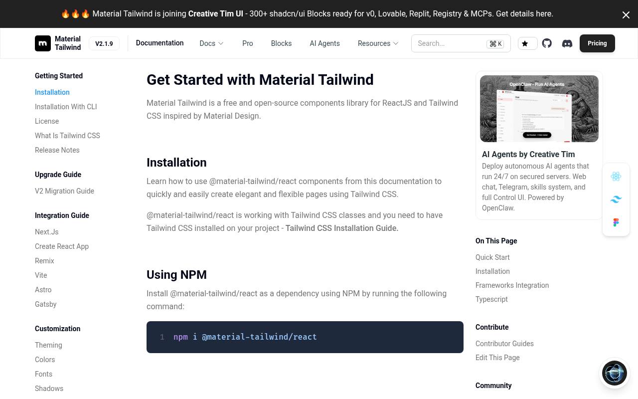
Material Tailwind offers a component-oriented route for React projects that want Tailwind styling with a recognizable Material-inspired direction. Its documentation provides React installation instructions and individual component examples, making it more appropriate for an application codebase than a purely static copy-and-paste workflow.
Free MIT components exist alongside separately marketed paid offerings, so use the documented free package rather than assuming every advertised resource is included. Consider its shared visual vocabulary when consistency matters across many controls, and verify peer dependencies and framework compatibility before integrating it into an established design system.
- Type
- React Tailwind component library
- Best for
- React interfaces seeking a coherent Material-inspired visual language
- License
- MIT free components; paid products separate
- Price
- Free + paid products
TailGrids
Tailwind components and UI blocks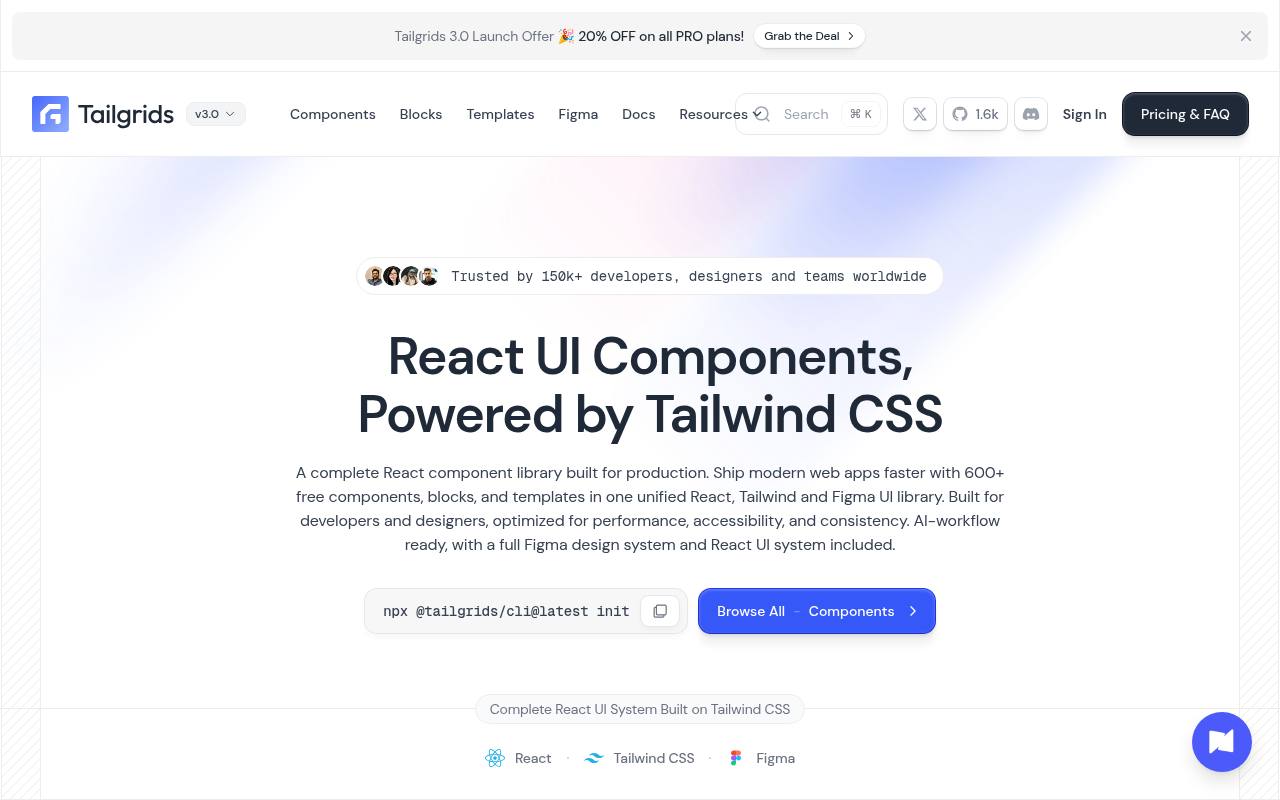
TailGrids combines a free open-source offering with a broader commercial collection of components, blocks, and templates. Its current site emphasizes a React-oriented component library, so inspect the selected resource rather than assuming every example is framework-neutral HTML.
The free library provides a starting point for evaluating its visual style and implementation approach without buying the extended catalogue. Keep the free and Pro boundaries visible in your project notes, and check the licence attached to downloaded files. This is a practical candidate when you want a small initial selection with room to expand later.
- Type
- Tailwind components and UI blocks
- Best for
- Evaluating reusable sections before expanding into paid collections
- License
- Free library MIT; paid assets have separate terms
- Price
- Free + Pro
Choose markup, plugins, or React components
Use integration style as your first filter. HyperUI and Tailblocks suit developers who want to own the markup; Flowbite and Preline provide documented behavior; Material Tailwind suits a React component workflow.
Avoid comparing them solely by catalogue size. A small set of understandable building blocks can be more valuable than hundreds of examples that introduce unfamiliar dependencies or conflict with your application’s rendering model.
Check the exact free licence
Record the licence for your download, not just a provider’s homepage slogan. Open-source packages, documentation, premium blocks, brand icons, and example photography may have distinct terms. Preserve required copyright notices when using MIT code.
Preline specifically publishes additional Fair Use conditions, which deserve attention for redistribution or competing products. If your intended use is a site builder or template marketplace, resolve those permissions before implementation begins.
Verify your Tailwind setup
Create a small integration branch and install only what the chosen example requires. Confirm that your build discovers the copied classes, that theme variables resolve correctly, and that dark-mode behavior matches your application.
Older snippets may assume configuration conventions absent from a newer project. Fix that mismatch centrally rather than adding scattered overrides until a single screenshot looks correct; otherwise the next component may reproduce the same underlying problem.
Treat interaction as a separate responsibility
A styled menu is not necessarily a keyboard-accessible control. Test opening, closing, Escape handling, focus movement, and disabled states. For dialogs, check focus containment and return behavior after dismissal.
Follow the library’s documented initialization instead of mixing independent scripts that compete over the same element. If a collection supplies only markup, choose an appropriate behavior implementation and document that dependency next to the component wrapper.
Unify the visual system
Define shared design tokens for colors, spacing, typography, radii, and shadows before assembling many unrelated blocks. Similar utility names can still produce inconsistent results when examples use different assumptions about content width or hierarchy.
Replace demonstration branding and choose one button treatment across the site. Extract reusable application components only after you understand the repeated pattern, rather than prematurely building abstractions around every copied section.
Keep output lean and useful
Measure real page performance after adding interactive libraries, image-heavy examples, and optional plugins. Import only what the documented setup supports, remove unused demonstration assets, and avoid shipping multiple libraries for a single widget each.
Tailwind’s generated CSS is only part of the total cost: JavaScript execution, image dimensions, and third-party requests also matter. Review your production bundle and test on a slower mobile device before considering the integration complete.
Can free blocks support a commercial website?
Many of these resources permit commercial website use, but permission depends on the relevant licence and the way you distribute the result. A finished client site is different from reselling a competing component collection.
Keep licence records, replace assets you cannot clear, and review updates before upgrading packages. The practical goal is a maintainable site whose team understands its dependencies, not simply the fastest possible assembly of visually impressive sections.