
Color choices become accessibility decisions as soon as text, icons, and controls depend on them. A pink button can look clear in a presentation and become difficult to read on a small screen.
Free color contrast checkers help replace visual guesses with measurable evidence. The resources below focus on testing foreground and background relationships, not generating palettes or collecting inspiration, so you can evaluate the colors already used in your design.
The right checker depends on where you work. A WCAG contrast checker is useful for quick numerical comparisons, while a desktop sampler can inspect a document or application outside your browser.
A Figma contrast plugin brings feedback into a mockup, and browser developer tools reveal what actually reaches the screen. Combining an early design check with an implementation check catches problems that either stage alone can easily miss during a busy product release.
This selection also includes an APCA contrast calculator for exploring how text polarity, size, and weight affect readability. Keep that work separate from WCAG 2.x conformance: an APCA lightness contrast value is not a WCAG contrast ratio.
All ten resources offer a free way to check contrast, but none can certify an entire interface as accessible. Use their results alongside keyboard testing, content review, and testing with people who have different access needs.
Quick picks at a glance
| # | Resource | License | Best for |
|---|---|---|---|
| 1 | WebAIM Contrast Checker | Free online use | Quick WCAG decisions for individual color pairs |
| 2 | TPGi Colour Contrast Analyser | Free; open-source BSD-3-Clause software | Sampling contrast beyond browser-based design tools |
| 3 | Accessible Colors | Free online use; source linked on site | Finding small corrections to failing text combinations |
| 4 | Tanaguru Contrast-Finder | Free web app; open-source project linked | Repairing pairs while keeping one color fixed |
| 5 | APCA Contrast Calculator | Free calculator use; separate terms govern code reuse | Exploring text readability beyond WCAG ratio checks |
| 6 | Colour Contrast Checker | Free online use | Reviewing color pairs with adjustable type previews |
| 7 | Contrast Checker | Free online use | Checking standard text and interface contrast thresholds |
| 8 | Contrast | Free Figma plugin; Figma account required | Checking contrast directly within Figma design files |
| 9 | Chrome DevTools | Free tools included with Chrome | Inspecting contrast in implemented web interfaces |
| 10 | Firefox Accessibility Inspector | Free tools included with Firefox | Finding text contrast issues in page context |
WebAIM Contrast Checker
Web app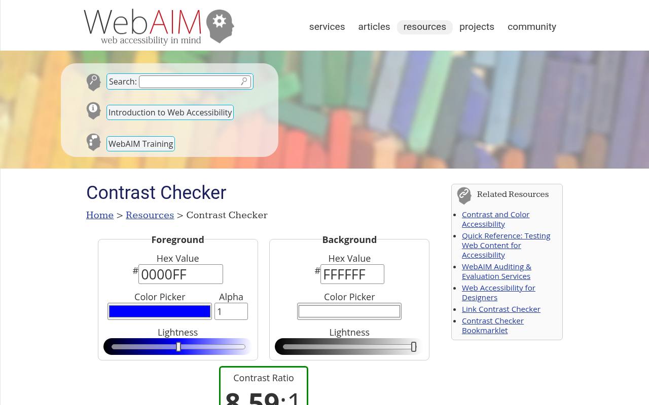
WebAIM offers a focused WCAG contrast checker with foreground and background hexadecimal inputs, color pickers, and lightness controls. Its results separate normal text, large text, and graphical objects or interface components, making the intended use easier to interpret.
The foreground alpha control also helps examine transparent text over a specified background. Use the shareable permalink to preserve a pair for discussion with a developer or reviewer. This free browser tool is particularly useful when you need a clear numerical answer without opening a larger design environment.
- Type
- Web app
- Best for
- Quick WCAG decisions for individual color pairs
- License
- Free online use
- Price
- 100% free
TPGi Colour Contrast Analyser
Desktop app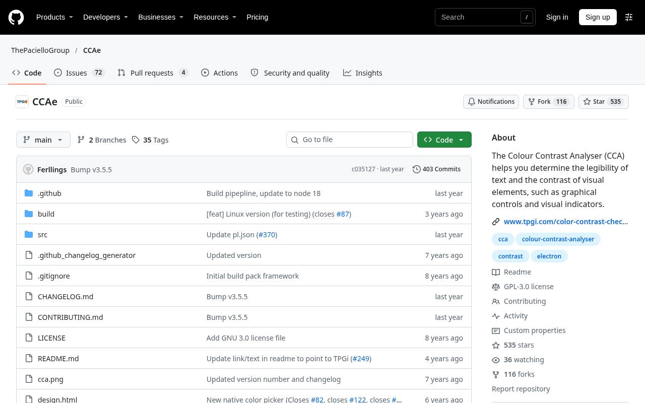
TPGi’s Colour Contrast Analyser is a downloadable desktop application for Windows and macOS, with source code and release downloads available through its official repository. Its screen color sampling makes it useful for checking content outside a webpage, including desktop interfaces and document previews.
The application evaluates foreground and background combinations against WCAG contrast requirements rather than relying on how a screenshot looks to one reviewer. Choose the installer for your operating system from the releases area; downloading the repository source alone is not the same as installing the app.
- Type
- Desktop app
- Best for
- Sampling contrast beyond browser-based design tools
- License
- Free; open-source BSD-3-Clause software
- Price
- 100% free
Accessible Colors
Web app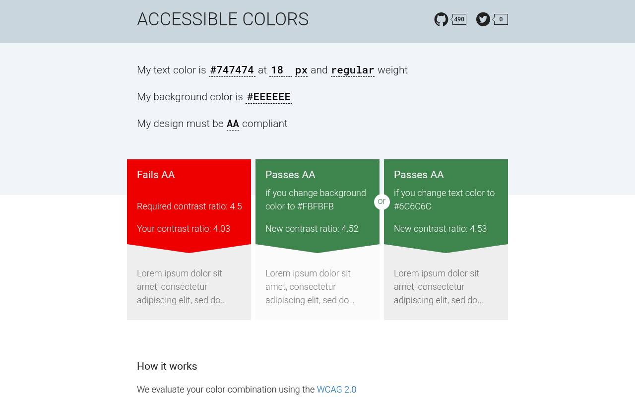
Accessible Colors starts with a text color, background color, font size, font weight, and requested conformance level. Rather than stopping at a failing result, it looks for lightness adjustments that can bring the combination into range while preserving the hue as much as possible.
That makes this free tool practical when a brand color is close to usable but needs a controlled change. Treat its suggested alternatives as candidates for a particular text treatment, then check those colors again wherever the same tokens appear at different sizes or weights.
- Type
- Web app
- Best for
- Finding small corrections to failing text combinations
- License
- Free online use; source linked on site
- Price
- 100% free
Tanaguru Contrast-Finder
Web app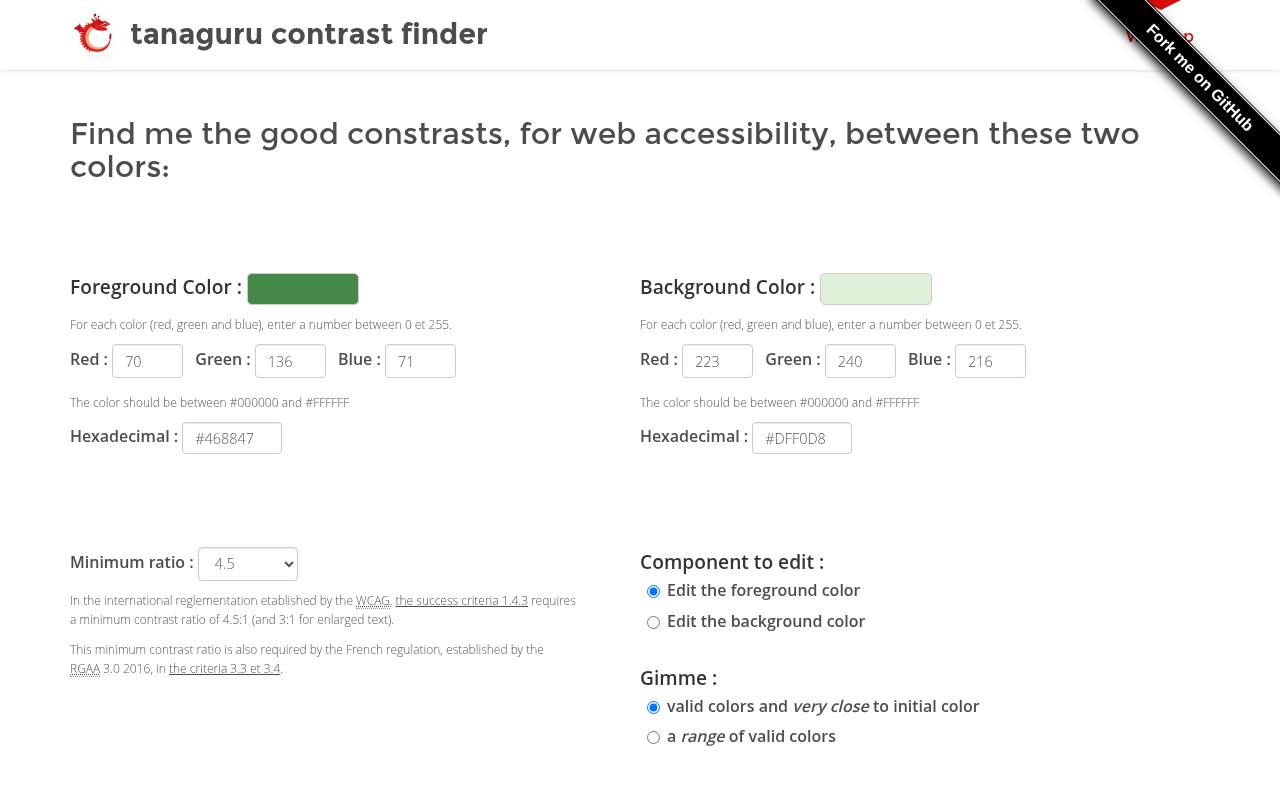
Tanaguru Contrast-Finder accepts foreground and background colors as hexadecimal values or RGB components, then lets you choose a minimum ratio of 3, 4.5, or 7. Its useful distinction is choosing which color changes: keep a surface fixed while finding a better text color, or do the reverse.
You can request valid colors close to the starting point or a broader range of alternatives. This free contrast repair workflow suits teams adjusting an established interface, where replacing both sides of every failing pair would create unnecessary redesign work.
- Type
- Web app
- Best for
- Repairing pairs while keeping one color fixed
- License
- Free web app; open-source project linked
- Price
- 100% free
APCA Contrast Calculator
Web app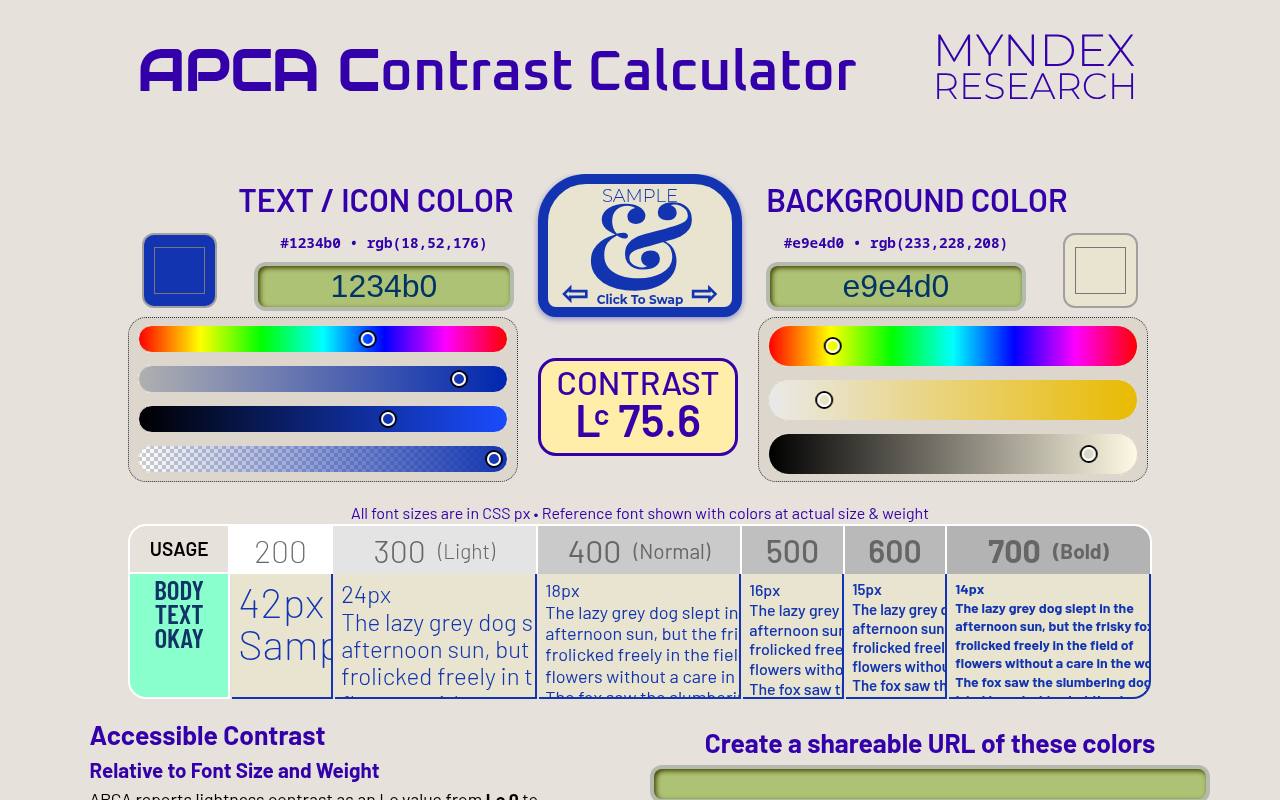
The APCA Contrast Calculator reports lightness contrast values and provides a font-size and weight reference table for interpreting text combinations. It distinguishes dark text on a light background from light text on a dark background, so entering the colors in the correct fields matters.
The tool accepts several color input forms and can create a shareable URL. Use this polarity-aware analysis as supplementary readability research, not as a substitute for WCAG 2.x pass/fail testing. Free access to the calculator does not automatically grant unrestricted rights to redistribute its underlying algorithm.
- Type
- Web app
- Best for
- Exploring text readability beyond WCAG ratio checks
- License
- Free calculator use; separate terms govern code reuse
- Price
- 100% free
Colour Contrast Checker
Web app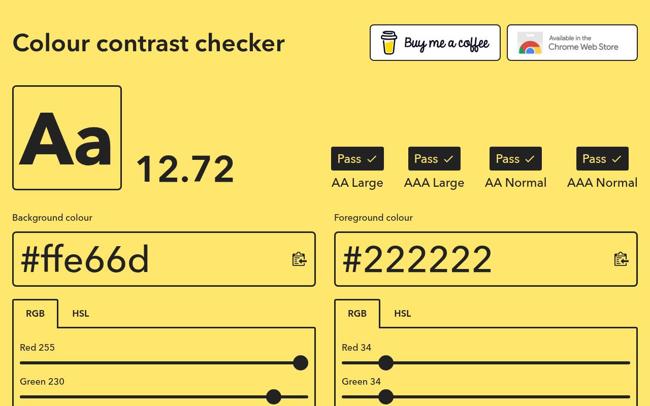
Colour Contrast Checker places a large sample beside its numerical ratio and separate AA and AAA results for normal and large text. You can edit RGB and HSL values, reverse the foreground and background, and copy colors to the clipboard.
Its typeface selection and editable example copy help you examine a more realistic text sample instead of relying exclusively on a generic sentence. Use the live typography preview to compare how a proposed pair feels, while keeping the reported WCAG thresholds as a separate, objective part of the decision.
- Type
- Web app
- Best for
- Reviewing color pairs with adjustable type previews
- License
- Free online use
- Price
- 100% free
Contrast Checker
Web app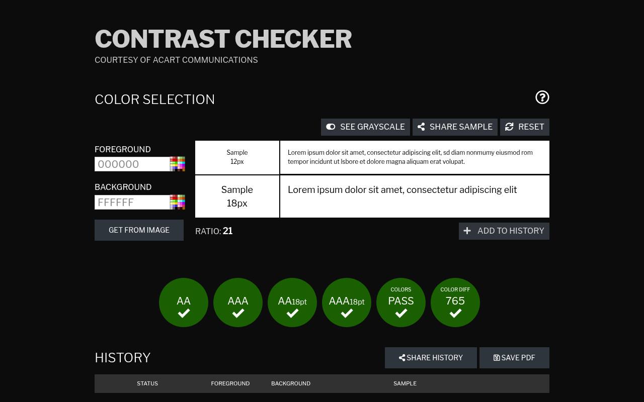
Contrast Checker, provided by Acart Communications, offers a straightforward place to compare foreground and background colors against WCAG contrast thresholds. The page includes results for text and visual interface elements, so you can distinguish a body-copy requirement from a component check.
Its conventional two-color workflow works well for verifying a specific label, icon, or surface combination before handing off a correction. Keep the testing context explicit when sharing results: a pair that works for a large heading may still be unsuitable for smaller copy using exactly the same colors.
- Type
- Web app
- Best for
- Checking standard text and interface contrast thresholds
- License
- Free online use
- Price
- 100% free
Contrast
Figma plugin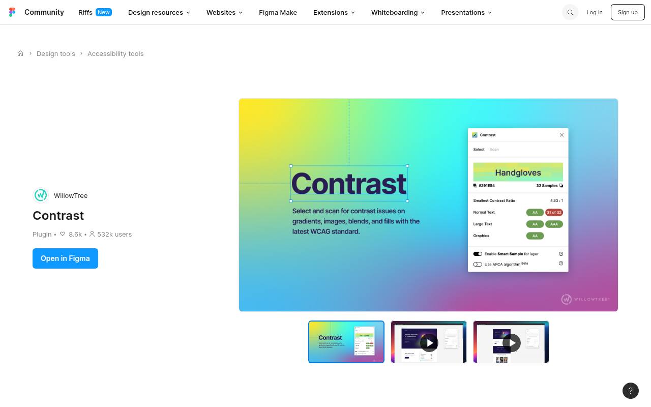
Contrast brings in-canvas contrast checks to Figma, reducing the need to move color values between a mockup and a separate website. The plugin checks selected design content and presents contrast feedback while you work; its updated design also includes APCA-based text sizing information alongside the familiar WCAG approach.
This makes it useful for discussing text size and weight before implementation. Install it through Figma Community and keep it updated. Results from a design file still need confirmation in the browser, where font rendering, transparency, and actual backgrounds can differ.
- Type
- Figma plugin
- Best for
- Checking contrast directly within Figma design files
- License
- Free Figma plugin; Figma account required
- Price
- 100% free
Chrome DevTools
Browser developer tools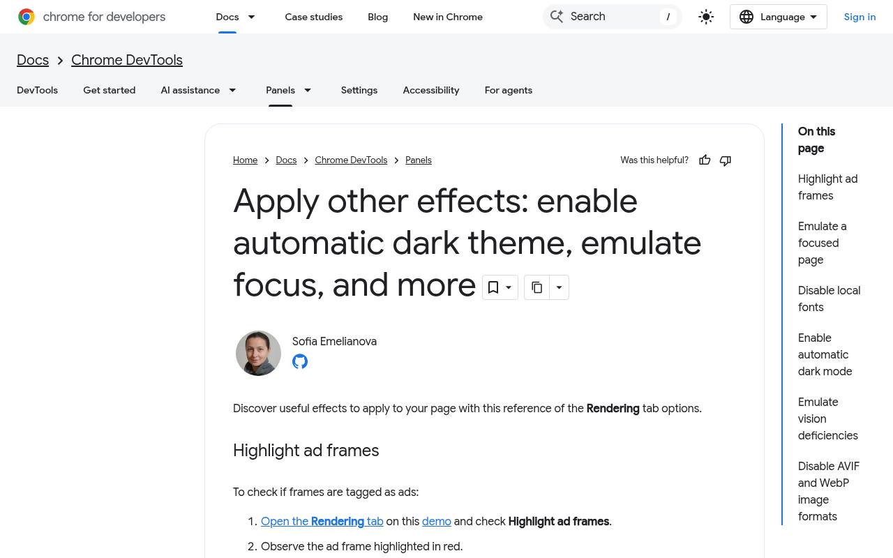
Chrome DevTools exposes rendered text contrast through its inspection workflow and color picker, with the official documentation showing how to examine and improve failing combinations. Inspect an element, open its text color in the Styles panel, and review the contrast information when available.
Suggested adjustments help you experiment without changing your source files immediately. The important advantage is implementation-level testing: you are investigating the page’s CSS rather than a detached swatch. Complex backgrounds still require care, and edits made only inside DevTools must be transferred into the project to persist.
- Type
- Browser developer tools
- Best for
- Inspecting contrast in implemented web interfaces
- License
- Free tools included with Chrome
- Price
- 100% free
Firefox Accessibility Inspector
Browser developer tools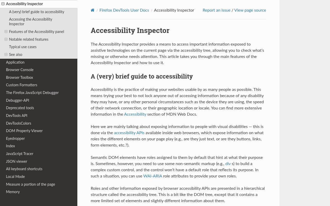
Firefox’s Accessibility Inspector combines an accessibility tree with checks that include text contrast issues. Its inspection highlights provide contrast information in the context of actual page elements, making it useful when tracking a failure back to the responsible content.
The official documentation explains the accessibility picker and the option to check for accessibility issues, rather than presenting a standalone color-pair calculator. Use this page-based inspection to review implemented screens after a design handoff. Where an automated result cannot resolve a background reliably, inspect the underlying colors and verify the combination manually.
- Type
- Browser developer tools
- Best for
- Finding text contrast issues in page context
- License
- Free tools included with Firefox
- Price
- 100% free
Choose a checker for the task in front of you
Start with a two-color calculator when the question is simply whether a known text color works on a known surface. Choose a desktop sampler for documents or native software, and a Figma plugin for early design feedback.
For a shipped website, prioritize browser inspection because inherited styles, overlays, and component states can change the final appearance. You rarely need all ten tools in one workflow; a reliable calculator plus an implementation inspector covers many everyday checks.
Read WCAG ratios without mixing requirements
For WCAG 2.x Level AA, normal text contrast generally needs at least 4.5:1, while large text needs 3:1. Large text means at least 18 points, or 14 points when bold, approximately 24 and 18.67 CSS pixels respectively.
AAA text thresholds are higher: 7:1 and 4.5:1. Relevant non-text interface visuals generally need 3:1 against adjacent colors under the applicable criterion. Exceptions and context matter, so do not apply one threshold indiscriminately to every decorative element.
Keep APCA and conformance results separate
An APCA Lc value is not another notation for a WCAG ratio, and there is no universal conversion that makes their results interchangeable. APCA considers polarity and connects contrast to recommended text sizes and weights.
Record its output separately when evaluating readability. If a project requires WCAG 2.2 conformance, retain the required WCAG ratio checks and evidence; supplementary perceptual analysis can improve design decisions without replacing the specified acceptance criteria.
Check states, transparency, and variable backgrounds
Test interactive component states, including hover, focus, selected, and error treatments, rather than approving only the default screen. For translucent text or surfaces, inspect the composited result over the actual background. Images and gradients need checking across the area behind the text, especially the weakest-contrast region.
A calculator that accepts two solid colors cannot prove that every location in a photograph is safe. A solid backing surface or consistent overlay can make variable background contrast easier to control.
Document useful evidence instead of collecting screenshots
A practical contrast testing record includes the foreground and background values, ratio, text size and weight, intended threshold, and component state. Add a permalink when the checker supports one, or record the page and selector for browser findings.
Screenshots help explain location, but a screenshot without values is difficult to reproduce. Keep the evidence beside design tokens or acceptance criteria so later changes to a shared color can trigger targeted regression checks instead of another full manual investigation.
Understand free access and software terms
These resources offer free contrast testing, but that does not mean every related service, software component, or publication has identical reuse rights. Using a hosted calculator to evaluate your own colors is different from copying its code into a commercial product.
Check the repository license before redistributing a desktop utility or embedding an algorithm. Figma plugins also operate within Figma’s account and platform requirements. For routine testing, there is generally no asset attribution step because you are measuring your own design rather than downloading artwork.
Can a passing ratio prove accessibility?
A passing ratio answers a specific contrast question, not whether an interface is fully accessible. Small or unusually thin type can remain uncomfortable, and color alone should not communicate errors, selection, or status. Pair color with labels, icons, patterns, or other meaningful cues.
Finish with human-centered accessibility review that includes keyboard operation, zoom, readable content, and feedback from people with disabilities. Numerical checks are most valuable when they support that broader process instead of becoming its only acceptance test.