
A good color direction often starts with looking rather than making. Free color inspiration sites let you compare combinations that someone has already selected, named, or used in context.
Instead of adjusting sliders from a blank canvas, you can notice relationships: a warm neutral beside a cool blue, a muted pink balanced by charcoal, or a bright accent that gives a restrained composition energy. That makes browsing a useful early step for branding, illustration, and editorial projects.
This collection focuses on curated color palettes, community libraries, and themed collections rather than automatic palette creation. Some sources organize combinations by mood or season; others bring together artist references, pixel-art palettes, or recognizable brand colors.
Their value is selection and context. You can move between several visual perspectives without assuming that one popular combination will suit every audience, medium, or layout you need to design for.
The ten resources below offer free color combinations to explore at the source. Use them to build a small shortlist, record the original links, and test your favorites in a realistic composition.
Free browsing does not mean every photograph, illustration, or brand identity shown on a page is available to republish. Treat the palettes as starting points, check any accompanying terms, and make the final color decisions around your own content and practical requirements.
Quick picks at a glance
| # | Resource | License | Best for |
|---|---|---|---|
| 1 | Color Hunt | Free palette browsing; website terms apply | Finding seasonal and mood-based four-color combinations |
| 2 | ColorPalettes.net | Free browsing; source imagery has separate rights | Connecting atmospheric reference imagery with coordinated colors |
| 3 | Lospec | Free downloads; check creator notes and applicable terms | Exploring limited-color palettes for pixel art projects |
| 4 | Happy Hues | Free palette reference; site assets retain their rights | Seeing curated combinations applied to complete page sections |
| 5 | Color Lisa | Free palette reference; artwork rights remain separate | Finding distinctive combinations associated with well-known paintings |
| 6 | LOL Colors | Free reference collection; website terms apply | Scanning a compact gallery of four-color ideas |
| 7 | ColorDrop | Free palette browsing; other tool terms may differ | Browsing named palettes through trend and recency views |
| 8 | SchemeColor | Free palette browsing; account required for favorites | Finding named themes and occasion-specific color combinations |
| 9 | BrandColors | Free reference; brand trademarks and identity rights remain | Researching established brand palettes and exporting reference collections |
| 10 | colors.lol | Free browsing; check repository terms for code reuse | Discovering unexpected combinations through playful descriptive color names |
Color Hunt
Palette library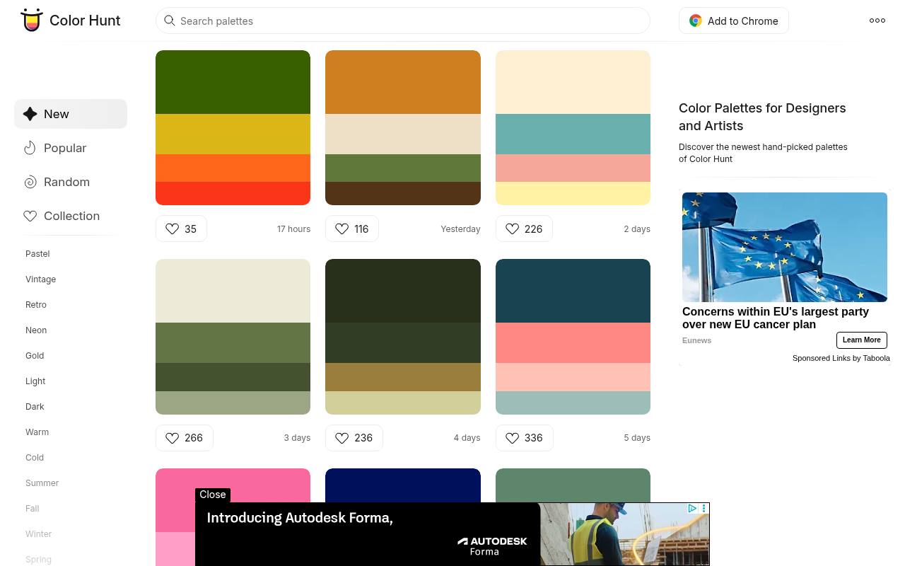
Color Hunt presents hand-picked palettes in a compact grid, with collections covering pastel, vintage, neon, nature, wedding, and other recognizable directions. Its New, Popular, and Random views offer different ways into the catalog, while popularity can be viewed across different time periods.
The four-color format makes comparisons quick: each card is small enough to scan without losing the relationship between its colors. Start here when a brief names a mood but leaves the actual hues open. Use the collection labels to narrow your search before choosing specific values.
- Type
- Palette library
- Best for
- Finding seasonal and mood-based four-color combinations
- License
- Free palette browsing; website terms apply
- Price
- 100% free
ColorPalettes.net
Editorial collection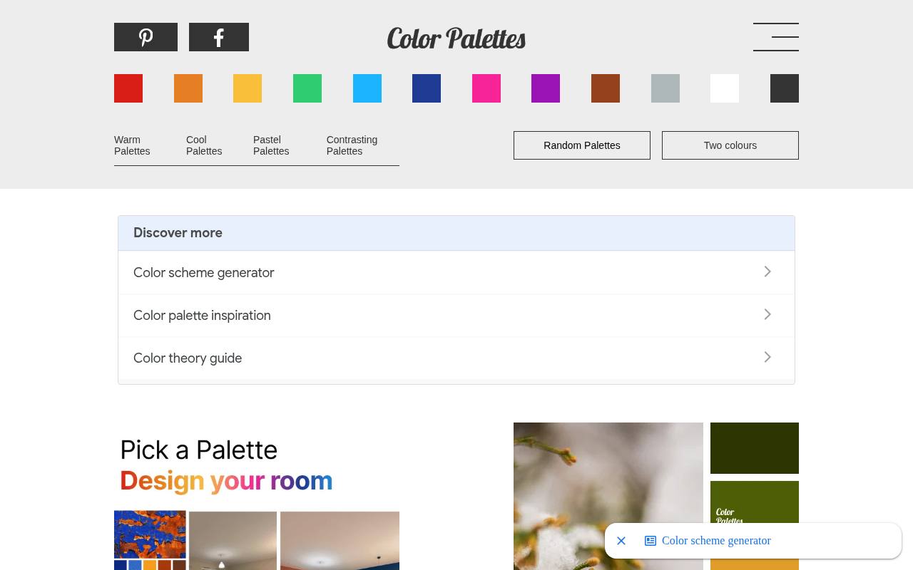
ColorPalettes.net pairs visual references with photo-led color collections, making it particularly useful when a brief describes an atmosphere rather than a technical color relationship. Navigation includes warm, cool, pastel, and contrasting palettes, plus individual color families.
Detailed tags describe combinations such as olive green with brown or pale blue with white, giving you several routes toward a similar mood. Its two-color search is helpful when part of the direction is already fixed. Borrow the color relationship for your own work rather than assuming the accompanying reference image is a free stock download.
- Type
- Editorial collection
- Best for
- Connecting atmospheric reference imagery with coordinated colors
- License
- Free browsing; source imagery has separate rights
- Price
- 100% free
Lospec
Community palette library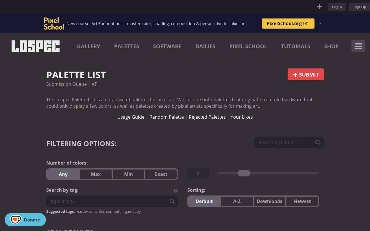
Lospec maintains a pixel-art palette database that includes historical hardware palettes and sets created by individual artists. Filters let you specify a minimum, maximum, or exact number of colors, and tags help distinguish styles and origins. Creator notes and example artwork provide more context than isolated swatches.
Its download formats include PNG, JASC PAL, Photoshop ASE, GIMP GPL, and HEX files, so a promising selection can move into an art workflow. Read the entry description before adopting a palette, especially where it references existing game artwork or particular hardware constraints.
- Type
- Community palette library
- Best for
- Exploring limited-color palettes for pixel art projects
- License
- Free downloads; check creator notes and applicable terms
- Price
- 100% free
Happy Hues
Contextual palette collection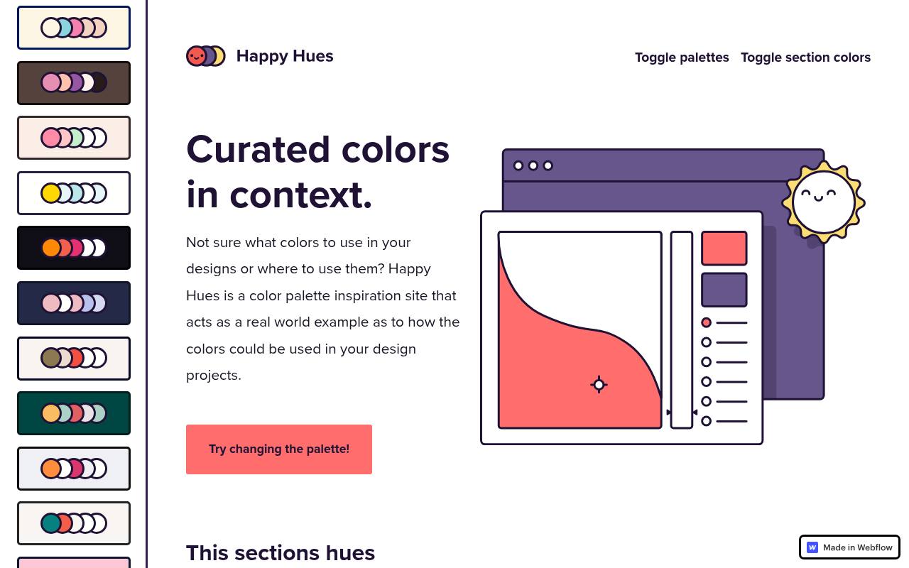
Happy Hues shows colors in context rather than asking you to judge every combination as an abstract strip. Switching palettes changes the example page, demonstrating relationships between backgrounds, headlines, buttons, and illustrations. Each section identifies its colors by role, and you can click a displayed hex value to copy it.
That role-based presentation is useful when a lovely palette leaves you unsure which color should dominate. Study the balance across several sections, then reinterpret it for your own content; the reference page is inspiration, not a complete production-ready design system.
- Type
- Contextual palette collection
- Best for
- Seeing curated combinations applied to complete page sections
- License
- Free palette reference; site assets retain their rights
- Price
- 100% free
Color Lisa
Art-inspired collection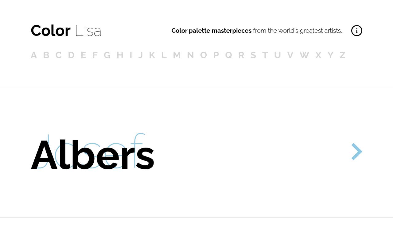
Color Lisa organizes art-inspired palettes around named artists and artworks, with an alphabetical index that makes deliberate browsing easy. Entries connect five hex colors with works by figures such as Josef Albers, Hilma af Klint, and Jean-Michel Basquiat.
Unlike an anonymous popularity feed, the artwork references give each selection a visual and historical starting point. This can be useful for editorial concepts, cultural projects, or a moodboard that needs a more specific reference. Treat the selections as interpretations of artworks, not authoritative pigment measurements or permission to reproduce the paintings themselves.
- Type
- Art-inspired collection
- Best for
- Finding distinctive combinations associated with well-known paintings
- License
- Free palette reference; artwork rights remain separate
- Price
- 100% free
LOL Colors
Curated palette gallery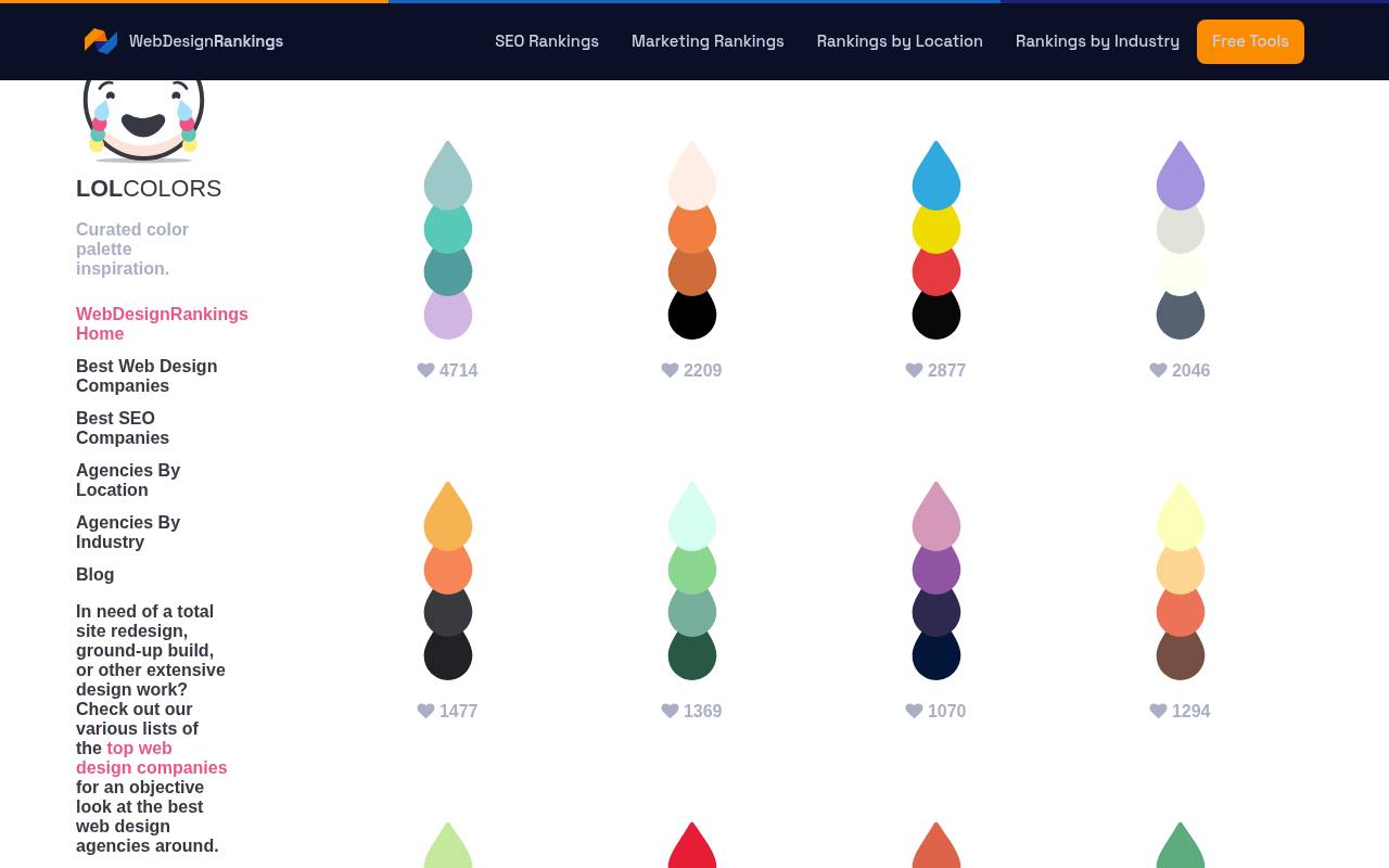
LOL Colors offers curated palette inspiration through distinctive droplet-shaped swatches, with four hex values displayed for each combination. The compact presentation makes it easy to compare subdued neutrals, saturated accents, and softer groupings without opening a complex editing interface.
A practical limitation matters here: the page explicitly says that sorting and liking are temporarily disabled, so use it as a browseable reference rather than an active voting tool. It works well for a quick visual detour when you want a smaller selection of combinations instead of an extensive searchable archive.
- Type
- Curated palette gallery
- Best for
- Scanning a compact gallery of four-color ideas
- License
- Free reference collection; website terms apply
- Price
- 100% free
ColorDrop
Palette collection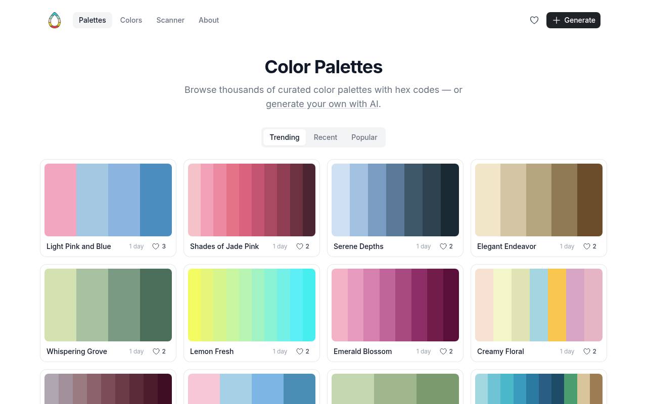
ColorDrop gives its palette collection Trending, Recent, and Popular views, helping you separate fresh additions from other browsing perspectives. Named entries range from straightforward color descriptions to more atmospheric combinations, and links to color families make it easier to continue exploring a hue already in your brief.
The site also offers generation tools, but its browseable palette catalog is the relevant feature here. Stay in the collection when you want ready-made references rather than newly generated results. Similar names can appear across entries, so save the specific palette link or values rather than its title alone.
- Type
- Palette collection
- Best for
- Browsing named palettes through trend and recency views
- License
- Free palette browsing; other tool terms may differ
- Price
- 100% free
SchemeColor
Themed palette collection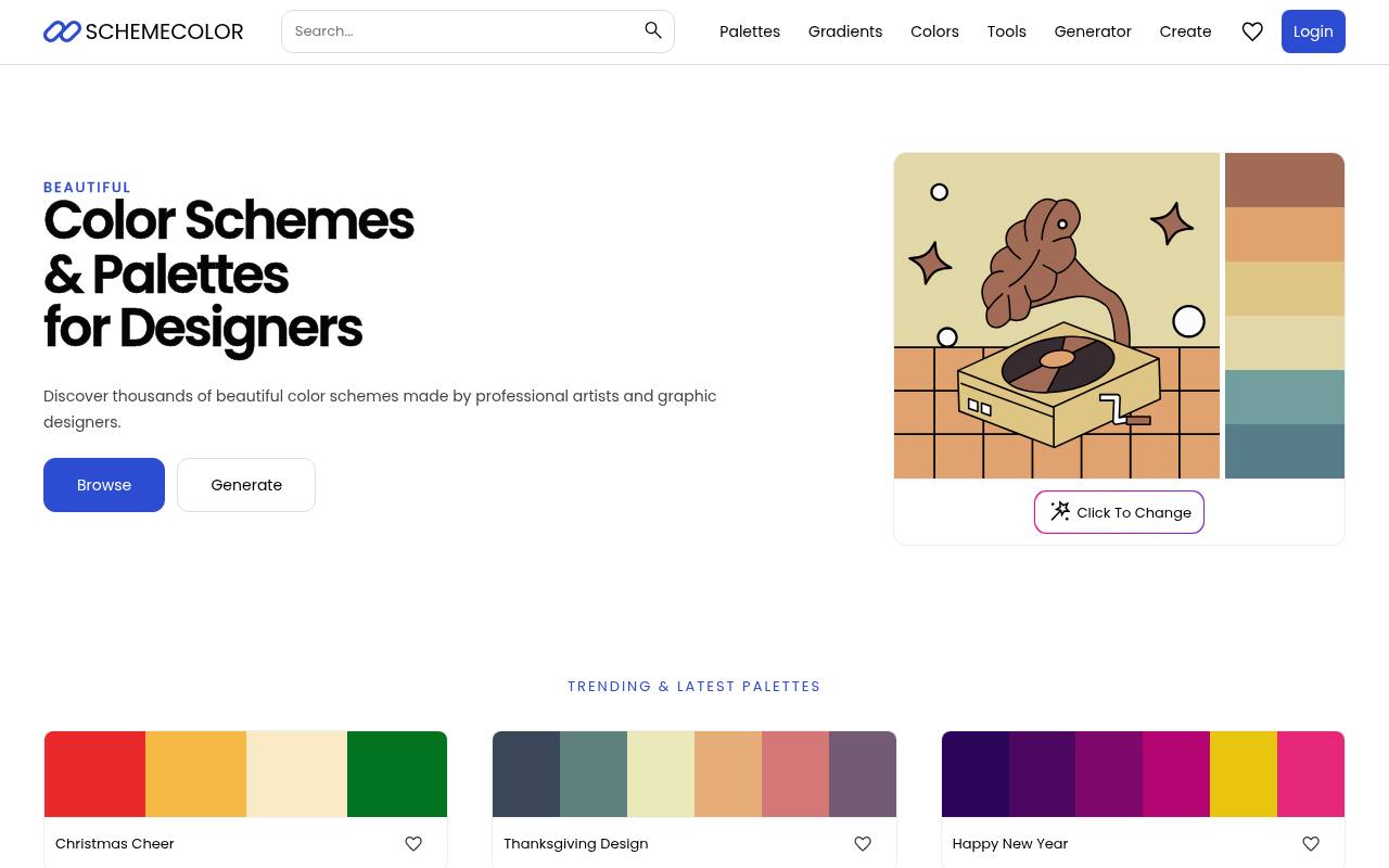
SchemeColor combines named color schemes with topical collections, including seasonal and occasion-based selections. Its homepage displays hex values directly beside palettes such as Retro of the 80s, Pastel Color Tones, and Vintage Fashion, making the intended direction easy to understand before opening an entry.
These themed collections are useful for campaign moodboards where the concept comes first. Browsing is available without paying, but the site states that favorites require a registered account. Focus on its palette pages for this task; the separate generators, converters, and gradient sections serve different stages of color work.
- Type
- Themed palette collection
- Best for
- Finding named themes and occasion-specific color combinations
- License
- Free palette browsing; account required for favorites
- Price
- 100% free
BrandColors
Brand color directory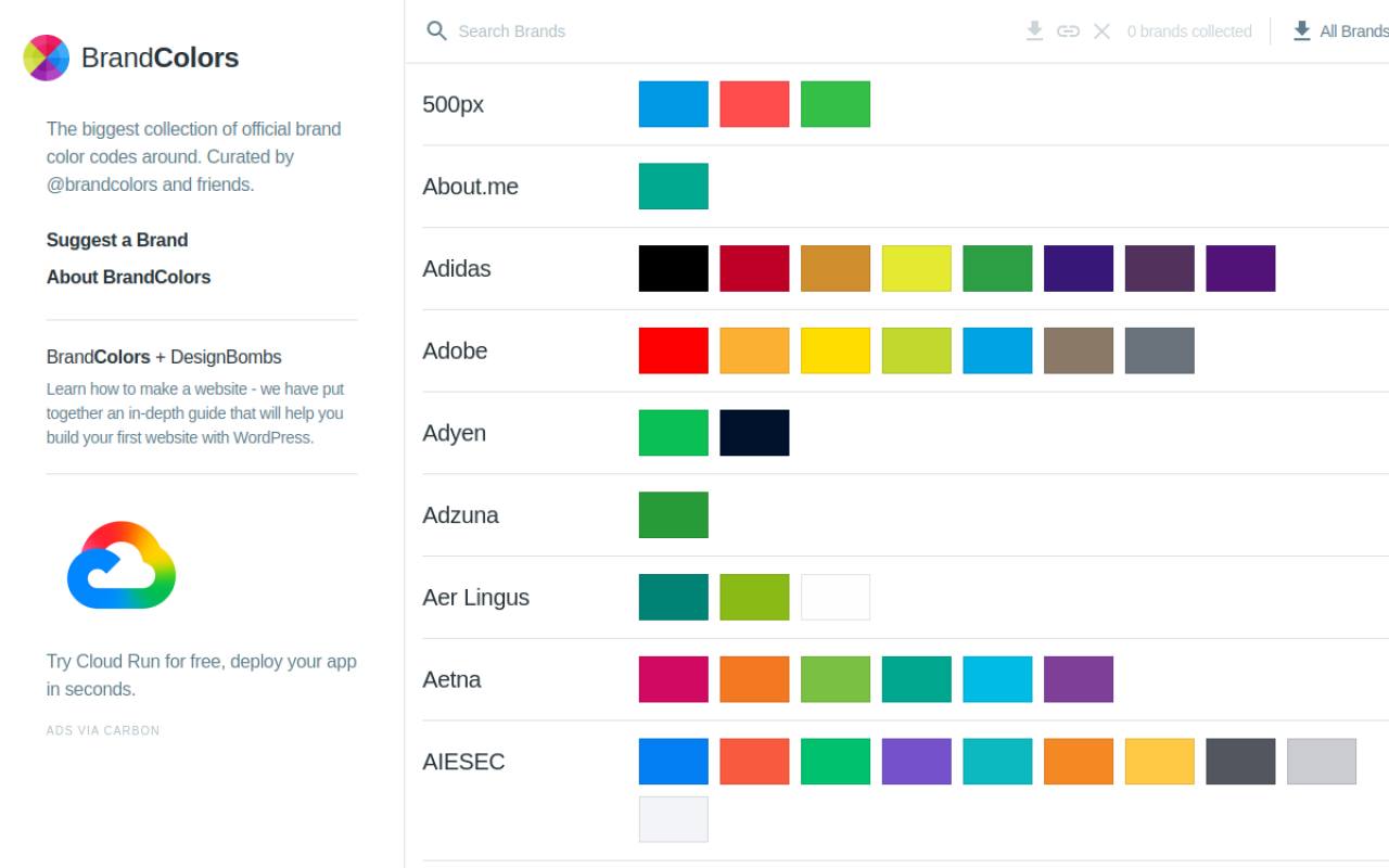
BrandColors collects brand color codes in a searchable reference rather than presenting generic mood palettes. It lets you assemble a collection of brands and download that selection in ASE, CSS, SCSS, LESS, or Stylus formats. Those collection exports are convenient for comparing established identities during research or preparing reference swatches for a presentation.
The site describes its codes as official, but confirm current specifications with the brand owner when accuracy is critical. Use these palettes to understand category conventions and differentiation, not as permission to copy another company’s identity or imply an affiliation.
- Type
- Brand color directory
- Best for
- Researching established brand palettes and exporting reference collections
- License
- Free reference; brand trademarks and identity rights remain
- Price
- 100% free
colors.lol
Curated palette collection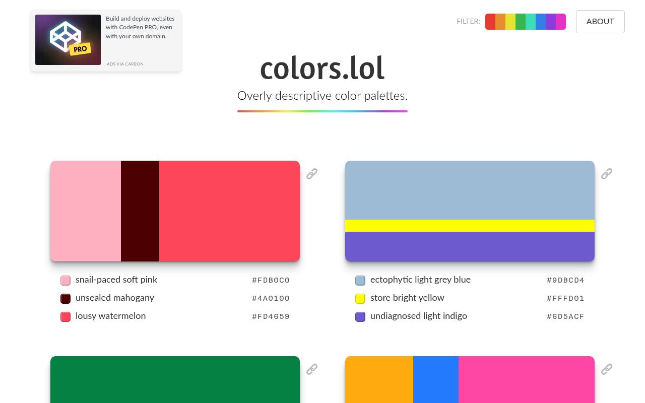
colors.lol pairs unusual color combinations with deliberately elaborate descriptions. Its About text explains that palettes are hand-selected from the @colorschemez Twitter bot, which generates combinations and matches colors with adjectives. The result is a curated browsing experience with a playful voice rather than a formal seasonal forecast.
A Random palette route encourages exploration when familiar searches keep producing the same references. Use it for creative prompts, experimental illustration, or an early moodboard that needs a surprising option. The descriptive names are conversation starters, not standardized color specifications for a production handoff.
- Type
- Curated palette collection
- Best for
- Discovering unexpected combinations through playful descriptive color names
- License
- Free browsing; check repository terms for code reuse
- Price
- 100% free
Choose a collection that matches the question
For mood-first research, start with Color Hunt or ColorPalettes.net. For composition and color placement, Happy Hues offers a clearer demonstration than isolated swatches. Lospec suits deliberately limited art palettes, while Color Lisa supplies an artistic reference. Choose the source that answers your immediate uncertainty rather than opening every library and saving dozens of unrelated options.
Read trends as signals, not instructions
A popular color palette tells you what attracts attention within a particular collection, not what every audience currently prefers. Recency and popularity are also different signals: a new entry may be interesting without representing a broad movement.
Compare several sources, then ask whether the direction fits your subject, existing identity, and expected lifespan. Short campaigns can tolerate a more topical choice than a long-term brand.
Separate palette inspiration from asset licensing
Free palette browsing should not be confused with a license to redistribute website screenshots, example artwork, photography, or logos. Check specific download notes when a creator provides files, and preserve useful credits in your project research.
For client work, record the source URL and review any relevant terms before reusing accompanying assets. Brand reference collections also do not grant trademark permissions or authorize an imitation identity.
Save values in a useful format
For a small shortlist, a hex color list and source link may be enough. For art software, Lospec’s palette files can reduce manual entry; BrandColors offers several stylesheet-oriented exports for reference collections.
Label saved swatches with their intended use rather than relying only on poetic palette names. Keep one authoritative set of values so presentation slides, design files, and implementation notes do not drift apart.
Test proportions before committing
A balanced color combination can still look wrong when every hue occupies equal space. Try one candidate as a large background, another as text, and a third as a limited accent.
Build a small sample using real headlines, imagery, and content density. This reveals whether the combination supports hierarchy or simply looks attractive as a row of equally sized rectangles.
Check legibility after choosing a direction
Palette inspiration is not an accessibility certification. Test the exact foreground and background pairs you intend to use, especially small text, controls, and status messages. Avoid making color the only indicator of meaning.
A collection may include several excellent decorative colors but no suitable text color, so adding a neutral or adjusting a selected value can be a necessary part of adapting the reference.
Can these palettes work in print?
A screen color reference is a starting point, not a promise of a matching printed result. Hex values describe digital colors, while paper, ink, and the printing process affect physical output.
Ask your printer about the required profile and proofing process before approving important brand materials. Preserve the visual relationships you liked, but expect some bright or delicate colors to need adjustment during production.
Build a shortlist you can explain
Keep three distinct directions rather than a large folder of nearly identical swatches. Add a sentence explaining why each supports the brief: quieter editorial tone, stronger product emphasis, or warmer illustration, for example.
Include a small applied mockup alongside the source link. A reasoned shortlist turns free color inspiration into a useful design decision and gives collaborators something more concrete to discuss than personal color preferences.