
Some fonts whisper; display fonts shout. They are designed for big sizes — hero banners, posters, YouTube thumbnails, magazine covers — where impact matters more than paragraph comfort. These ten free display fonts are among the boldest on the web.
We focused on variety: tall condensed sans-serifs, slab-serif muscle, military stencil, layered shading and ultra-wide geometric shapes. All are free to download from Google Fonts and free for commercial use.
Click any screenshot to open the free font's source page, preview it with your own text, and download it free.
Quick picks at a glance
| # | Resource | Style | Best for |
|---|---|---|---|
| 1 | Anton | Condensed grotesque | Posters and thumbnails |
| 2 | Bebas Neue | All-caps condensed | Hero headlines |
| 3 | Oswald | Condensed gothic | Editorial headers |
| 4 | Alfa Slab One | Heavy slab serif | Rugged branding |
| 5 | Black Ops One | Stencil | Military and action themes |
| 6 | Bungee Shade | Shaded display | 3D-effect titles |
| 7 | Dela Gothic One | Heavy gothic | Striking modern posters |
| 8 | Rubik Mono One | Wide monospaced caps | Playful tech headlines |
| 9 | Unbounded | Wide geometric | Web3 and futuristic brands |
| 10 | Big Shoulders | Chicago condensed | Civic and industrial design |
Anton
Condensed grotesque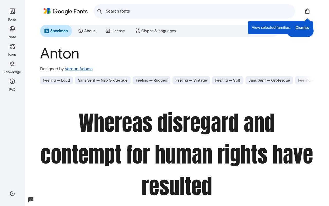
BIG. BOLD. FREE.
ABCDEFGHIJKLM abcdefghijklm 0123456789
Tall, tightly packed letters let Anton give a short poster headline considerable visual mass. Its heavy condensed drawing suits sports graphics and video thumbnails where a few words must dominate; supporting dates and descriptions belong in quieter type because this download supplies one forceful design rather than a weight family.
Vernon Adams designed Anton; its free Google Fonts download includes 1 style at weight 400, without italics. The Anton download supports Latin, extended Latin, and Vietnamese. Anton’s Open Font License permits commercial posters and thumbnails projects.
- Style
- Condensed grotesque
- Best for
- Posters and thumbnails
- License
- SIL Open Font License
- Price
- 100% free
Bebas Neue
All-caps condensed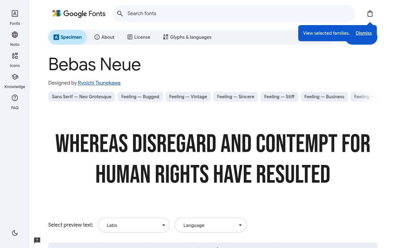
BIG. BOLD. FREE.
ABCDEFGHIJKLM abcdefghijklm 0123456789
All-capital lettering is the defining attraction of Bebas Neue: narrow forms create tall, clean silhouettes for hero headlines. A landing-page slogan can be stacked into deliberate lines above a contrasting body sans. This particular Google Fonts download is a single regular design, not a collection of lighter and heavier headline cuts.
The free Google Fonts selection for Bebas Neue, by Ryoichi Tsunekawa, contains 1 style at weight 400, without italics. Included subsets in Bebas Neue span Latin and extended Latin. Bebas Neue’s Open Font License permits commercial hero headlines projects.
- Style
- All-caps condensed
- Best for
- Hero headlines
- License
- SIL Open Font License
- Price
- 100% free
Oswald
Condensed gothic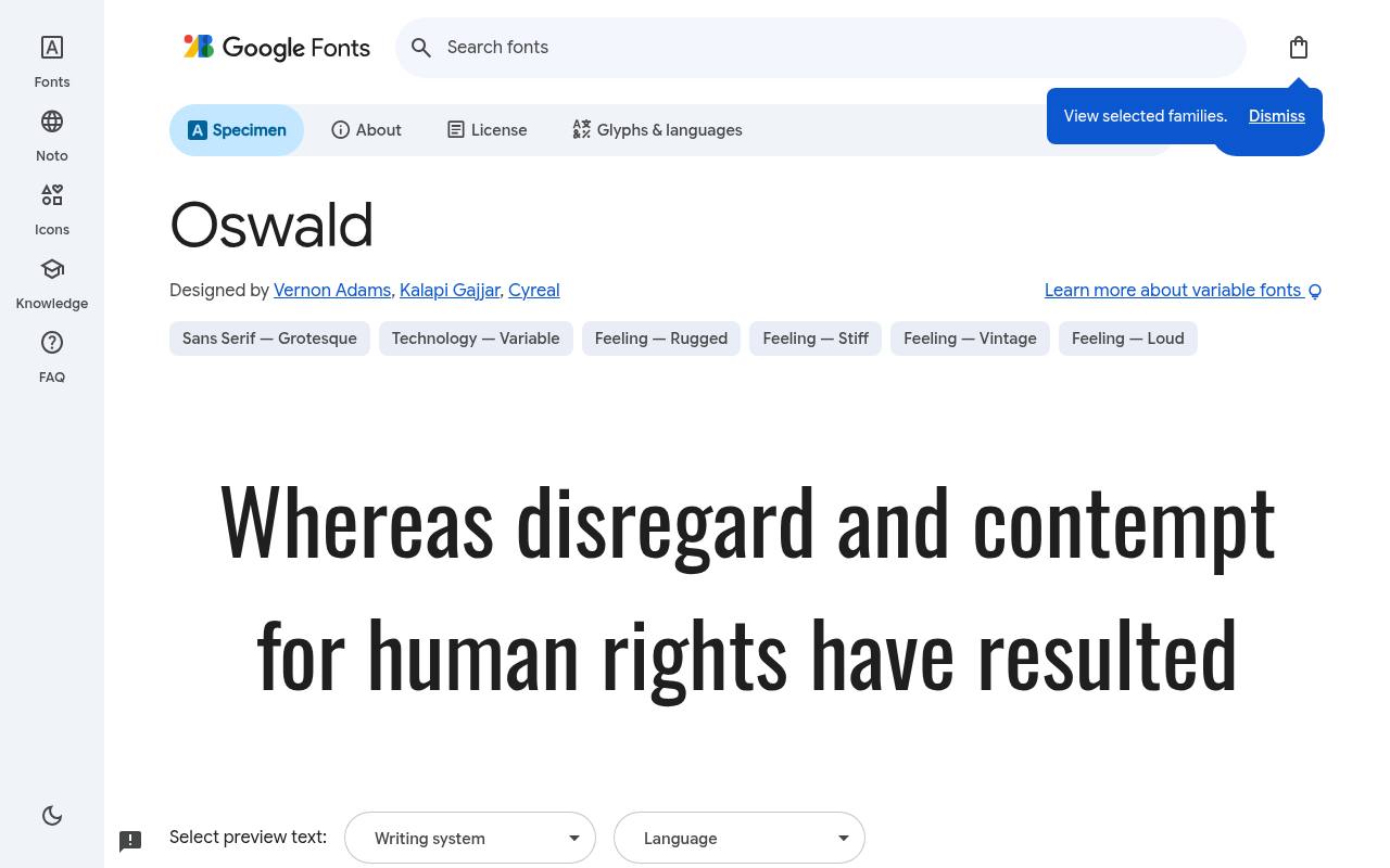
BIG. BOLD. FREE.
ABCDEFGHIJKLM abcdefghijklm 0123456789
Classic condensed gothic lettering gets a web-oriented treatment in Oswald. Its narrow rhythm makes editorial section titles and news navigation feel compact without the sheer heaviness of a one-weight poster font. Use the available weight progression to separate the masthead, category labels, and short article headings within one recognizable family.
For Oswald, Google Fonts supplies 6 styles spanning weights 200–700, without italics free, crediting Vernon Adams, Kalapi Gajjar, and Cyreal. Oswald’s axes cover Weight 200–700. Oswald’s listed subsets cover Cyrillic, extended Cyrillic, Latin, extended Latin, and Vietnamese. Oswald’s Open Font License permits commercial editorial headers projects.
- Style
- Condensed gothic
- Best for
- Editorial headers
- License
- SIL Open Font License
- Price
- 100% free
Alfa Slab One
Heavy slab serif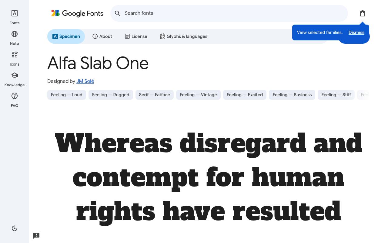
BIG. BOLD. FREE.
ABCDEFGHIJKLM abcdefghijklm 0123456789
Chunky slabs and dense strokes give Alfa Slab One the physical presence of a painted sign. A craft-beer label or workwear campaign can put its name in this heavy face and leave ingredients or specifications to a quieter sans.
Despite the regular style label, the drawing is emphatically weighty. Credited to JM Solé, Alfa Slab One comes free from Google Fonts in 1 style at weight 400, without italics. Script coverage for Alfa Slab One includes Latin, extended Latin, and Vietnamese.
Alfa Slab One’s Open Font License permits commercial rugged branding projects.Like every free font in this list, it ships under the SIL Open Font License, so it is free for personal and commercial projects alike.
- Style
- Heavy slab serif
- Best for
- Rugged branding
- License
- SIL Open Font License
- Price
- 100% free
Black Ops One
Stencil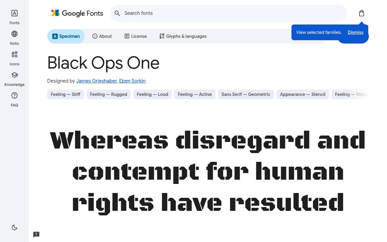
BIG. BOLD. FREE.
ABCDEFGHIJKLM abcdefghijklm 0123456789
Stencil breaks make Black Ops One immediately suggest tactical equipment and action graphics. Its broad, muscular shapes work for a bootcamp poster title or game mission heading, with neutral supporting text keeping instructions separate from the military styling. The download is a single fixed weight rather than adjustable stencil strength.
Google Fonts lists James Grieshaber and Eben Sorkin as Black Ops One’s designer credits and offers 1 style at weight 400, without italics in the free download. The Black Ops One download supports extended Cyrillic, Latin, extended Latin, and Vietnamese. Black Ops One’s Open Font License permits commercial military and action themes projects.
- Style
- Stencil
- Best for
- Military and action themes
- License
- SIL Open Font License
- Price
- 100% free
Bungee Shade
Shaded display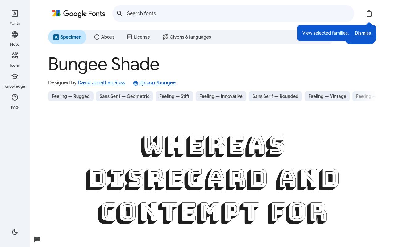
BIG. BOLD. FREE.
ABCDEFGHIJKLM abcdefghijklm 0123456789
A built-in dimensional shadow distinguishes Bungee Shade from an ordinary bold headline face. The urban Bungee letterforms already contain the depth effect, making a festival title or playful storefront graphic feel constructed rather than flat. Extra drop shadows would compete with the lettering’s own carefully drawn shaded edges.
David Jonathan Ross designed Bungee Shade; its free Google Fonts download includes 1 style at weight 400, without italics. Included subsets in Bungee Shade span Latin, extended Latin, and Vietnamese. Bungee Shade’s Open Font License permits commercial 3d-effect titles projects.
- Style
- Shaded display
- Best for
- 3D-effect titles
- License
- SIL Open Font License
- Price
- 100% free
Dela Gothic One
Heavy gothic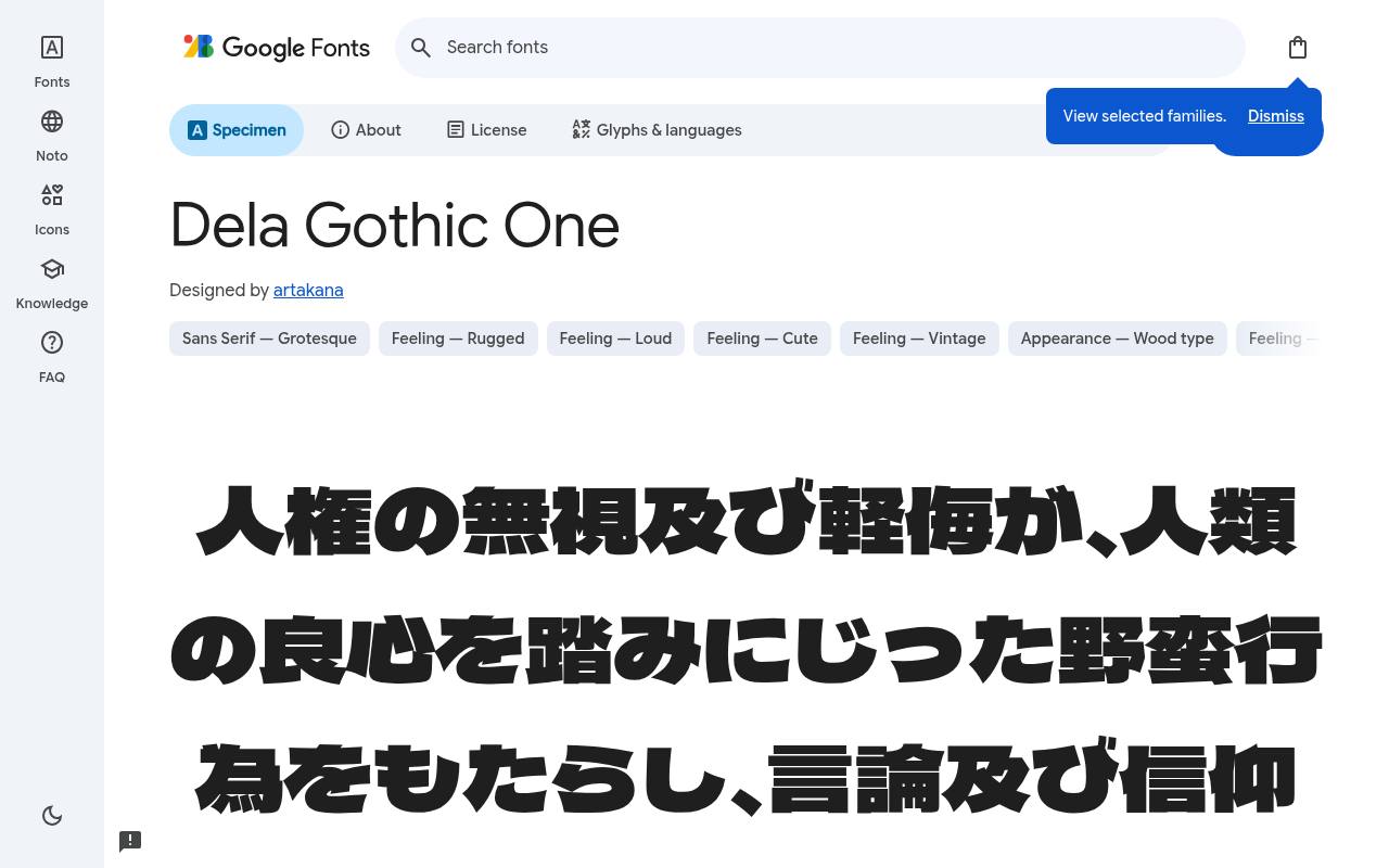
BIG. BOLD. FREE.
ABCDEFGHIJKLM abcdefghijklm 0123456789
Dense strokes and compact counters give Dela Gothic One an emphatic blocklike texture. Rooted in Japanese gothic lettering, it brings substantial visual weight to street-style posters and event titles, including layouts that mix Japanese and Latin text. Large margins help those tightly drawn letter interiors remain part of a deliberate composition.
The free Google Fonts selection for Dela Gothic One, by artakana, contains 1 style at weight 400, without italics. Dela Gothic One’s listed subsets cover Cyrillic, Greek, Japanese, Latin, extended Latin, and Vietnamese. Dela Gothic One’s Open Font License permits commercial striking modern posters projects.
- Style
- Heavy gothic
- Best for
- Striking modern posters
- License
- SIL Open Font License
- Price
- 100% free
Rubik Mono One
Wide monospaced caps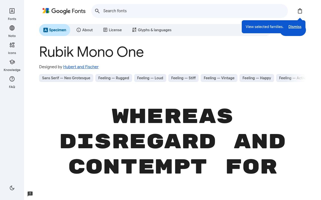
BIG. BOLD. FREE.
ABCDEFGHIJKLM abcdefghijklm 0123456789
Wide, rounded capitals give Rubik Mono One a playful mechanical rhythm rather than the quiet texture of a conventional coding face. Its fixed-width construction suits a short gaming-brand headline or oversized technology slogan. Long phrases demand substantial horizontal room, so the strongest applications treat each word as a graphic element.
For Rubik Mono One, Google Fonts supplies 1 style at weight 400, without italics free, crediting Hubert and Fischer. Script coverage for Rubik Mono One includes Cyrillic, Latin, and extended Latin. Rubik Mono One’s Open Font License permits commercial playful tech headlines projects.
- Style
- Wide monospaced caps
- Best for
- Playful tech headlines
- License
- SIL Open Font License
- Price
- 100% free
Unbounded
Wide geometric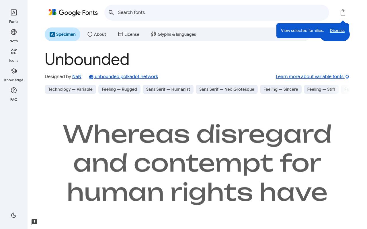
BIG. BOLD. FREE.
ABCDEFGHIJKLM abcdefghijklm 0123456789
Expansive proportions and rounded geometry make Unbounded feel deliberately larger than a neutral website sans. A futuristic product launch can use its wide forms for a brief hero statement, then choose a lighter setting for supporting labels. Weight varies continuously, though there is no width axis.
Credited to NaN, Unbounded comes free from Google Fonts in 8 styles spanning weights 200–900, without italics. Unbounded’s axes cover Weight 200–900. The Unbounded download supports Cyrillic, extended Cyrillic, Latin, extended Latin, and Vietnamese. Unbounded’s Open Font License permits commercial web3 and futuristic brands projects.
- Style
- Wide geometric
- Best for
- Web3 and futuristic brands
- License
- SIL Open Font License
- Price
- 100% free
Big Shoulders
Chicago condensed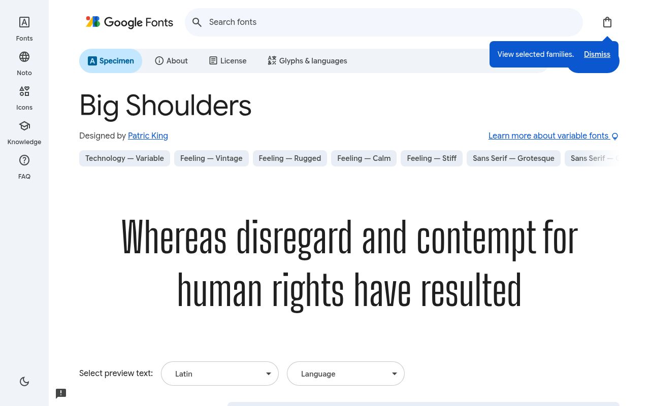
BIG. BOLD. FREE.
ABCDEFGHIJKLM abcdefghijklm 0123456789
Chicago’s industrial signage informs Big Shoulders, the Google Fonts family now carrying the former Big Shoulders Display name. Narrow, upright forms suit civic-event posters and bold editorial covers.
Its optical-size range adds a useful distinction to the broad weight selection, supporting both smaller signage details and prominent event titles. Google Fonts lists Patric King as Big Shoulders’s designer credits and offers 9 styles spanning weights 100–900, without italics in the free download.
Big Shoulders’s axes cover Optical Size 10–72 and Weight 100–900. Included subsets in Big Shoulders span Latin, extended Latin, and Vietnamese. Big Shoulders’s Open Font License permits commercial civic and industrial design projects.
- Style
- Chicago condensed
- Best for
- Civic and industrial design
- License
- SIL Open Font License
- Price
- 100% free
Getting the most from free display fonts
Display fonts are meant to be big: 48px and up. At smaller sizes, tight spacing and heavy weights clog up. Tighten letter-spacing slightly on condensed faces like Anton and Bebas Neue to make headlines feel solid.
Always pair a free display font with a calm body face. One loud voice per page is plenty.
Where free display fonts make the biggest impact
Display fonts earn their keep on hero sections, posters, event flyers, album covers, sports graphics, social media cards and YouTube thumbnails. Anywhere a viewer gives you one second of attention, a bold free display font can deliver the message before they scroll away.
On websites, use a display font for the main headline only, and perhaps for big numbers or section titles. Body copy, buttons and navigation need something calmer.
Styling tips for bold headlines
All-caps condensed faces like Bebas Neue and Anton look stronger with slightly reduced line height, so stacked lines lock together. Heavy slabs like Alfa Slab One benefit from extra tracking at smaller sizes. Layered faces like Bungee Shade look best in two contrasting colours.
Use colour blocks behind your free display font for poster-like energy: a bright headline on a solid background is simple, bold and easy to read.
Frequently asked questions
What is the best free poster font? Anton and Bebas Neue are the most popular free poster fonts; Dela Gothic One is great for a modern, heavy look.
Can I use free display fonts for a brand logo? Yes — every font here is open-licensed for commercial logos.
Write for the available shape before styling
Before comparing free display fonts, write several versions of the headline that communicate the same point. A shorter phrase may give you more impact than a stronger font squeezed into an unsuitable space.
Keep the essential promise intact, then try each version in your intended format. This makes writing and typography work together instead of forcing the typeface to rescue an overlong message.
Compare Anton with Unbounded using the same words. Their different widths will quickly show why a font choice affects the whole composition.
If the wider option creates an awkward final line, consider rewriting or changing the layout before reducing the type. Strong headline fonts should help readers understand the message immediately, not reward them only after they decode a complicated arrangement.
Build a campaign that survives every crop
A headline may need to appear on a landscape banner, a square social graphic and a tall printed poster. Set up those formats together and identify a safe area for the key words.
Condensed fonts such as Bebas Neue or Big Shoulders can be useful in narrow arrangements, but they still need enough surrounding room to avoid looking trapped against the edges.
Do not solve every crop by scaling the complete artwork as one image. Reposition supporting details and allow intentional line breaks for each format. Keep the hierarchy recognisable even when the composition changes.
When searching for poster fonts free to use across a campaign, test the smallest digital placement as carefully as the largest print application; it often reveals weaknesses first.
Judge weight against the background, not in isolation
Dela Gothic One and Alfa Slab One both create substantial visual weight, yet their internal spaces and overall texture differ. Put them over the actual image or colour treatment planned for your project.
Check whether the letter interiors remain distinct, particularly in compressed previews. A font that feels wonderfully solid on white can become difficult to recognise against complicated photography.
Bungee Shade already carries a pronounced dimensional character, so evaluate any extra shadow or outline carefully. Effects should solve a specific contrast problem or support the concept, rather than simply making the free typeface louder.
Try moving the text onto a calmer part of the image first. A cleaner placement can provide more impact while preserving the details that attracted you to the font.
Use a practical proofing sequence for print
Create a plain proof at the intended size before committing to a finished poster, sign or packaging panel. Check the headline both close up and from the distance at which people will encounter it.
Black Ops One may contribute a strong stencil character, but that character still needs to carry the actual wording clearly in your chosen production process.
Ask the printer or fabricator about file preparation, colour handling and any limits relevant to fine gaps or small details. Keep an editable source document, and prepare delivery files according to the supplier’s requirements.
Free display typography can look highly professional, but a polished mock-up is not a production test. Reviewing a physical sample helps you catch issues while changes are still straightforward.
Install for design, embed for visitors
Use the article’s Google Fonts link to preview your headline and download the family from its source. Extract the files, retain the licence information and install the desktop fonts through your operating system.
If the name does not appear in your design application, reopen the application before troubleshooting further. Avoid substituting a different family merely because an old document has not refreshed its font list.
For a website, a local installation is not enough: visitors need access to the relevant webfont through your embedding or self-hosting setup. Load only the styles you use and provide a fallback that preserves readable text.
Test how the headline wraps before and after loading. A free font should not leave the main message invisible or unexpectedly cover the action you want visitors to take.
Create rules for future headlines, not just this one
What should you record after choosing your display family? Save examples of short, medium and long headlines, including approved line breaks and the smallest successful use.
Oswald may handle one set of editorial needs while Rubik Mono One suits a more compact statement. Document the role you actually tested, so collaborators do not assume the font will behave equally well in every context.
Can you build a distinctive identity with bold fonts free of purchase costs? Yes, but your identity also depends on language, composition, imagery and consistent application.
Keep the supplied open-licence terms with shared assets and direct collaborators to the original source when appropriate. Treat the font as one reusable ingredient rather than the whole brand, and you will find it easier to expand the design without losing coherence.
Check what readers remember after a glance
Show your headline briefly to someone who has not worked on the design, then ask what they remember. You are checking whether the main idea survives, not conducting a vote on favourite free fonts.
If they recall the visual effect but miss the offer or event name, simplify the wording or hierarchy before investing more time in decorative refinements.
Repeat the exercise with the supporting information visible and ask what action they would take next. A successful headline attracts attention and leads somewhere useful, whether that means reading an article, booking a ticket or recognising a product.
Keep the final message direct enough to work without explanation, and let the chosen display face reinforce the meaning rather than compete with it.