
Pixel fonts are made from tiny squares, just like the screens of classic consoles and home computers. Whether you are building an indie game, a retro-themed website or a Twitch overlay, a crisp free pixel font gives instant 8-bit credibility.
These ten free gaming fonts range from arcade-cabinet capitals to green-screen terminal text. All are free on Google Fonts and open-licensed, so you can ship them inside commercial games — something many 'free' pixel fonts on random sites do not allow.
Each card shows a live preview, a screenshot of the source page and a direct link to the free download.
Quick picks at a glance
| # | Resource | Style | Best for |
|---|---|---|---|
| 1 | Press Start 2P | Arcade bitmap | Title screens and HUDs |
| 2 | VT323 | Terminal | Hacker and CRT themes |
| 3 | Silkscreen | Tiny bitmap | Small UI labels |
| 4 | Pixelify Sans | Modern pixel | Readable game text |
| 5 | DotGothic16 | Japanese bitmap | JRPG-style dialogue |
| 6 | Sixtyfour | Home-computer bitmap | Commodore-style nostalgia |
| 7 | Jersey 10 | Sporty pixel | Sports and racing games |
| 8 | Tiny5 | Micro pixel | Extremely small text |
| 9 | Handjet | Dot-matrix | LED signs and receipts |
| 10 | Workbench | Amiga-style bitmap | Retro desktop interfaces |
Press Start 2P
Arcade bitmap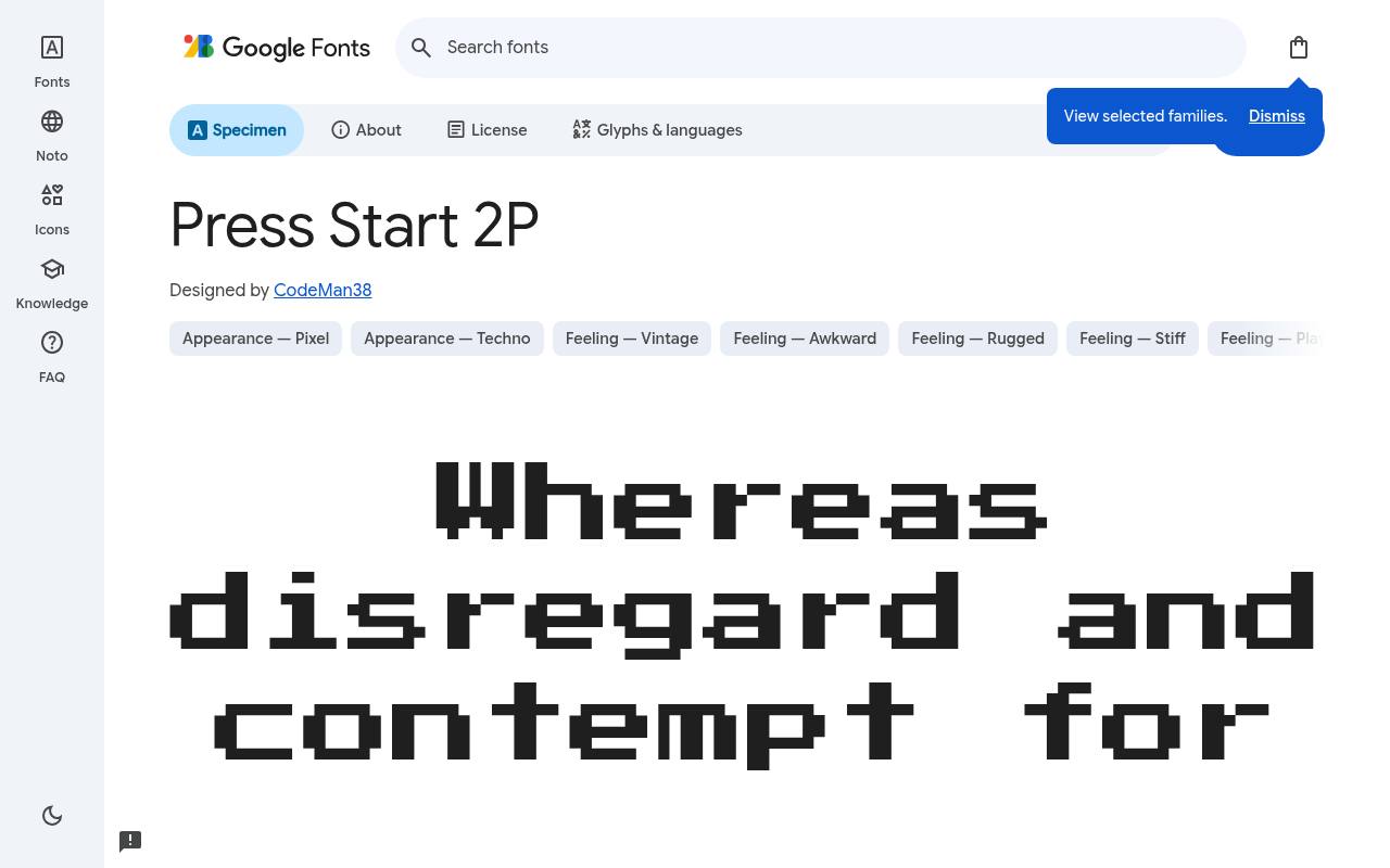
PRESS START — FREE
ABCDEFGHIJKLM abcdefghijklm 0123456789
Namco arcade lettering of the 1980s inspires Press Start 2P's square, stepped forms and unmistakable coin-op atmosphere. CodeMan38 designed the free Google Fonts release of Press Start 2P, which includes one upright style at weight 400 and no separate italic.
Press Start 2P includes Cyrillic, extended Cyrillic, Greek, Latin and extended Latin coverage. A retro game title screen could use it for a score heading or start prompt, reserving a less emphatic text family for lengthy explanations outside the simulated arcade display.
- Style
- Arcade bitmap
- Best for
- Title screens and HUDs
- License
- SIL Open Font License
- Price
- 100% free
VT323
Terminal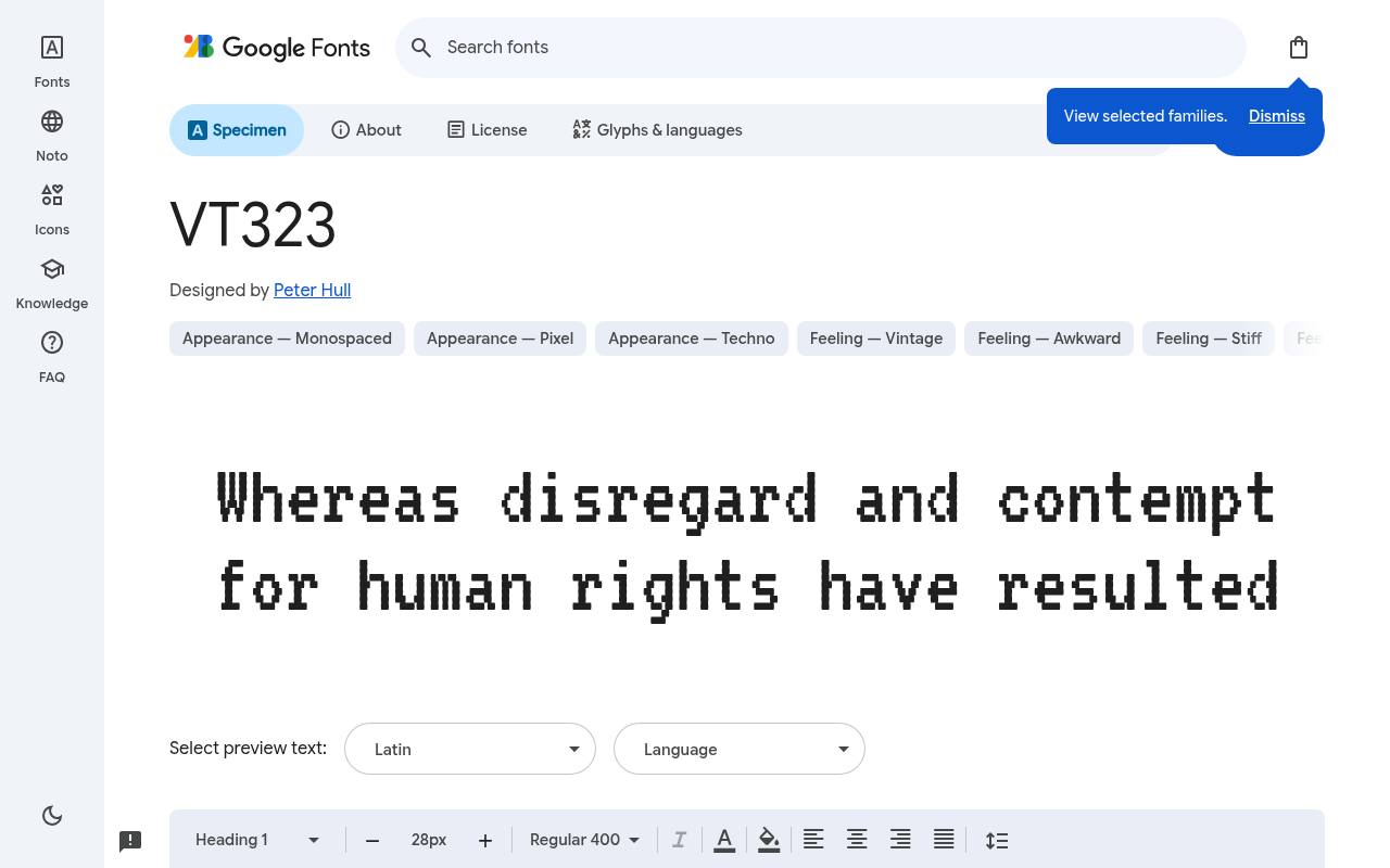
PRESS START — FREE
ABCDEFGHIJKLM abcdefghijklm 0123456789
DEC VT320 terminal glyphs provide the model for VT323, giving its monospaced texture a specific computing reference rather than generic pixel decoration. The free VT323 download credits Peter Hull and supplies one upright style at weight 400 and no separate italic.
Character coverage in VT323 extends to Latin, extended Latin and Vietnamese. A browser-based text adventure could distinguish command prompts and computer responses with this terminal voice, framing the play area like an old workstation screen. Equal-width spacing reinforces the terminal simulation when commands and responses occupy consecutive lines.
- Style
- Terminal
- Best for
- Hacker and CRT themes
- License
- SIL Open Font License
- Price
- 100% free
Silkscreen
Tiny bitmap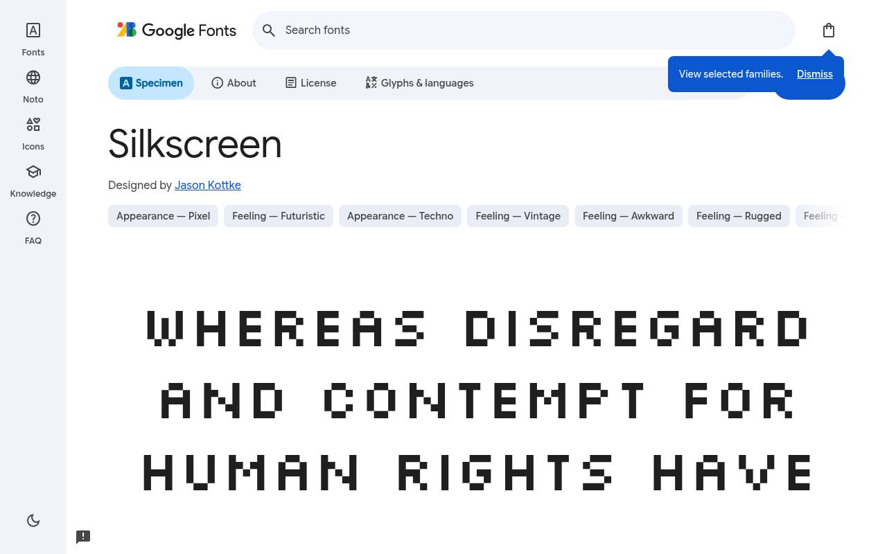
PRESS START — FREE
ABCDEFGHIJKLM abcdefghijklm 0123456789
Tiny interface lettering is Silkscreen's specialty, with compact pixel-built forms that recall early web graphics as much as game menus. Google Fonts offers Silkscreen free with 2 styles spanning weights 400–700, with no italics; the design credit goes to Jason Kottke.
The Silkscreen character set covers Latin and extended Latin. An 8-bit fan site could use its regular cut for small navigation labels and the bold for selected states, keeping longer game reviews in a more spacious reading face.
The two fixed weights provide emphasis without introducing variable axes or an italic treatment.Like every free font in this list, it ships under the SIL Open Font License, so it is free for personal and commercial projects alike.
- Style
- Tiny bitmap
- Best for
- Small UI labels
- License
- SIL Open Font License
- Price
- 100% free
Pixelify Sans
Modern pixel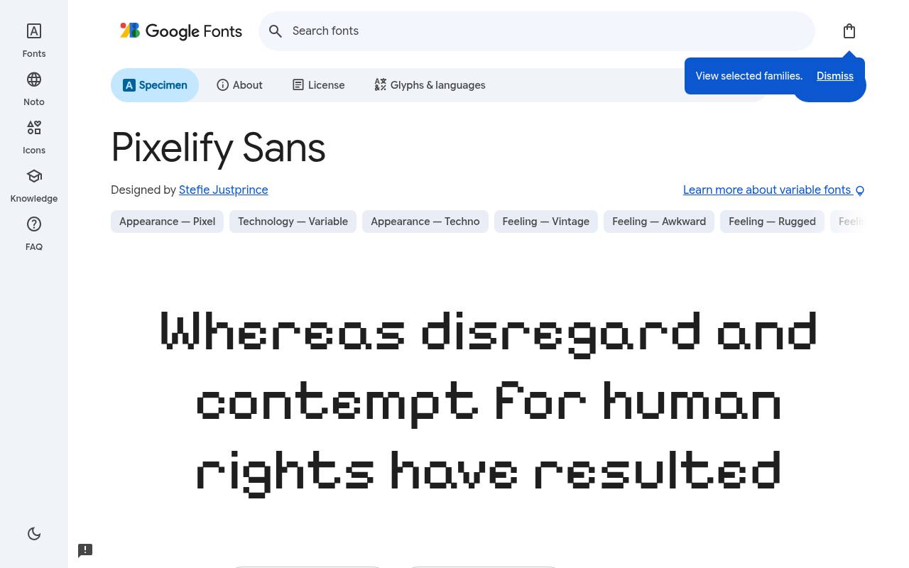
PRESS START — FREE
ABCDEFGHIJKLM abcdefghijklm 0123456789
Stepped contours meet contemporary weight flexibility in Pixelify Sans, giving the pixel aesthetic more hierarchy than a single fixed display cut. Stefie Justprince designed the free Google Fonts release of Pixelify Sans, which includes 4 styles spanning weights 400–700, with no italics.
Variable controls cover Weight 400–700. Pixelify Sans includes Cyrillic, Latin and extended Latin coverage. A story-driven retro game could distinguish speaker names from dialogue through weight, while preserving one coherent pixel-built voice across conversation windows and inventory labels.
- Style
- Modern pixel
- Best for
- Readable game text
- License
- SIL Open Font License
- Price
- 100% free
DotGothic16
Japanese bitmap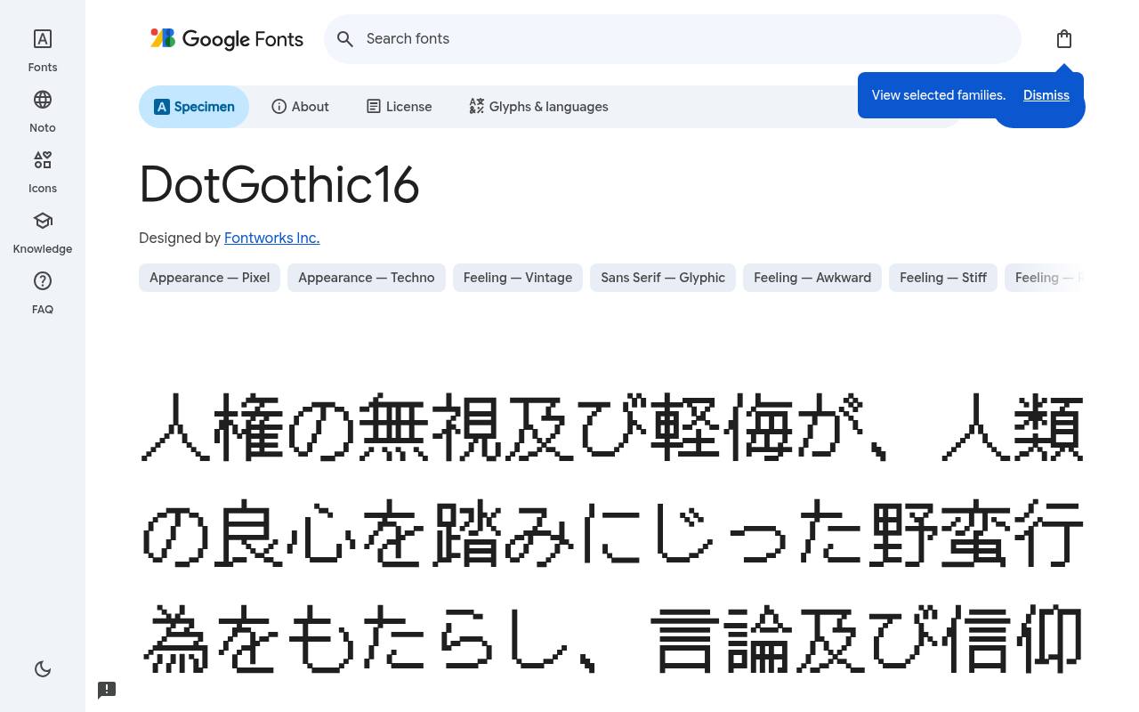
PRESS START — FREE
ABCDEFGHIJKLM abcdefghijklm 0123456789
Japanese 16-dot bitmap lettering informs DotGothic16, whose grid-like rhythm immediately evokes classic console menus and JRPG dialogue. The free DotGothic16 download credits Fontworks Inc. and supplies one upright style at weight 400 and no separate italic. Character coverage in DotGothic16 extends to Cyrillic, Japanese, Latin and extended Latin.
A bilingual game mockup could combine Japanese and Latin text within the same visual system, using the square character construction to reinforce its vintage hardware setting. The fixed upright cut favors consistent menu texture rather than bold or italic hierarchy.
- Style
- Japanese bitmap
- Best for
- JRPG-style dialogue
- License
- SIL Open Font License
- Price
- 100% free
Sixtyfour
Home-computer bitmap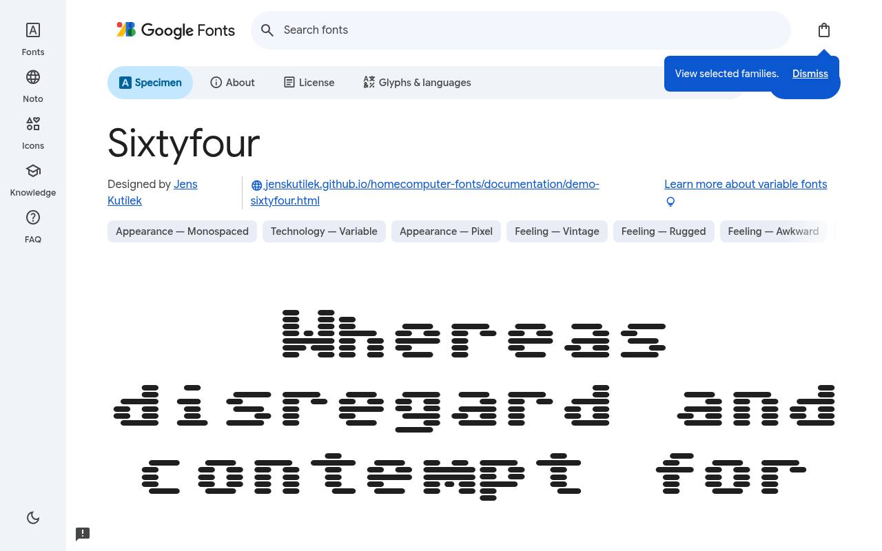
PRESS START — FREE
ABCDEFGHIJKLM abcdefghijklm 0123456789
Commodore 64 lettering gives Sixtyfour its cheerful home-computer identity, while variable texture controls take it beyond a fixed bitmap imitation. Google Fonts offers Sixtyfour free with one upright style at weight 400 and no separate italic; the design credit goes to Jens Kutílek.
Variable controls cover Bleed 0–100, Scanlines -53–100. The Sixtyfour character set covers Latin, extended Latin, math and symbols. A retro-computing game could use the monospaced forms for a boot screen or loading message, treating bleed and scanlines as part of the fictional display hardware.
- Style
- Home-computer bitmap
- Best for
- Commodore-style nostalgia
- License
- SIL Open Font License
- Price
- 100% free
Jersey 10
Sporty pixel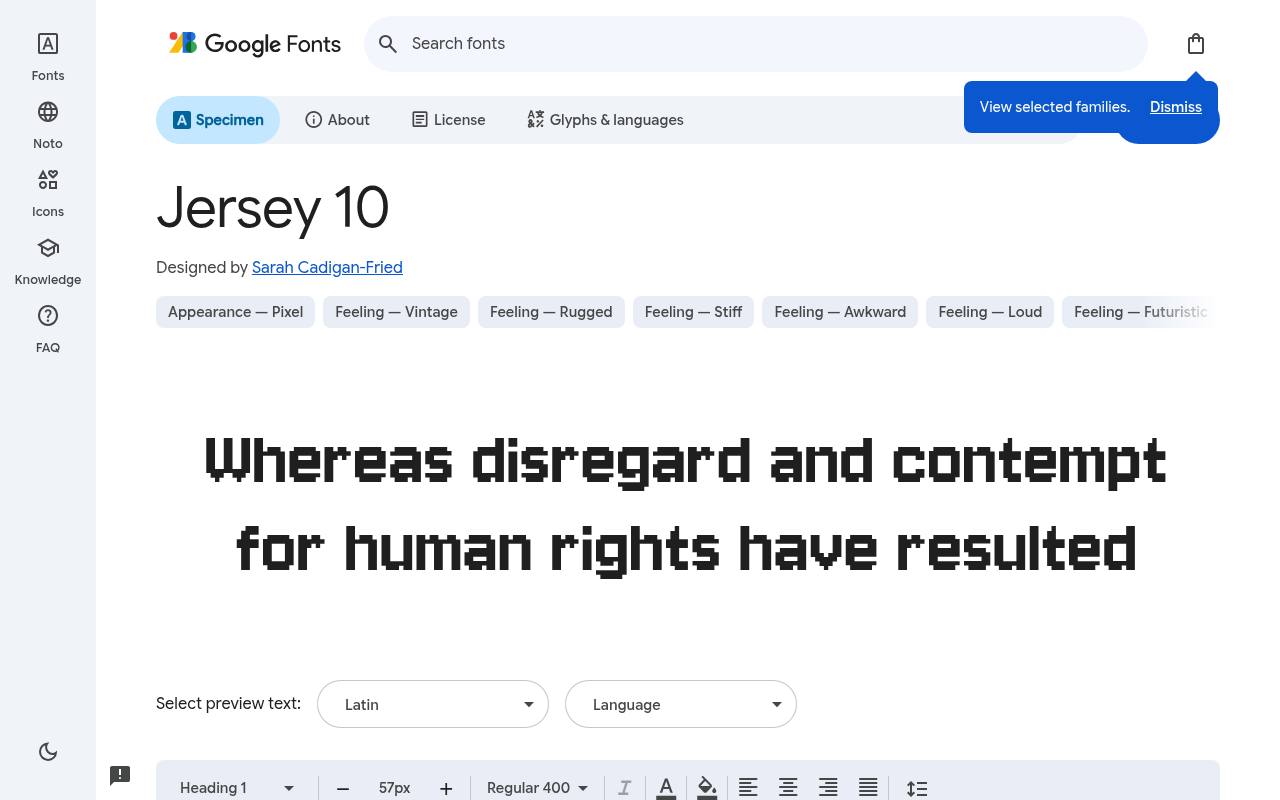
PRESS START — FREE
ABCDEFGHIJKLM abcdefghijklm 0123456789
Athletic jersey lettering meets pixel construction in Jersey 10, making its blocky forms especially suitable for sports-themed retro interfaces. Sarah Cadigan-Fried designed the free Google Fonts release of Jersey 10, which includes one upright style at weight 400 and no separate italic.
Jersey 10 includes Latin and extended Latin coverage. A racing game's lap counter or a pixel-football scoreboard could use its compact display voice, with a simpler companion reserved for tutorial paragraphs and detailed controller mappings. Its sporting reference adds a team-uniform flavor missing from more generic square arcade lettering.
- Style
- Sporty pixel
- Best for
- Sports and racing games
- License
- SIL Open Font License
- Price
- 100% free
Tiny5
Micro pixel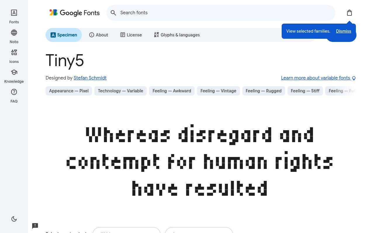
PRESS START — FREE
ABCDEFGHIJKLM abcdefghijklm 0123456789
A five-pixel-tall design concept gives Tiny5 its micro-lettering identity, intended for game details that must fit into very limited space. The free Tiny5 download credits Stefan Schmidt and supplies 18 styles spanning weights 100–900, including italics. Variable controls cover Bleed 0–100, Jitter 0–100, Roundness 0–100, Width 50–200, Weight 100–900.
Character coverage in Tiny5 extends to Armenian, Cyrillic, extended Cyrillic, Greek, extended Greek, Latin, extended Latin and Vietnamese. An item counter or miniature map label can use that compact character, while its variable controls provide scope for much wider and more textured variations.
- Style
- Micro pixel
- Best for
- Extremely small text
- License
- SIL Open Font License
- Price
- 100% free
Handjet
Dot-matrix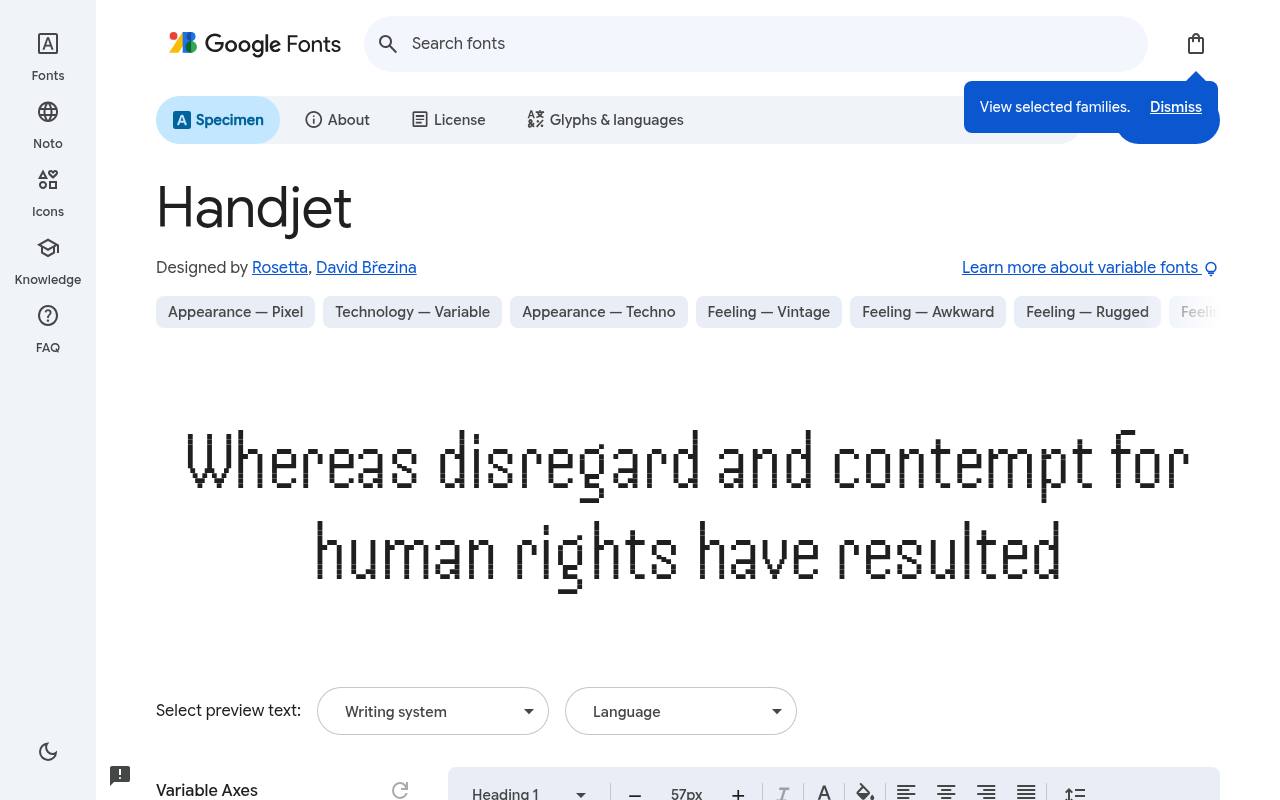
PRESS START — FREE
ABCDEFGHIJKLM abcdefghijklm 0123456789
Discrete elements build Handjet's dot-matrix texture, letting its forms suggest LED displays or inkjet output rather than solid-outline arcade type. Google Fonts offers Handjet free with 9 styles spanning weights 100–900, with no italics; the design credit goes to Rosetta and David Březina. Variable controls cover Element Grid 1–2, Element Shape 0–16, Weight 100–900.
The Handjet character set covers Arabic, Armenian, Cyrillic, extended Cyrillic, Greek, Hebrew, Latin, extended Latin and Vietnamese. A retro game's ticket receipt or electronic scoreboard could use its grid and shape controls to imply specific hardware, giving different fictional devices their own typographic finish.
- Style
- Dot-matrix
- Best for
- LED signs and receipts
- License
- SIL Open Font License
- Price
- 100% free
Workbench
Amiga-style bitmap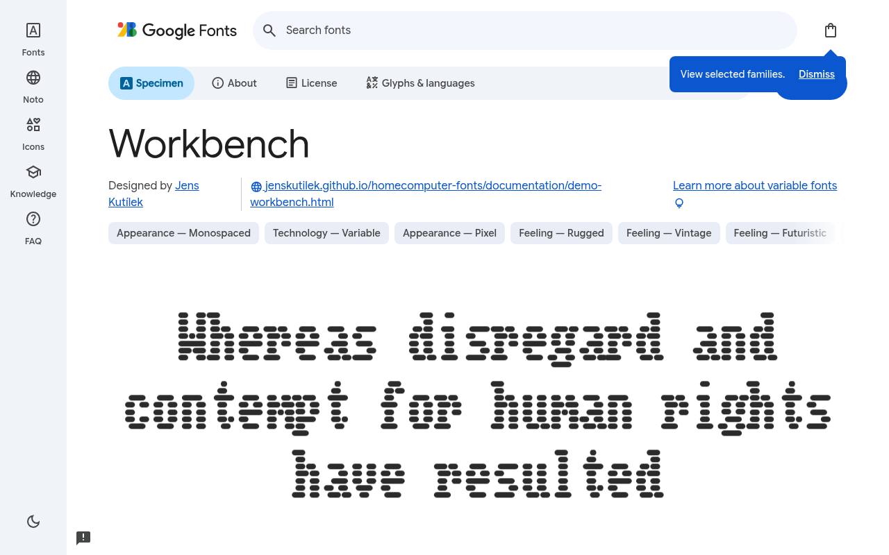
PRESS START — FREE
ABCDEFGHIJKLM abcdefghijklm 0123456789
Amiga desktop lettering inspires Workbench's monospaced forms, with adjustable display texture that reinforces its old-computer identity. Jens Kutílek designed the free Google Fonts release of Workbench, which includes one upright style at weight 400 and no separate italic.
Two variable axes, Bleed (0–100) and Scanlines (-53 to 100), let the glow and CRT lines be dialed in or out. Workbench includes Latin, math and symbols coverage. An interactive portfolio styled as a retro operating system could use it for window titles and menu accents, leaving detailed project descriptions in a more conventional reading face.
- Style
- Amiga-style bitmap
- Best for
- Retro desktop interfaces
- License
- SIL Open Font License
- Price
- 100% free
Keeping free pixel fonts crisp
Pixel fonts look blurry when scaled to awkward sizes. Use whole multiples of the font's design grid (8px, 16px, 24px for Press Start 2P) and disable anti-aliasing in game engines where possible.
Pair a free pixel font headline with a clean modern sans for paragraphs on websites — retro flavour without eye strain.
Using free pixel fonts in game engines
In Unity, Godot or GameMaker, import the free pixel font at its native size and turn off font smoothing or anti-aliasing so edges stay hard. Set the camera or canvas to scale in whole-number steps. In Godot, disable filtering on the font resource; in Unity's TextMeshPro, use a point-filtered atlas.
Test your UI at the target resolution early — a free 8-bit font that looks crisp in the editor can blur once the game is scaled to a phone screen.
Pixel fonts on retro-themed websites
Pixel fonts are fun on the web too: portfolio sites, game studio pages, Twitch overlays and nostalgic blogs. Keep them for headings, buttons and small labels, and use a modern sans for paragraphs so visitors are not squinting. Add CSS image-rendering: pixelated to accompanying sprite images and the whole page will feel consistent.
A terminal-style hero with VT323 and a blinking cursor is a classic trick that still delights visitors.
Frequently asked questions
Is Press Start 2P free for commercial games? Yes, it is open-licensed and widely used in indie games.
What is the most readable free pixel font? Pixelify Sans and Silkscreen are the easiest to read at small sizes.
Choose a different test for every game screen
Start your search for free pixel fonts with a list of text tasks rather than a single aesthetic reference. A title, inventory label, dialogue window and settings menu place different demands on letterforms.
Build a sample screen for each task, using realistic wording. Include the longest item name you expect instead of filling every slot with a convenient short placeholder.
Compare Press Start 2P on the title screen with Pixelify Sans inside an actual conversation. The goal is not to make every part of the game equally decorative.
You want players to recognise the world quickly and then read without unnecessary effort. Free game fonts give you room to experiment, but assigning each one a purpose keeps that freedom from producing an inconsistent interface.
Treat text expansion as a layout requirement
Leave flexible space around labels if your project may support additional languages. Translated text can occupy more room, and a fixed-width button that looks tidy in one language may clip another.
Check each required character on the family page and in the files you actually ship. Do not assume every free font in this collection supports the same scripts or punctuation.
DotGothic16 is worth examining when Japanese text is part of your plan, but you still need to test the specific strings your game uses. Include names, symbols, quotation marks and line breaks in that review.
Ask a fluent reader to assess the result when possible. A convincing retro style does not compensate for missing glyphs or awkward text wrapping in an important conversation.
Design counters that remain calm during play
Scoreboards need to behave well as values change. Preview Jersey 10 with short and long scores, then check whether the surrounding labels jump or crowd nearby icons.
Keep enough room for the largest expected value. You can also align a counter within a stable container, so a changing number does not cause the rest of the interface to shuffle during play.
For Tiny5 or Silkscreen labels, judge readability at the actual viewing distance and on the intended device. A tiny caption that looks charming in a zoomed editor may be frustrating on a handheld screen.
If the label carries important information, enlarge the interface or simplify the wording. Small-looking arcade fonts should never become an excuse for information that players cannot comfortably read.
Separate retro effects from essential communication
Sixtyfour, Workbench and Handjet offer distinctive retro-tech personalities, but the surrounding visual effects deserve their own controls. Compare the text with and without scanlines, glow, distortion or a simulated screen texture.
If removing an effect suddenly makes instructions clear, the problem may be the effect rather than the free typeface. Keep those decisions separate while you test your interface.
When using retro gaming fonts in a stream overlay, check the final compressed video rather than only the original artwork. Thin gaps and small details can become less clear over moving footage.
Keep score labels away from busy areas and provide a calm backing panel when necessary. A restrained treatment often preserves more of the intended pixel character than a stack of competing filters.
Import only what your project needs
Open the Google Fonts source for your chosen family, preview your strings and download the free files. Keep the licence document with your assets, then import the relevant font into your design tool or game project.
A desktop installation and a game asset are different things: confirm that the font is included in the exported application, not simply available on your development machine.
For a website, use the supported embedding method or self-host suitable webfont files with a fallback. Load the styles and character coverage you actually need, while preserving every language your page supports.
Test on a device without the family installed. This catches accidental dependence on a local copy and shows whether visitors can still read your content while the free font downloads.
Run a reading playtest, not just a visual review
How do you know whether a pixel font is readable enough? Ask someone to complete a real task: equip an item, change an option or follow a dialogue choice.
Watch for hesitation and misread labels rather than asking only whether the screen looks good. VT323 may suit a terminal sequence beautifully, but the sequence still needs enough space and time for its message.
Can you use 8-bit fonts free of charge and still create a distinctive game identity? Yes, but distinction comes from your wider visual system, including layout, illustration, sound and writing.
Keep the font’s supplied open-licence information with your release records. Build a small set of approved text styles so new screens retain the same character without requiring every designer to improvise from scratch.
Keep settings screens welcoming to new players
A nostalgic interface should not require nostalgic knowledge. Use plain labels for display settings, controls and save options, even when the surrounding artwork imitates an old computer.
If you choose Workbench for a retro desktop concept, make sure the interaction remains understandable to someone who has never seen the system that inspired it. Familiarity with your reference should be optional.
Offer a preview when players adjust text size or interface scale, and check that their choices persist as intended. Longer descriptions may need a separate panel rather than a tiny tooltip.
Your free pixel lettering can remain part of the atmosphere while you give players practical control over how they read, especially when your game moves between desk monitors, televisions and handheld devices.