
Nostalgia sells, and nothing summons it faster than type. A single free retro font can transport visitors to a 1920s cocktail lounge, a 1970s roller disco or a 1980s arcade. These ten free vintage fonts cover the most-loved eras of display lettering.
Unlike our free serif fonts collection, these are not built for reading paragraphs — they are built to make a statement. Use them on posters, album covers, menus, beer labels and event flyers.
All ten retro fonts are free to download from Google Fonts and licensed for commercial use. Every card includes a live preview and a direct link to the free download.
Quick picks at a glance
| # | Resource | Style | Best for |
|---|---|---|---|
| 1 | Monoton | Neon inline | Neon signs and nightlife |
| 2 | Righteous | Deco sans | Retro tech and gaming |
| 3 | Shrikhand | 70s display | Disco, food and fun |
| 4 | Rye | Western woodtype | Saloon and whiskey labels |
| 5 | Bungee | Urban sign | Street signage and vertical text |
| 6 | Audiowide | 80s tech | Synthwave and sci-fi |
| 7 | Limelight | Art deco | Cinema and cocktail menus |
| 8 | Abril Fatface | Victorian fat face | Magazine headlines |
| 9 | Lobster | Retro script | Diner and bakery logos |
| 10 | Fascinate | Deco display | Theatrical posters |
Monoton
Neon inline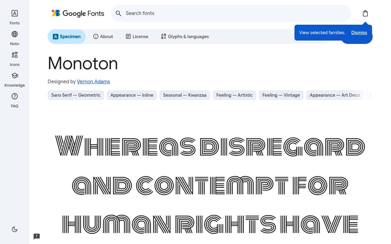
Groovy free fonts
ABCDEFGHIJKLM abcdefghijklm 0123456789
Parallel inline strokes give Monoton the striped glow of retro neon lettering, turning even a short word into a patterned display. The free Monoton download credits Vernon Adams and supplies one upright style at weight 400 and no separate italic. Character coverage in Monoton extends to Latin and extended Latin.
A late-night music poster could feature the venue name at a generous scale, leaving dates and ticket information outside the dense inline texture in a plain companion face. Its internal striping supplies decoration that a solid geometric sans would need added effects to achieve.
- Style
- Neon inline
- Best for
- Neon signs and nightlife
- License
- SIL Open Font License
- Price
- 100% free
Righteous
Deco sans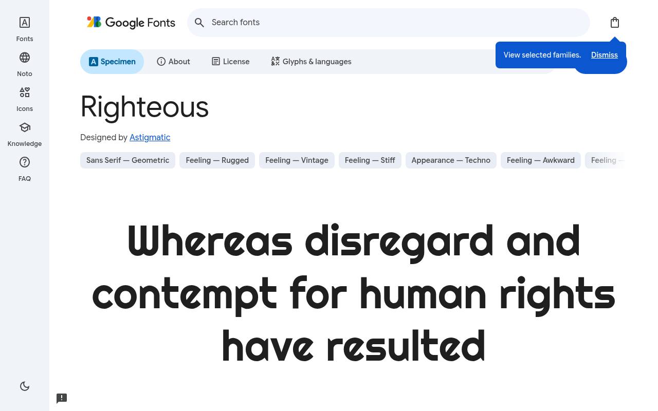
Groovy free fonts
ABCDEFGHIJKLM abcdefghijklm 0123456789
Deco lettering from old album covers informs Righteous, whose rounded geometry feels simultaneously vintage and futuristic. Google Fonts offers Righteous free with one upright style at weight 400 and no separate italic; the design credit goes to Astigmatic. The Righteous character set covers Latin and extended Latin.
A retro gaming label could put a short studio name in these sculpted forms, borrowing the period atmosphere without imitating damaged printing or adding artificial aging to the letters. The rounded construction distinguishes its futuristic nostalgia from angular science-fiction or terminal-inspired lettering.
- Style
- Deco sans
- Best for
- Retro tech and gaming
- License
- SIL Open Font License
- Price
- 100% free
Shrikhand
70s display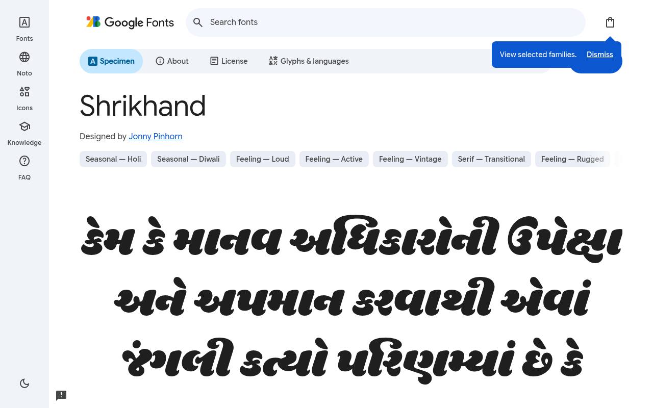
Groovy free fonts
ABCDEFGHIJKLM abcdefghijklm 0123456789
Gujarati hand-painted signage informs Shrikhand's heavy, flowing forms, whose built-in slant also recalls exuberant 1970s display lettering. Jonny Pinhorn designed the free Google Fonts release of Shrikhand, which includes one upright style at weight 400 and no separate italic. Shrikhand includes Gujarati, Latin and extended Latin coverage.
An ice-cream shop could use it for a generous flavor headline or bilingual brand graphic, allowing the dense curves to provide the retro character without additional outlines. The leaning appearance is intrinsic; Google Fonts does not list a separate italic style.
- Style
- 70s display
- Best for
- Disco, food and fun
- License
- SIL Open Font License
- Price
- 100% free
Rye
Western woodtype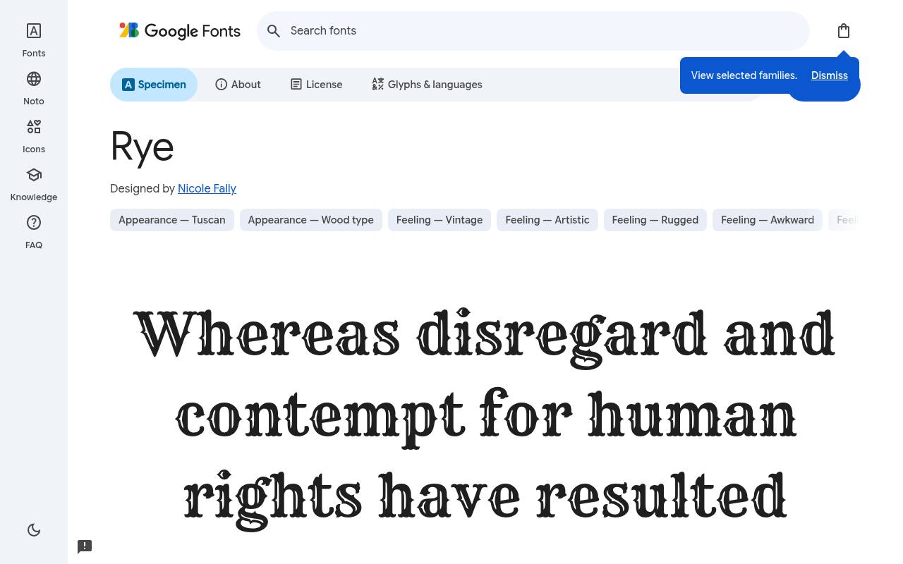
Groovy free fonts
ABCDEFGHIJKLM abcdefghijklm 0123456789
Decorative Western wood type gives Rye its 19th-century wanted-poster flavor, with shaped strokes that already carry considerable ornament. The free Rye download credits Nicole Fally and supplies one upright style at weight 400 and no separate italic.
Character coverage in Rye extends to Latin and extended Latin. A barbecue restaurant's headline or country-music bill could use this lettering as the period cue, leaving menu descriptions and ticket details to a less embellished face.
Its ornamental stroke shapes bring historical atmosphere even when printed in a single flat color.Like every free font in this list, it ships under the SIL Open Font License, so it is free for personal and commercial projects alike.
- Style
- Western woodtype
- Best for
- Saloon and whiskey labels
- License
- SIL Open Font License
- Price
- 100% free
Bungee
Urban sign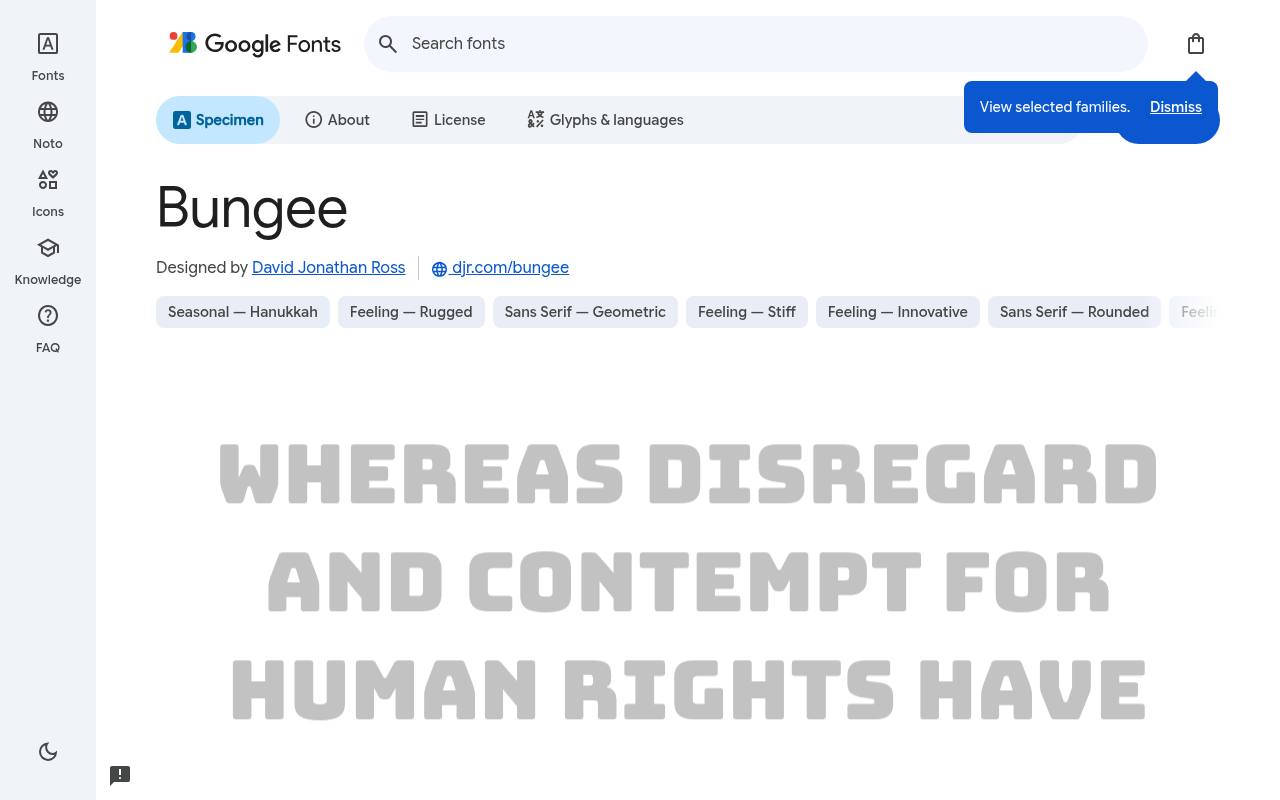
Groovy free fonts
ABCDEFGHIJKLM abcdefghijklm 0123456789
North American urban signs inspired Bungee's chunky construction and particular interest in vertical lettering. Google Fonts offers Bungee free with one upright style at weight 400 and no separate italic; the design credit goes to David Jonathan Ross.
The Bungee character set covers Latin, extended Latin and Vietnamese. A narrow retro event poster could stack its short title down one side; this download is the base Bungee face, rather than an automatic bundle of the separately named layered companion families.
- Style
- Urban sign
- Best for
- Street signage and vertical text
- License
- SIL Open Font License
- Price
- 100% free
Audiowide
80s tech
Groovy free fonts
ABCDEFGHIJKLM abcdefghijklm 0123456789
Wide, rounded forms make Audiowide feel at home beside 1980s electronics and science-fiction graphics rather than traditional vintage print. Astigmatic designed the free Google Fonts release of Audiowide, which includes one upright style at weight 400 and no separate italic.
Audiowide includes Latin and extended Latin coverage. For a synthwave game landing page, a short title can establish the retro-tech setting, while simpler typography keeps instructions distinct from the futuristic display lettering. The broad proportions are fixed, with neither a condensed companion nor variable width included.
- Style
- 80s tech
- Best for
- Synthwave and sci-fi
- License
- SIL Open Font License
- Price
- 100% free
Limelight
Art deco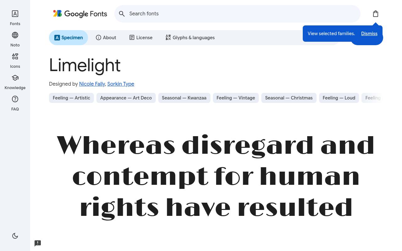
Groovy free fonts
ABCDEFGHIJKLM abcdefghijklm 0123456789
Hollywood glamour of the 1920s and 1930s runs through Limelight's sharply contrasted deco forms. The free Limelight download credits Nicole Fally and Sorkin Type and supplies one upright style at weight 400 and no separate italic. Character coverage in Limelight extends to Latin and extended Latin.
A repertory cinema program could use it for the evening's feature title above orderly cast details, allowing the distinctive geometry to suggest a marquee without relying on a full ornamental border. The strong contrast makes a short title feel more ceremonial than ordinary geometric lettering.
- Style
- Art deco
- Best for
- Cinema and cocktail menus
- License
- SIL Open Font License
- Price
- 100% free
Abril Fatface
Victorian fat face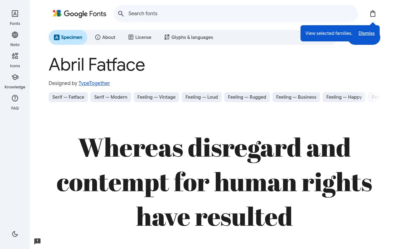
Groovy free fonts
ABCDEFGHIJKLM abcdefghijklm 0123456789
Nineteenth-century fat-face advertising supplies Abril Fatface with its enormous dark strokes and strikingly fine details. Google Fonts offers Abril Fatface free with one upright style at weight 400 and no separate italic; the design credit goes to TypeTogether. The Abril Fatface character set covers Latin and extended Latin.
A vintage-inspired editorial cover could give one feature title ample space, pairing that dense silhouette with much calmer captions so the contrast remains the central typographic effect. Its apparently bold appearance is the sole supplied cut, not a selectable weight range.
- Style
- Victorian fat face
- Best for
- Magazine headlines
- License
- SIL Open Font License
- Price
- 100% free
Lobster
Retro script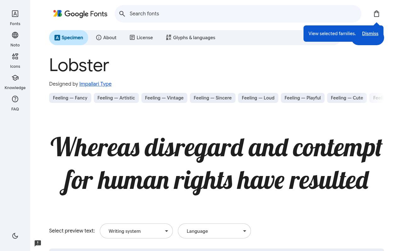
Groovy free fonts
ABCDEFGHIJKLM abcdefghijklm 0123456789
Bold connections and flowing ligatures give Lobster the familiar character of retro diner and bakery signage. Impallari Type designed the free Google Fonts release of Lobster, which includes one upright style at weight 400 and no separate italic. Lobster includes Cyrillic, extended Cyrillic, Latin, extended Latin and Vietnamese coverage.
A neighborhood café could use it for a concise wordmark or a breakfast-section heading, keeping its tightly connected script distinct from the straightforward lettering used for prices and descriptions. The script already has substantial weight, despite its single cut being labeled Regular.
- Style
- Retro script
- Best for
- Diner and bakery logos
- License
- SIL Open Font License
- Price
- 100% free
Fascinate
Deco display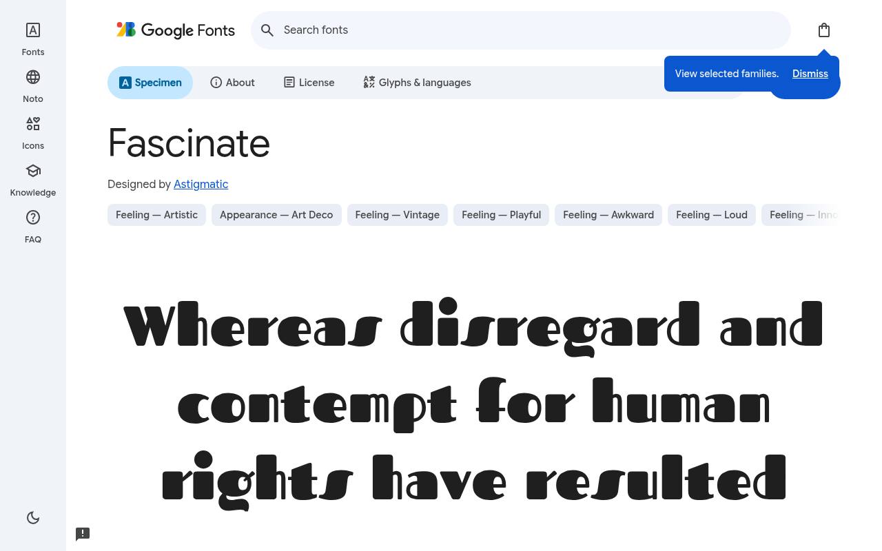
Groovy free fonts
ABCDEFGHIJKLM abcdefghijklm 0123456789
Sculpted, high-contrast forms make Fascinate feel theatrical, drawing on art deco rather than rustic or distressed vintage lettering. The free Fascinate download credits Astigmatic and supplies one upright style at weight 400 and no separate italic. Character coverage in Fascinate extends to Latin and extended Latin.
A period-themed stage poster could use it for the production name, with a simple cast listing below that leaves the unusual letter shapes as the main decorative feature. Its dimensional-looking silhouette comes from the drawing itself rather than separate shadow layers.
- Style
- Deco display
- Best for
- Theatrical posters
- License
- SIL Open Font License
- Price
- 100% free
Making free retro fonts look authentic
Era-appropriate colour does half the work: mustard, orange and brown for the 70s; black, gold and cream for art deco; hot pink and cyan for the 80s. Add subtle grain or paper texture and your free vintage font suddenly looks printed rather than typed.
Keep body text modern and simple so the retro headline stays the star. And because all ten are free fonts under open licenses, you can use them on merchandise and packaging without worry.
A quick tour of retro type eras
The 1800s gave us wood type and fat faces — think Rye and Abril Fatface. The 1920s and 30s brought art deco geometry and theatrical glamour, captured here by Limelight and Fascinate.
The 1950s loved neon signs and casual scripts like Lobster. The 1970s went soft, heavy and groovy with faces like Shrikhand. The 1980s plugged in, with wide techno shapes like Audiowide and neon-tube inlines like Monoton.
Knowing the era helps you pick colours, textures and imagery that make your free retro font feel authentic rather than costume-like.
Where to use free vintage fonts
Retro fonts are perfect for craft breweries, barbershops, diners, record shops, vintage clothing stores, music festivals and throwback event posters. They also make great accents on modern sites — one retro headline on a clean layout can feel fresh rather than dated.
Use them at large sizes, give them generous margins, and resist the urge to combine two decorative faces. One free vintage font plus one neutral companion is the classic formula.
Frequently asked questions
Are these free retro fonts OK for merchandise? Yes. The Open Font License allows T-shirts, posters, packaging and other products you sell.
What is the best free 70s font? Shrikhand is our favourite for groovy 70s headlines; Righteous also works well for a lighter retro feel.
Start with the words, not the mood board
Before you compare free retro fonts, type the exact wording your design must carry. A short shop name and a long festival title create very different spacing problems.
Include punctuation, prices and any accented characters your audience needs. You can then judge the actual letter combinations rather than choosing a font because its sample happens to contain especially attractive letters.
Build a small comparison sheet with your wording in Righteous, Limelight and Shrikhand at the same visual size. Notice which option gives the message enough presence without forcing awkward line breaks.
When searching for vintage fonts free of charge, this practical exercise helps you choose something usable rather than collecting downloads that never reach a finished layout.
Give packaging a clear reading order
On a label, separate the brand name from the product description, flavour and practical information before you style anything. Lobster might suit the name while a quieter treatment handles ingredients and instructions.
Leave room for the information your packaging actually requires. A free decorative typeface should support the buying decision, not turn every surface into a competing headline.
Test your label wrapped around the intended container, not only flat on a screen. Curves hide letters near the edges, and glossy material can interrupt fine details with reflections.
Compare a printed draft at shelf distance with a close reading in your hand. If the name disappears, simplify the composition before adding outlines, shadows or further decorative elements.
Balance character without borrowing another decade
Combining nostalgic fonts works best when each face has a clearly different job. You could compare Abril Fatface for a publication title with Bungee for a separate promotional badge, then decide whether both genuinely belong in the same identity.
Do not assume that two free fonts work together simply because both feel old-fashioned; their proportions and visual weight still need to cooperate.
If you are exploring 70s fonts, use Shrikhand as a reference point and test how your supporting typography changes its personality.
A narrow supporting line can make a heavy title feel larger, while generous margins give its curves room to breathe. Keep the surrounding layout deliberate rather than adding decorative details whenever an empty area makes you nervous.
Check decorative details across materials
Monoton needs enough physical space for its inline construction to remain visible. Print the smallest intended use before approving a drinks token, embroidered patch or compact sticker.
Fine gaps can fill in or lose definition depending on the production process. Ask your supplier about the artwork they need, and adjust the application rather than assuming a beautiful screen preview guarantees a clean result.
The same principle applies when you compare art deco fonts free from this collection. Limelight and Fascinate may produce different results in foil, cut vinyl or ordinary digital print because their shapes distribute light and dark differently.
Use a plain proof first, then introduce special finishes. You will find it easier to identify whether a problem comes from typography or production.
Move a downloaded family into your workflow
Follow the article link to the Google Fonts family page and preview your own text before downloading the free files. Extract the download, open the supplied font files and use your operating system’s installation control.
Reopen your design application if the family does not appear immediately. Keep the original download and its licence information together so your project folder remains understandable later.
For a website, use the embedding instructions or suitable webfont files rather than assuming a desktop installation makes the family available to visitors.
Load only the styles your layout uses, provide a fallback and check the page before the free font finishes loading. A decorative heading should remain readable and should not push important content unexpectedly down the page when it appears.
Make a reusable handover rather than a one-off graphic
Once your design works, record how the free vintage font should be used: its role, approved colours, minimum practical size and a few examples of suitable wording.
Include a deliberately difficult example, such as a long location name. These notes help someone else customise a poster or menu without gradually stretching letters or squeezing spacing to make every new message fit.
Keep editable artwork alongside exported files and point collaborators to the original font source. These Google Fonts families have open licences, but you should still retain and read the supplied terms when passing font files onward.
Distinguish the freedom to use the typeface from ownership of your complete identity: other businesses can choose the same free font, even when your composition is distinctive.
Keep the nostalgia relevant to your audience
Ask someone outside the design team what your first draft suggests before explaining the concept. If Audiowide makes them expect a technology event when you are promoting a bakery, that reaction is useful evidence.
You do not have to follow every preference, but you should understand the associations your free type choice creates before applying it across an entire campaign.
Use that feedback to refine the relationship between lettering and content rather than automatically replacing the font. A clearer product description, a different photograph or more direct wording may resolve the mismatch.
Keep a record of the chosen direction so later seasonal graphics remain recognisably part of the same business, even when their nostalgic references become more playful or experimental.