
Sans-serif fonts are the workhorses of digital design. They power app interfaces, dashboards, landing pages and most of the websites you visit every day. A great free sans-serif font needs clear letterforms at small sizes, a full set of weights and enough personality to set your brand apart.
We chose these ten free sans-serif fonts for real product work. They have big character sets, variable weights and excellent rendering on screens. Every one is free on Google Fonts and licensed for commercial use.
Scroll through the free font previews, open the source with a click, and pick the clean sans that fits your product.
Quick picks at a glance
| # | Resource | Style | Best for |
|---|---|---|---|
| 1 | Inter | UI neo-grotesque | App interfaces |
| 2 | Plus Jakarta Sans | Geometric sans | Modern SaaS branding |
| 3 | DM Sans | Low-contrast geometric | Clean websites |
| 4 | Outfit | Geometric display sans | Bold headlines |
| 5 | Figtree | Friendly sans | Approachable products |
| 6 | Nunito Sans | Humanist sans | Readable body text |
| 7 | Lexend | Readability sans | Accessible design |
| 8 | Sora | Tech sans | Crypto and tech brands |
| 9 | Urbanist | Geometric minimal | Fashion and architecture |
| 10 | IBM Plex Sans | Corporate grotesque | Enterprise and data |
Inter
UI neo-grotesque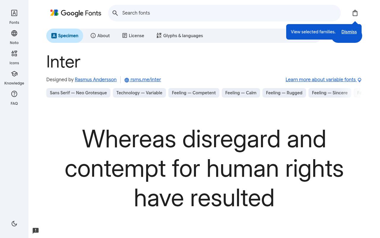
Clean, modern & free
ABCDEFGHIJKLM abcdefghijklm 0123456789
Screen-first proportions give Inter its clear, compact interface voice: the tall x-height keeps labels prominent, while tabular numbers suit changing dashboard values. Set account balances, navigation, and settings in this restrained neo-grotesque, using heavier weights for section labels rather than introducing a competing display face.
Rasmus Andersson designed Inter; its free Google Fonts download includes 18 styles spanning weights 100–900, with matching italics. Inter’s axes cover Optical Size 14–32 and Weight 100–900. Inter’s listed subsets cover Cyrillic, extended Cyrillic, Greek, extended Greek, Latin, extended Latin, and Vietnamese. Inter’s Open Font License permits commercial app interfaces projects.
- Style
- UI neo-grotesque
- Best for
- App interfaces
- License
- SIL Open Font License
- Price
- 100% free
Plus Jakarta Sans
Geometric sans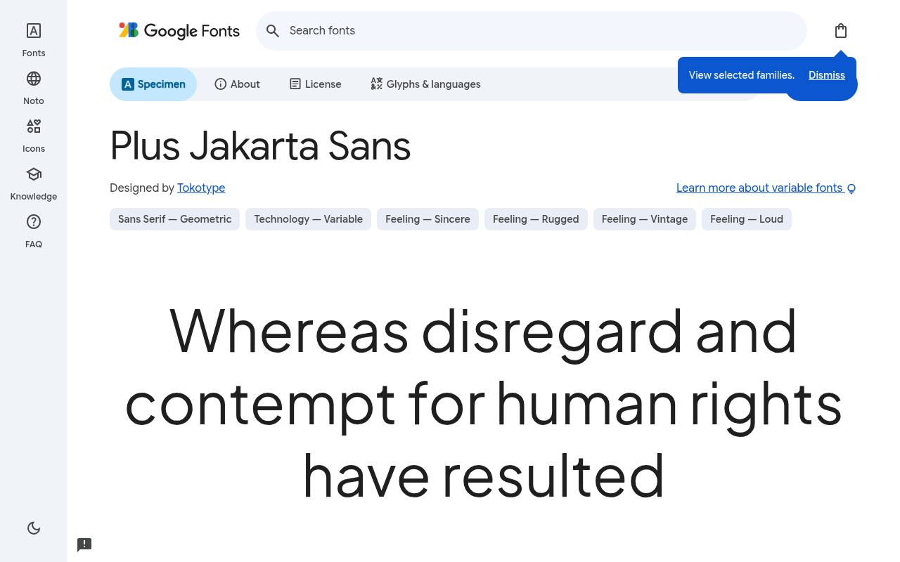
Clean, modern & free
ABCDEFGHIJKLM abcdefghijklm 0123456789
Geometric construction meets friendly curves in Plus Jakarta Sans, giving SaaS branding a polished but approachable tone. A product landing page can carry the same family from a bold benefit statement into quieter feature descriptions, with italics available for customer quotations and emphasized phrases.
The free Google Fonts selection for Plus Jakarta Sans, by Tokotype, contains 14 styles spanning weights 200–800, with matching italics. Plus Jakarta Sans’s axes cover Weight 200–800. Script coverage for Plus Jakarta Sans includes extended Cyrillic, Latin, extended Latin, and Vietnamese. Plus Jakarta Sans’s Open Font License permits commercial modern saas branding projects.
- Style
- Geometric sans
- Best for
- Modern SaaS branding
- License
- SIL Open Font License
- Price
- 100% free
DM Sans
Low-contrast geometric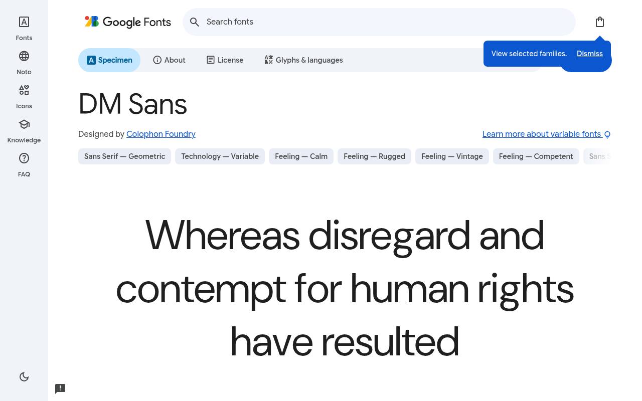
Clean, modern & free
ABCDEFGHIJKLM abcdefghijklm 0123456789
Small website text is central to DM Sans, whose low-contrast geometric forms produce a tidy paragraph texture. Pair its restrained navigation and article copy with DM Serif Display headings for a related but expressive contrast; its optical-size control also makes the download more adaptable than a single fixed-size design.
For DM Sans, Google Fonts supplies 20 styles spanning weights 100–1000, with matching italics free, crediting Colophon Foundry. DM Sans’s axes cover Optical Size 9–40 and Weight 100–1000. The DM Sans download supports Latin and extended Latin. DM Sans’s Open Font License permits commercial clean websites projects.
- Style
- Low-contrast geometric
- Best for
- Clean websites
- License
- SIL Open Font License
- Price
- 100% free
Outfit
Geometric display sans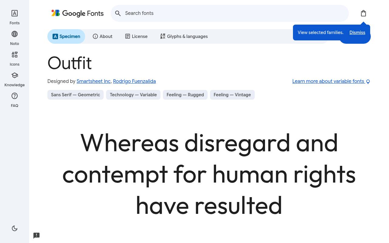
Clean, modern & free
ABCDEFGHIJKLM abcdefghijklm 0123456789
Crisp circles and assertive geometry make Outfit particularly effective in short, heavy headlines. For a startup portfolio, a large project title can establish the identity while lighter descriptions keep the page from becoming visually dense.
Its upright-only family favors hierarchy built through weight rather than slanted emphasis. Credited to Smartsheet Inc and Rodrigo Fuenzalida, Outfit comes free from Google Fonts in 9 styles spanning weights 100–900, without italics. Outfit’s axes cover Weight 100–900.
Included subsets in Outfit span Latin and extended Latin. Outfit’s Open Font License permits commercial bold headlines projects.Like every free font in this list, it ships under the SIL Open Font License, so it is free for personal and commercial projects alike.
- Style
- Geometric display sans
- Best for
- Bold headlines
- License
- SIL Open Font License
- Price
- 100% free
Figtree
Friendly sans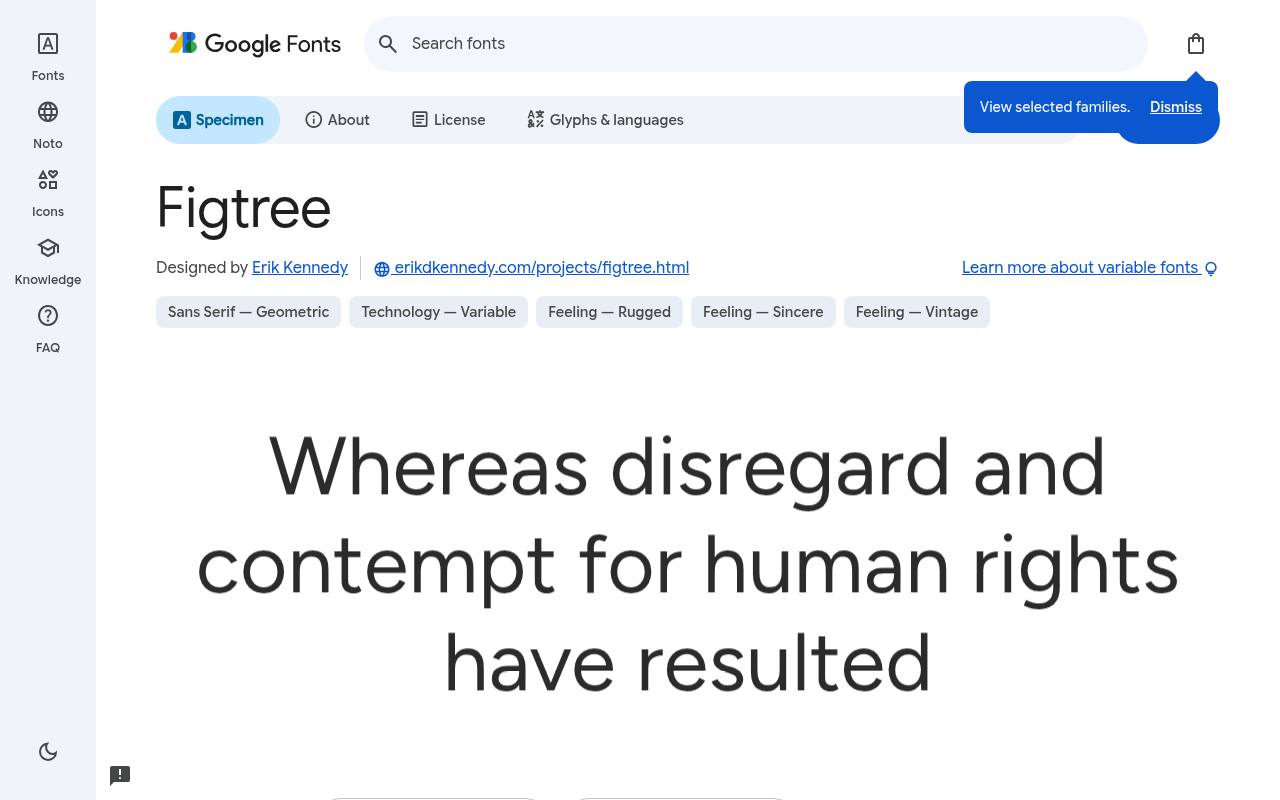
Clean, modern & free
ABCDEFGHIJKLM abcdefghijklm 0123456789
Slightly softened details give Figtree an easygoing presence without turning interface text into a novelty. Consumer apps and community sites can use its lighter weights for explanations and stronger ones for action labels, with real italics providing a separate voice for quoted messages or contextual notes.
Google Fonts lists Erik Kennedy as Figtree’s designer credits and offers 14 styles spanning weights 300–900, with matching italics in the free download. Figtree’s axes cover Weight 300–900. Figtree’s listed subsets cover Latin and extended Latin. Figtree’s Open Font License permits commercial approachable products projects.
- Style
- Friendly sans
- Best for
- Approachable products
- License
- SIL Open Font License
- Price
- 100% free
Nunito Sans
Humanist sans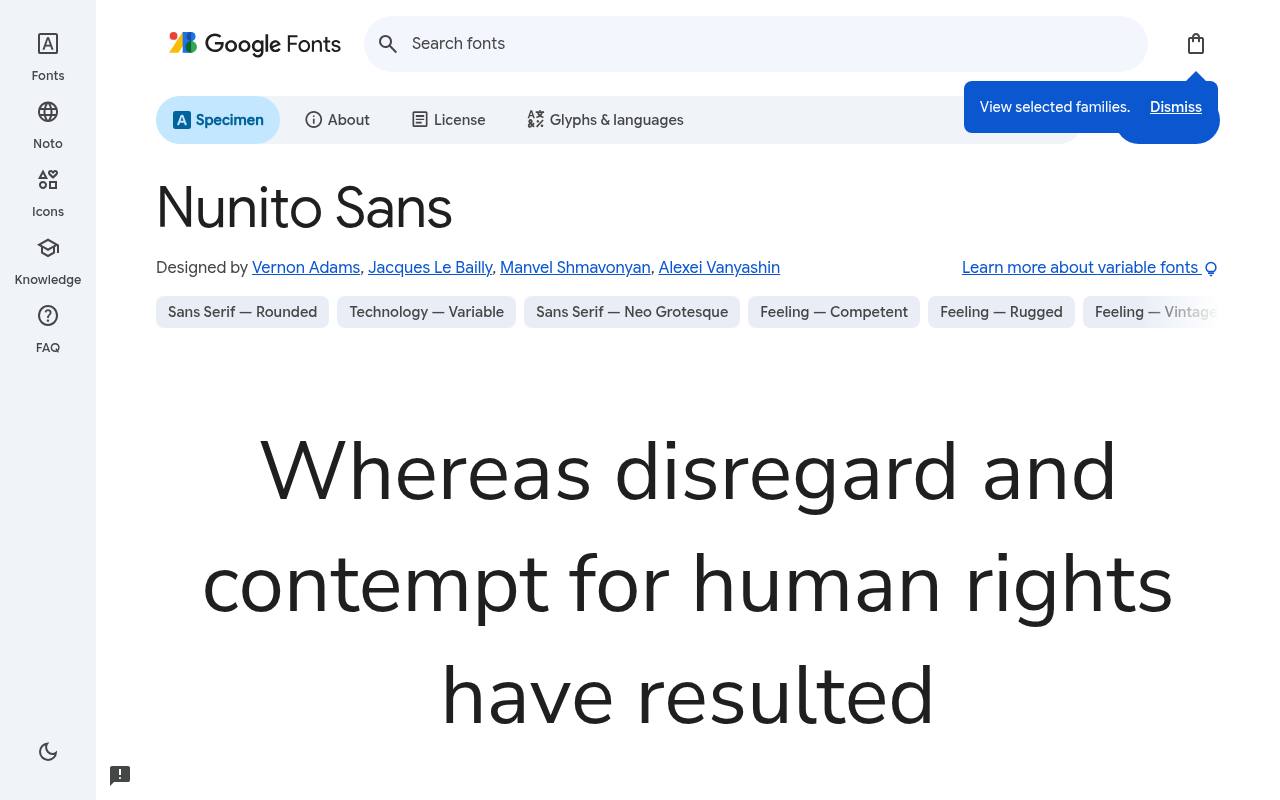
Clean, modern & free
ABCDEFGHIJKLM abcdefghijklm 0123456789
Open, balanced forms make Nunito Sans a practical paragraph face for help centers. Its unusually broad adjustment options let a documentation system tune width, lowercase height, and optical size as well as weight, keeping article copy and compact navigation related without forcing them into identical proportions.
Vernon Adams, Jacques Le Bailly, Manvel Shmavonyan, and Alexei Vanyashin designed Nunito Sans; its free Google Fonts download includes 18 styles spanning weights 200–1000, with matching italics.
Its variable controls are Lowercase Height 440–540, Optical Size 6–12, Width 75–125, and Weight 200–1000. Script coverage for Nunito Sans includes Cyrillic, extended Cyrillic, Latin, extended Latin, and Vietnamese. Nunito Sans’s Open Font License permits commercial readable body text projects.
- Style
- Humanist sans
- Best for
- Readable body text
- License
- SIL Open Font License
- Price
- 100% free
Lexend
Readability sans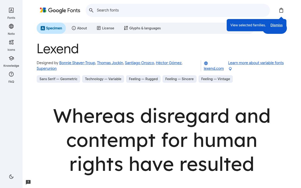
Clean, modern & free
ABCDEFGHIJKLM abcdefghijklm 0123456789
Created with reading comfort as a goal, Lexend uses open, generously proportioned forms for a calm page texture. An educational product could use it for lesson instructions and progress screens; that reading-focused intention is useful context, not a promise that one typeface alone makes an interface accessible.
The free Google Fonts selection for Lexend, by Bonnie Shaver-Troup, Thomas Jockin, Santiago Orozco, Héctor Gómez, and Superunion, contains 9 styles spanning weights 100–900, without italics. Lexend’s axes cover Weight 100–900. The Lexend download supports Latin, extended Latin, and Vietnamese. Lexend’s Open Font License permits commercial accessible design projects.
- Style
- Readability sans
- Best for
- Accessible design
- License
- SIL Open Font License
- Price
- 100% free
Sora
Tech sans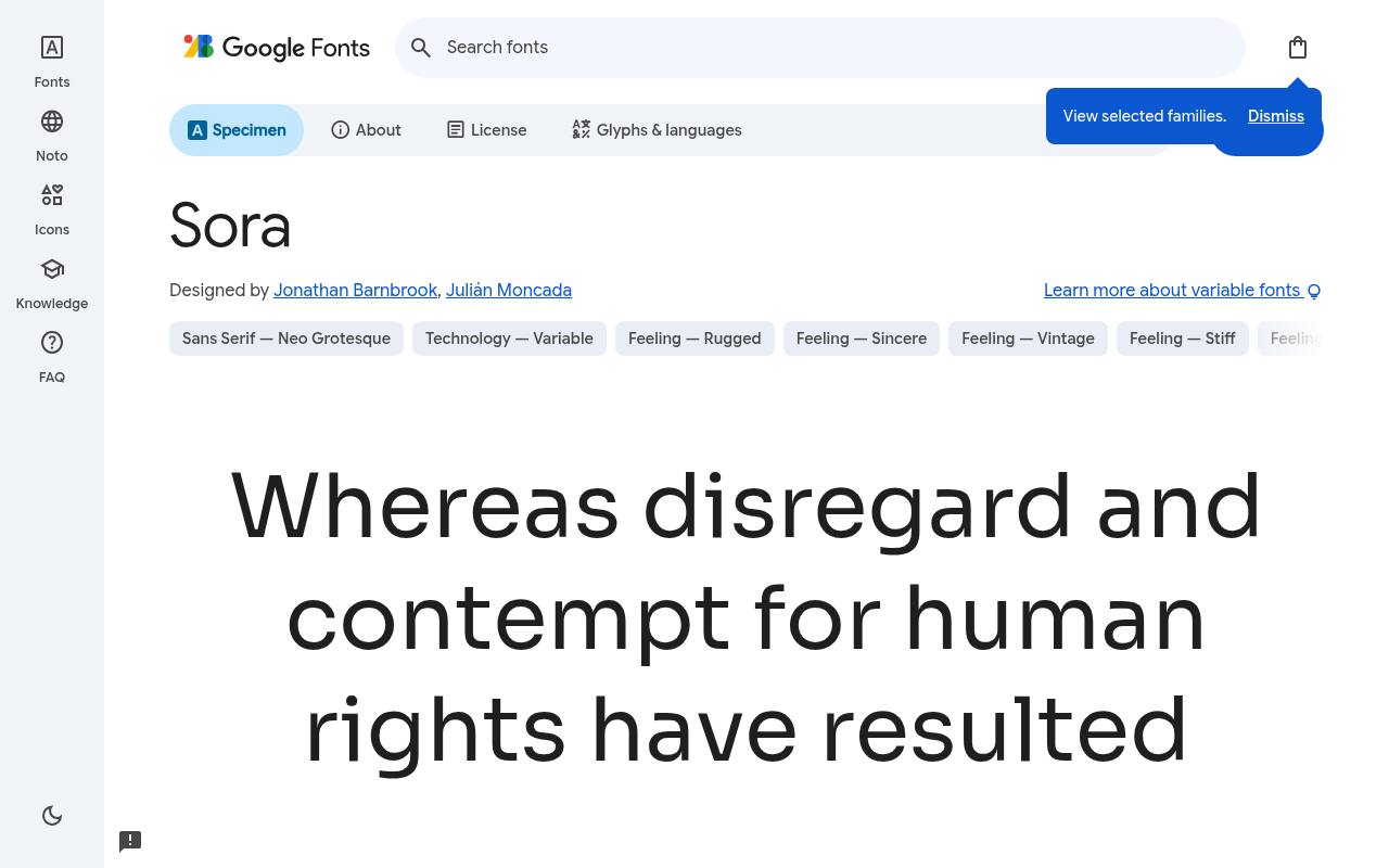
Clean, modern & free
ABCDEFGHIJKLM abcdefghijklm 0123456789
Originally made for a decentralized technology platform, Sora brings a measured futuristic character to fintech and software branding. Its clear shapes suit a product overview with technical headings and short explanations, while the progression from delicate to heavy weights creates contrast without relying on ornamental sci-fi lettering.
For Sora, Google Fonts supplies 8 styles spanning weights 100–800, without italics free, crediting Jonathan Barnbrook and Julián Moncada. Sora’s axes cover Weight 100–800. Included subsets in Sora span Latin and extended Latin. Sora’s Open Font License permits commercial crypto and tech brands projects.
- Style
- Tech sans
- Best for
- Crypto and tech brands
- License
- SIL Open Font License
- Price
- 100% free
Urbanist
Geometric minimal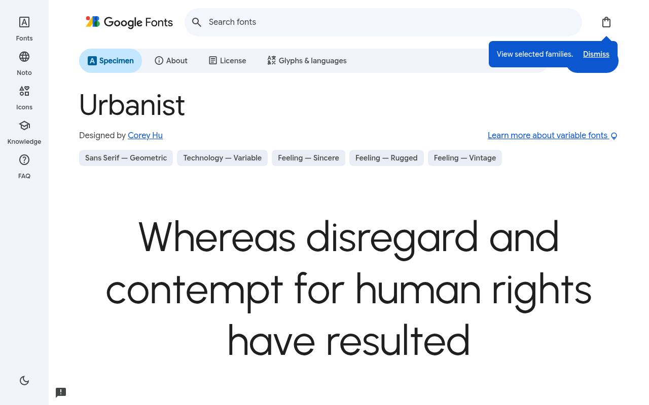
Clean, modern & free
ABCDEFGHIJKLM abcdefghijklm 0123456789
Modernist geometry gives Urbanist the spare, airy character that suits architecture and fashion portfolios. Thin project titles can sit beside large photographs, with sturdier weights carrying studio descriptions and contact details. Matching italics extend that visual system to captions and editorial commentary rather than requiring another family.
Credited to Corey Hu, Urbanist comes free from Google Fonts in 18 styles spanning weights 100–900, with matching italics. Urbanist’s axes cover Weight 100–900. Urbanist’s listed subsets cover Latin and extended Latin. Urbanist’s Open Font License permits commercial fashion and architecture projects.
- Style
- Geometric minimal
- Best for
- Fashion and architecture
- License
- SIL Open Font License
- Price
- 100% free
IBM Plex Sans
Corporate grotesque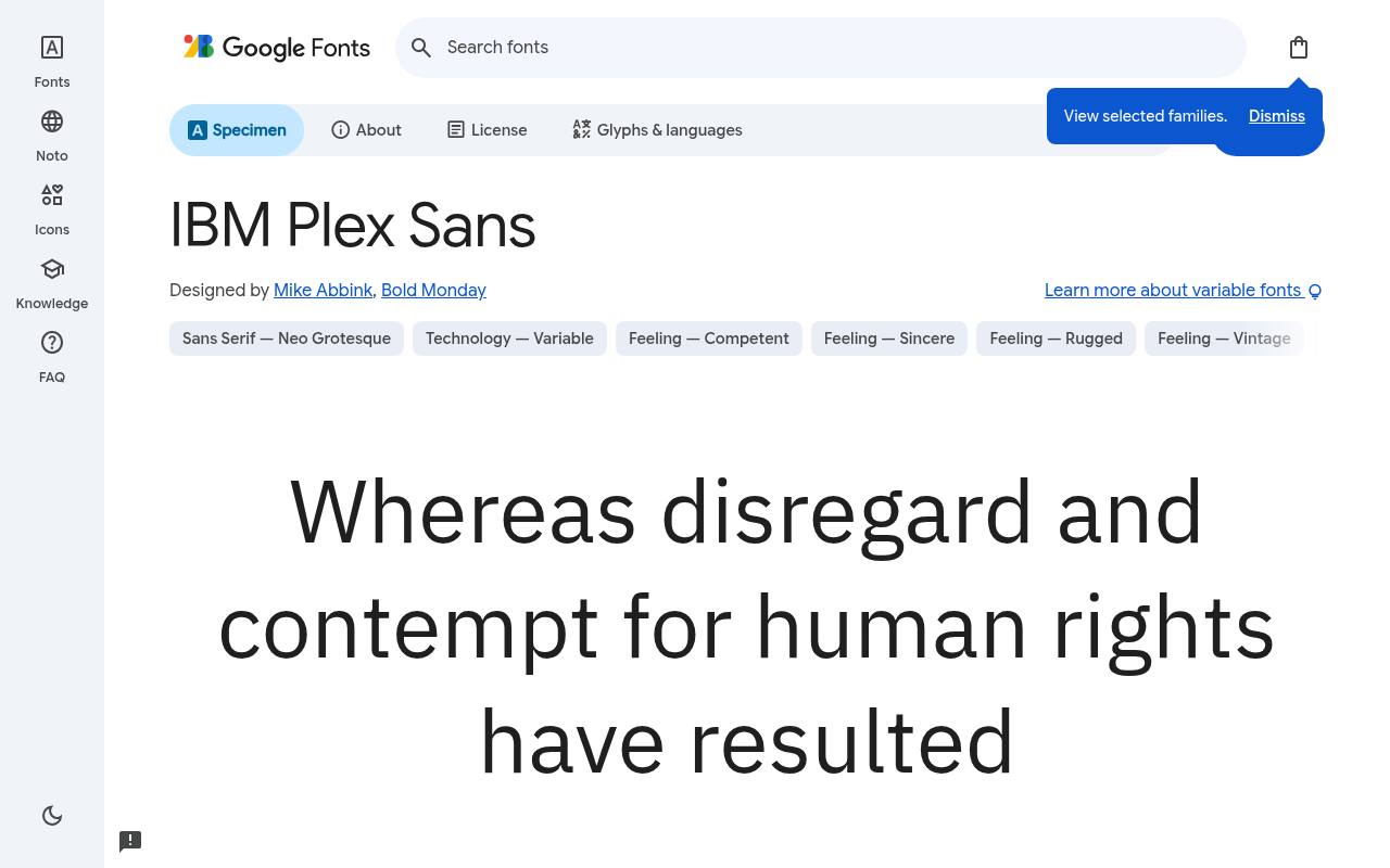
Clean, modern & free
ABCDEFGHIJKLM abcdefghijklm 0123456789
Engineered shapes and human touches coexist in IBM Plex Sans, lending enterprise interfaces a precise but not impersonal voice. A data dashboard can use narrower settings for busy navigation and wider ones for explanatory text, while the family’s italics distinguish annotations from the main reporting hierarchy.
Google Fonts lists Mike Abbink and Bold Monday as IBM Plex Sans’s designer credits and offers 14 styles spanning weights 100–700, with matching italics in the free download.
IBM Plex Sans’s axes cover Width 75–100 and Weight 100–700. Script coverage for IBM Plex Sans includes Cyrillic, extended Cyrillic, Greek, Latin, extended Latin, and Vietnamese. IBM Plex Sans’s Open Font License permits commercial enterprise and data projects.
- Style
- Corporate grotesque
- Best for
- Enterprise and data
- License
- SIL Open Font License
- Price
- 100% free
Picking a free sans-serif font for UI
Check three things: numbers (are they tabular for tables?), the uppercase 'I' versus lowercase 'l' (are they distinct?), and rendering at 12–14px on Windows. Inter, IBM Plex Sans and Nunito Sans pass all three easily.
Variable versions of these free fonts let you ship every weight in one small file — a quick win for page speed.
Building a type system with a free sans-serif
A single free sans-serif font with variable weights can handle an entire product: 700 for page titles, 600 for section headings, 500 for buttons and labels, 400 for body text. Keep a modular type scale (for example 14, 16, 20, 24, 32, 48px) and your interface will feel consistent without extra fonts.
Turn on tabular figures for tables and dashboards so numbers line up neatly. Inter, IBM Plex Sans and Figtree all support this for free.
Accessibility and readability
Readable UI type needs a generous x-height, open apertures and clear differences between similar letters. Lexend was designed specifically around reading research, while Nunito Sans and Figtree have open, friendly shapes that help at small sizes.
Pair your free sans-serif font with good contrast (at least 4.5:1 for body text) and a 16px minimum on mobile, and most users will read comfortably.
Frequently asked questions
What is the best free font for app UI? Inter is the most popular free UI font; Plus Jakarta Sans and Figtree are great if you want more personality.
Is Inter free for commercial use? Yes, it is open-licensed and free for apps, websites and branding.
Compare families inside a complete user journey
Instead of selecting free sans serif fonts from an isolated alphabet, place your shortlist inside a real journey. Build the sign-in screen, a populated dashboard, an error state and a confirmation message.
Use realistic names and sentences throughout. You will learn more from a crowded form than from a large specimen heading, because the form reveals how the family handles practical constraints.
Compare Inter, Figtree and Plus Jakarta Sans without changing your layout between samples. Then make small adjustments to size and spacing so each receives a fair trial.
The best fonts for UI are not simply those that look polished in a presentation; they support quick decisions across ordinary product tasks. Ask colleagues to complete those tasks before asking which option they find most attractive.
Match the voice to the product relationship
An enterprise reporting tool and a community app may both need clean fonts, yet they ask for different emotional signals.
IBM Plex Sans can provide a useful reference for a more technical presentation, while Figtree offers another direction to compare for an approachable service. Judge the typography alongside your actual labels and messages rather than attaching a fixed personality to every geometric shape.
Sora, Urbanist and Outfit offer further ways to explore your brand voice without abandoning a sans-serif foundation. Test them on a product announcement as well as a dense settings screen.
If one family feels right for marketing but less comfortable in everyday controls, you can restrict its role. A free font does not have to handle every touchpoint to earn its place in your identity.
Make forms tolerant of real-world content
Forms reveal problems that tidy sample pages conceal. Fill your prototype with long email addresses, hyphenated surnames, international phone formats and explanatory error messages.
Check that labels remain associated with their fields when the page narrows. DM Sans or Nunito Sans may look comfortable in a short paragraph, but your layout still needs enough flexibility for longer, less predictable content.
Test browser zoom and increased text size before finalising component heights. Fixed boxes can cut off letters or hide instructions even when the free font itself is readable.
Let buttons and messages grow where practical, and avoid replacing useful labels with unexplained abbreviations. When choosing free fonts for apps, treat adaptability as a joint responsibility of the typography, the interface components and the words you write.
Turn financial and technical data into a fair test
Use realistic data to compare number-heavy screens: negative values, decimals, percentages, currency signs and empty states. Check whether punctuation remains visible and whether totals are easy to distinguish from individual entries.
Inter and IBM Plex Sans are sensible candidates to test here, but the decision should come from your own content. A short row of identical digits cannot represent an entire reporting interface.
Keep alignment, units and emphasis consistent across tables before blaming a font for a difficult screen. If users must repeatedly look back to the heading to remember what a column means, the information design may need attention.
Use weight changes sparingly and do not rely on colour alone to signal a loss or warning. Free typography works best when the surrounding data presentation is equally considered.
Make font delivery part of the design decision
When you download your chosen free family from Google Fonts, inspect which styles your design really uses before adding files to production.
A variable font can be useful, but it is not automatically smaller than every carefully selected set of static files. Compare the actual assets for your required weights and languages rather than assuming that one delivery method always wins.
For desktop work, install the supplied fonts through your operating system and reopen applications that do not recognise them immediately. For the web, configure the chosen files or hosted embed, supply a sensible fallback and test the transition as the font loads.
Keep licence documentation with your assets. If someone else maintains the product later, clear records make the free typography easier to support responsibly.
Document decisions so the interface stays coherent
If your brief says modern sans serif free of unnecessary decoration, translate that description into practical examples. Show how page titles, field labels, helper text and empty states should look.
Include long content and narrow screens in the documentation rather than presenting only ideal conditions. These examples give future contributors something concrete to follow when they add features or customise an existing component.
Can Lexend make your product accessible on its own? No single font can guarantee that outcome. You still need clear wording, usable controls, sufficient contrast and testing with people who have different reading needs.
Record what you learn from those tests and revisit your choices when the product changes. A free family is a starting resource; a dependable reading experience comes from the decisions you make around it.
Test the tone of important messages
Compare success, warning and error messages in the same free family before approving your final choice. Typography should help users understand what happened without making a routine correction feel alarming.
Use ordinary language and a clear next step, then judge whether your weight and spacing support that message. A heavier style is not always the best way to make an instruction noticeable.
Include sensitive journeys such as password recovery, payment failure and account deletion in your review. These screens need calm explanations more than visual novelty.
Keep the wording and treatment consistent across the product, and involve the people responsible for support when possible. Their knowledge of recurring misunderstandings can make your font trial more useful than another round of purely aesthetic comparisons.