
A single brand color rarely covers an entire interface. Buttons need hover states, cards need subtle surfaces, and text needs several levels of emphasis. Free color scale generators turn that starting hue into an ordered family of lighter and darker values.
Instead of collecting unrelated swatches, you can build a repeatable system that connects visual decisions to named values in your application. The useful result is a working ramp, not simply a pleasing combination.
This collection focuses on UI color scales and design token generators: tools for shade and tint ramps, Tailwind-style numbering, contrast-driven themes, and developer handoff. Some generate a single 50–950 family; others produce semantic roles for complete light and dark interfaces.
That distinction matters when choosing a tool. A quick ramp can solve a small branding task, while a product with multiple themes needs deliberate relationships between surfaces, foregrounds, borders, and interactive states.
Each option below has a free generation workflow, although optional services and source-code terms differ. Start with your actual brand value, inspect the generated steps, and try the exported colors in components before adopting them.
Treat every automatic result as a draft that still needs review. The strongest workflow combines fast generation with semantic color tokens, documented usage rules, and checks against the backgrounds your product actually uses, rather than approving the swatch strip alone.
Quick picks at a glance
| # | Resource | License | Best for |
|---|---|---|---|
| 1 | UI Colors | Free generator; optional paid features | Previewing Tailwind shade families in interface layouts |
| 2 | tints.dev | Free web generator and API; repository terms apply | Tuning eleven-stop ramps around a fixed brand value |
| 3 | ColorBox | Free web tool; check source terms for code reuse | Shaping multi-step ramps with adjustable channel curves |
| 4 | Leonardo | Free; Apache-2.0 source code | Generating adaptive UI themes around target contrast ratios |
| 5 | Scale | Free web app; consult repository for source terms | Exploring lighter and darker branches of one hue |
| 6 | Radix Colors | Free; MIT-licensed Radix Colors project | Building role-oriented twelve-step accent and gray scales |
| 7 | Material Theme Builder | Free; Apache-2.0 source repository | Creating Material color roles for light and dark |
| 8 | Tintary | Free browser tool; site terms apply | Connecting generated ramps to semantic roles and previews |
| 9 | Electrik | Free tool; Electrik project identifies MIT licensing | Exporting named scales across Tailwind and Slate workflows |
| 10 | Tailwind Shades | Free; MIT-licensed source | Preserving a source color across Tailwind export versions |
UI Colors
Web app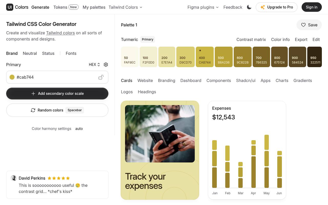
UI Colors turns a starting color into a Tailwind-style scale and puts the result beside interface examples. Its generator includes previews for cards, dashboards, components, and other layouts, making it easier to spot shades that look attractive in isolation but feel weak in context.
Use the component previews to compare surface, border, and accent choices before taking the generated values into your project. The free generator is the relevant starting point; check current upgrade prompts before relying on additional account or premium features for a team workflow.
- Type
- Web app
- Best for
- Previewing Tailwind shade families in interface layouts
- License
- Free generator; optional paid features
- Price
- Free + Pro
tints.dev
Web app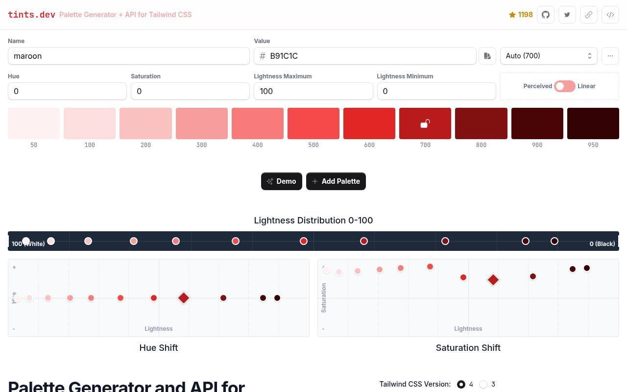
Tints.dev builds an eleven-stop color scale from a hexadecimal input, with stops running from 50 through 950. You can place the original value at a different stop rather than accepting 500 automatically. Hue, saturation, and lightness or luminance controls help shape the rest of the ramp, particularly when a simple fade produces dull extremes.
Its palette API also generates scales from base hex values, although the documented API does not expose the full set of manual HSL adjustments. It is a focused free choice for developers who want repeatable generation.
- Type
- Web app
- Best for
- Tuning eleven-stop ramps around a fixed brand value
- License
- Free web generator and API; repository terms apply
- Price
- 100% free
ColorBox
Web app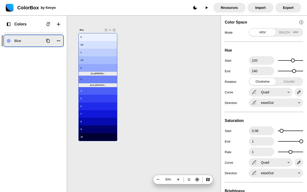
ColorBox exposes the machinery behind a ramp through customizable color curves. Adjust hue, saturation, brightness, and the number of steps to move beyond a uniform march toward white or black. The interface displays individual values and contrast information, while its export area includes Tailwind CSS output, OKLCH, Swift, and configuration data.
Keeping the configuration is especially useful when you want to revise a family later instead of recreating it manually. Choose this free tool when precise ramp construction matters more than getting a preset result with minimal controls.
- Type
- Web app
- Best for
- Shaping multi-step ramps with adjustable channel curves
- License
- Free web tool; check source terms for code reuse
- Price
- 100% free
Leonardo
Web app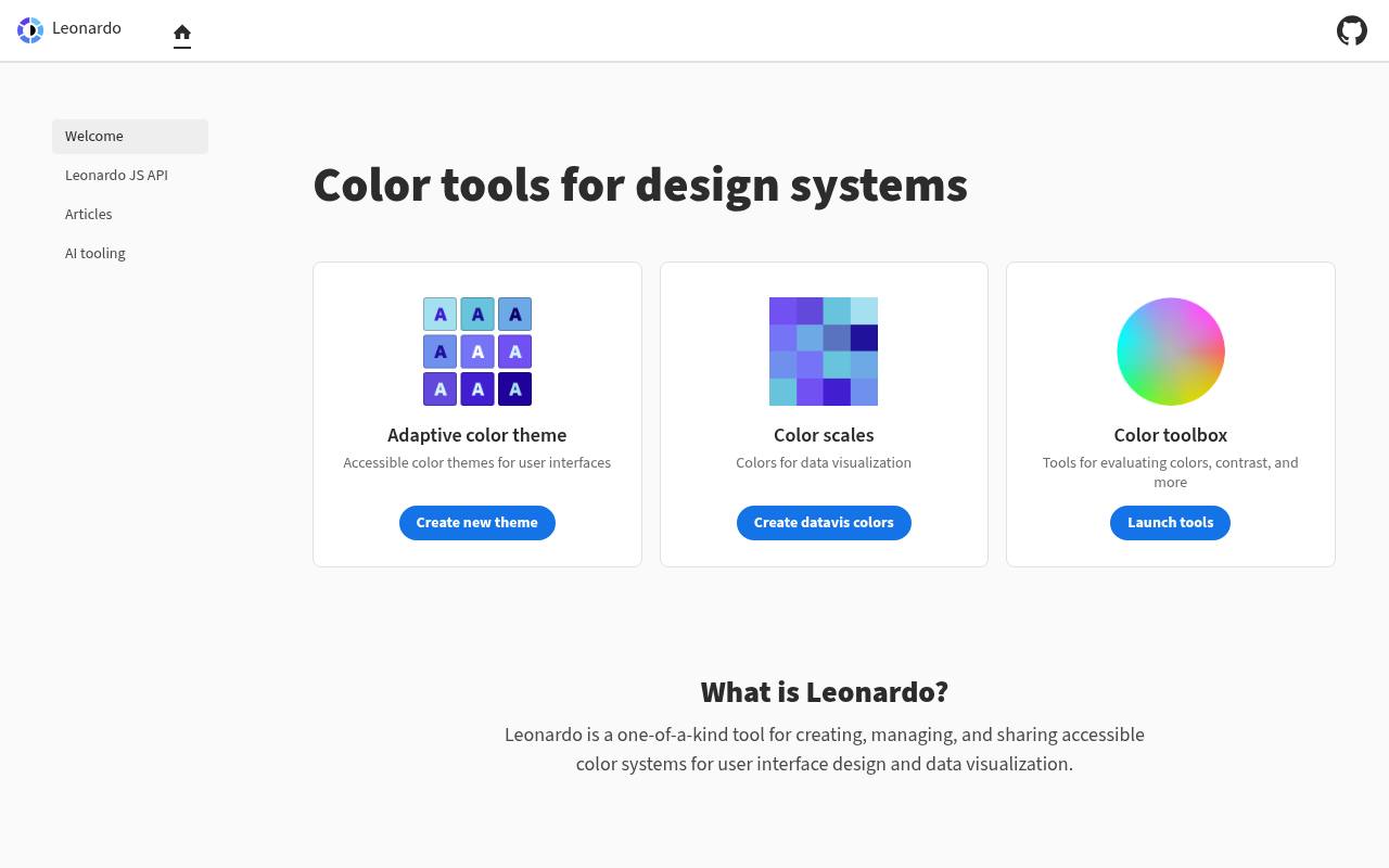
Leonardo is particularly useful when your starting requirement is target contrast ratios, not a conventional set of numbered shades. Its adaptive theme workflow generates colors relative to a background and lets you explore changes in brightness, contrast, and saturation.
For implementation, the site offers CSS custom properties, design-token output, and parameters for the Adobe Leonardo JavaScript package. SVG downloads support design handoff as well. Focus on the adaptive UI theme area for this task: the same site also contains separate visualization and analysis tools that serve different color workflows.
- Type
- Web app
- Best for
- Generating adaptive UI themes around target contrast ratios
- License
- Free; Apache-2.0 source code
- Price
- 100% free
Scale
Web app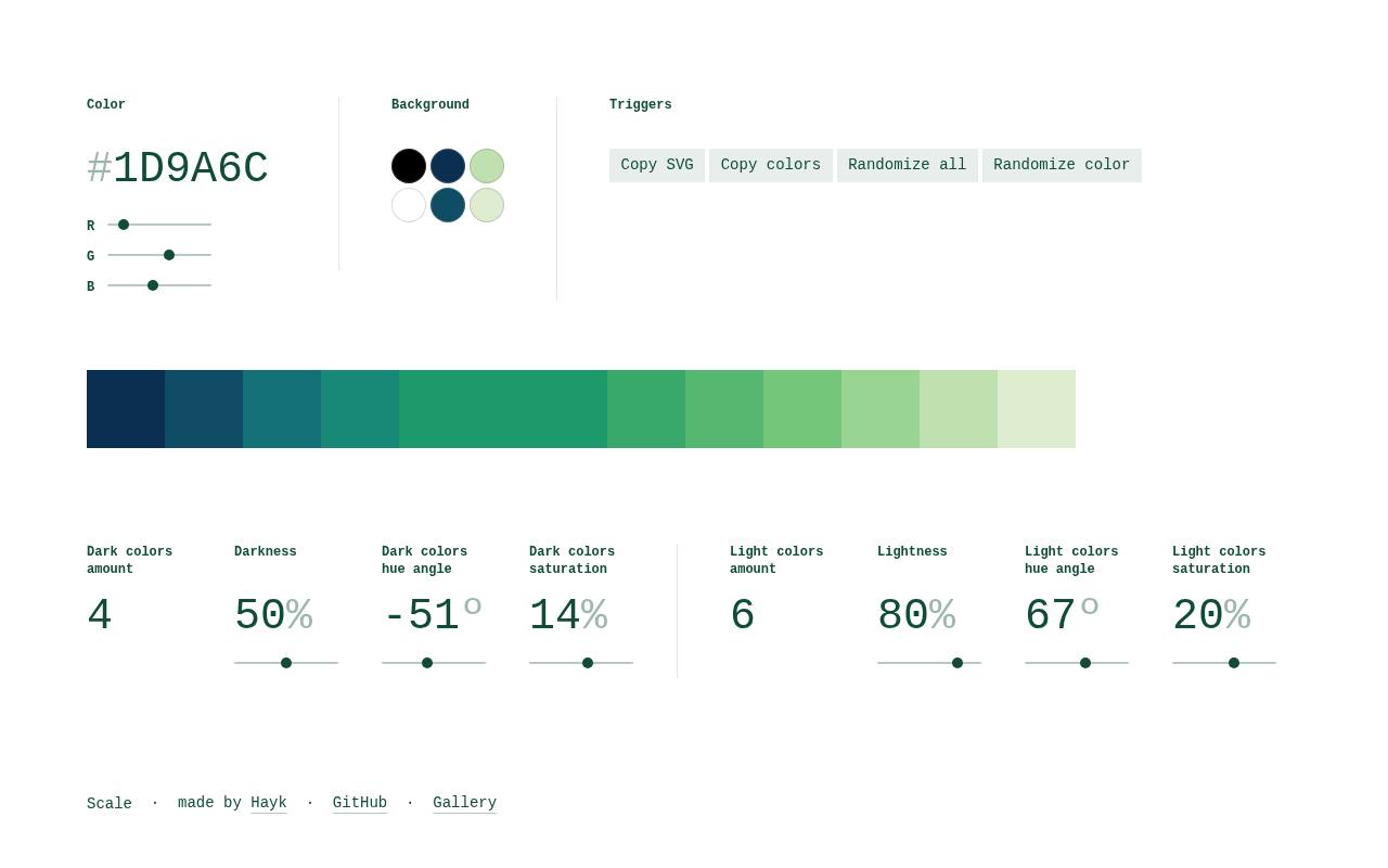
Scale by hihayk is a compact, generative workspace dedicated to color scale construction. Rather than asking you to assemble several unrelated brand colors, it keeps attention on the progression around a base color.
Use it to explore how a family behaves toward its lighter and darker ends, then evaluate the candidate values in your own components. Its public repository makes the project easy to inspect. This is a useful visual ramp prototype tool, but do not assume it supplies a complete semantic token architecture for your application.
- Type
- Web app
- Best for
- Exploring lighter and darker branches of one hue
- License
- Free web app; consult repository for source terms
- Price
- 100% free
Radix Colors
Web app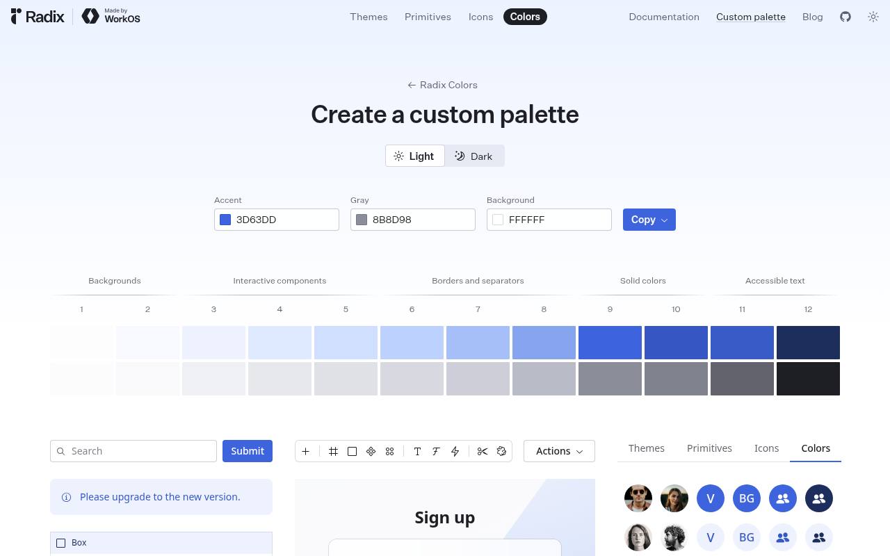
Radix Colors provides a custom palette builder with accent, gray, and background inputs, plus light and dark views. The generated twelve-step scales are presented against practical roles: backgrounds, interactive components, borders, solid colors, and accessible text. That role structure is the main advantage over an undifferentiated row of tints.
Use the live interface preview to examine how the accent and neutral families work together, then copy the result for implementation. Radix numbering differs from Tailwind numbering, so preserve its intended step meanings rather than translating labels mechanically.
- Type
- Web app
- Best for
- Building role-oriented twelve-step accent and gray scales
- License
- Free; MIT-licensed Radix Colors project
- Price
- 100% free
Material Theme Builder
Web app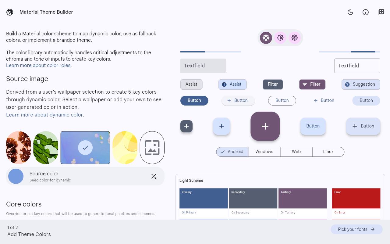
Material Theme Builder translates source colors into a Material color system with tonal relationships and named interface roles. It is especially relevant when your components already follow Material Design, because a usable result needs more than a primary-color ramp.
The builder supports light and dark themes and code export, connecting the visual theme to implementation. Review the generated role assignments rather than replacing them with arbitrary shade numbers.
Its public source repository is archived, so check compatibility with your current components. This free option is more opinionated than a general ramp editor, which is helpful for Material products but less appropriate for unrelated token conventions.
- Type
- Web app
- Best for
- Creating Material color roles for light and dark
- License
- Free; Apache-2.0 source repository
- Price
- 100% free
Tintary
Web app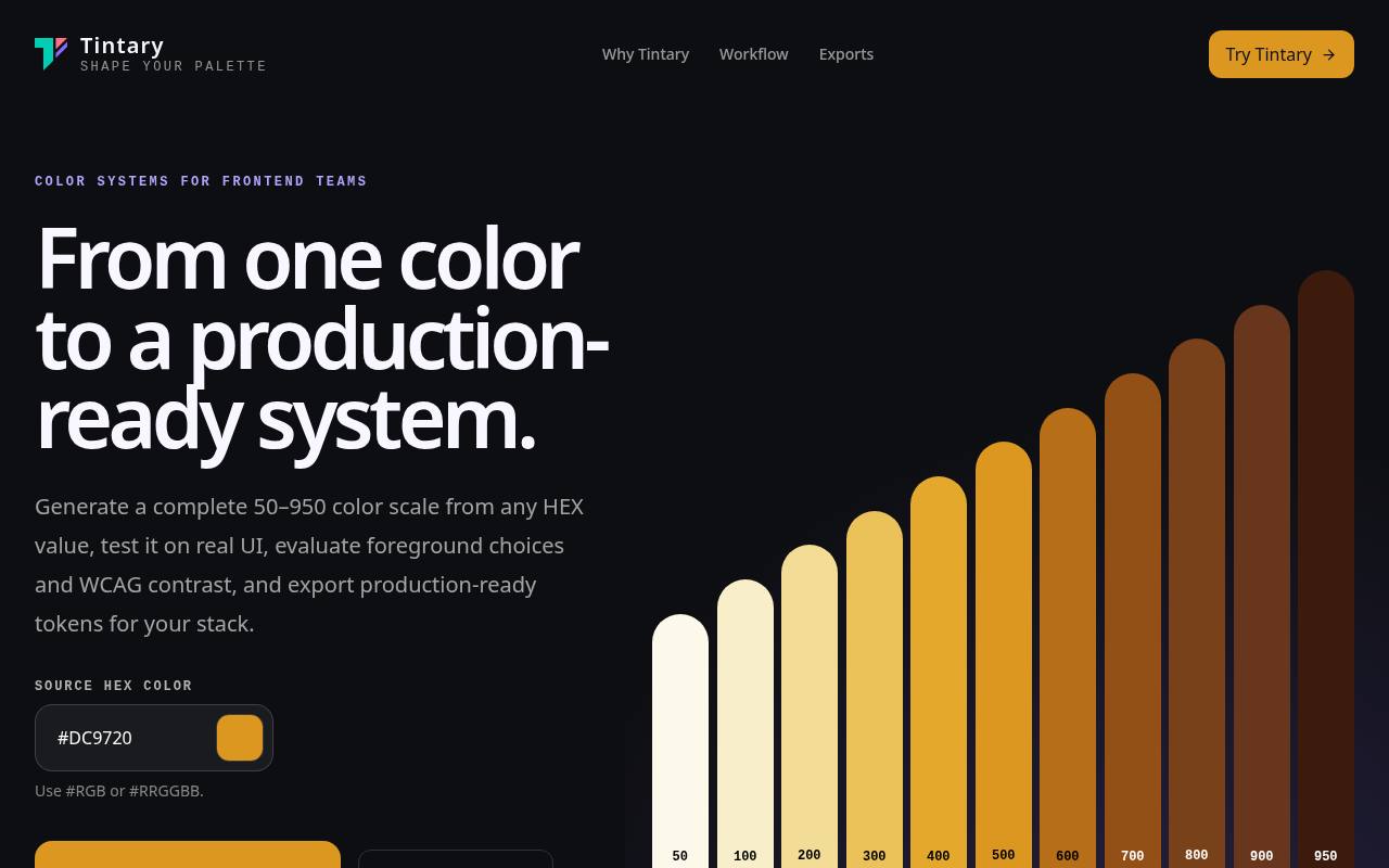
Tintary starts with a hex value and generates a 50–950 shade scale, then extends the task into foreground choices, semantic roles, and interface previews. Its workflow separates source-system construction, contextual previews, quality checks, and export.
You can inspect WCAG AA and AAA results across light and dark modes rather than judging the swatches alone. The site states that it is free without an account, with the workspace saved locally. Export adapters provide the handoff step; inspect the chosen adapter before integrating its generated names into an existing token system.
- Type
- Web app
- Best for
- Connecting generated ramps to semantic roles and previews
- License
- Free browser tool; site terms apply
- Price
- 100% free
Electrik
Web app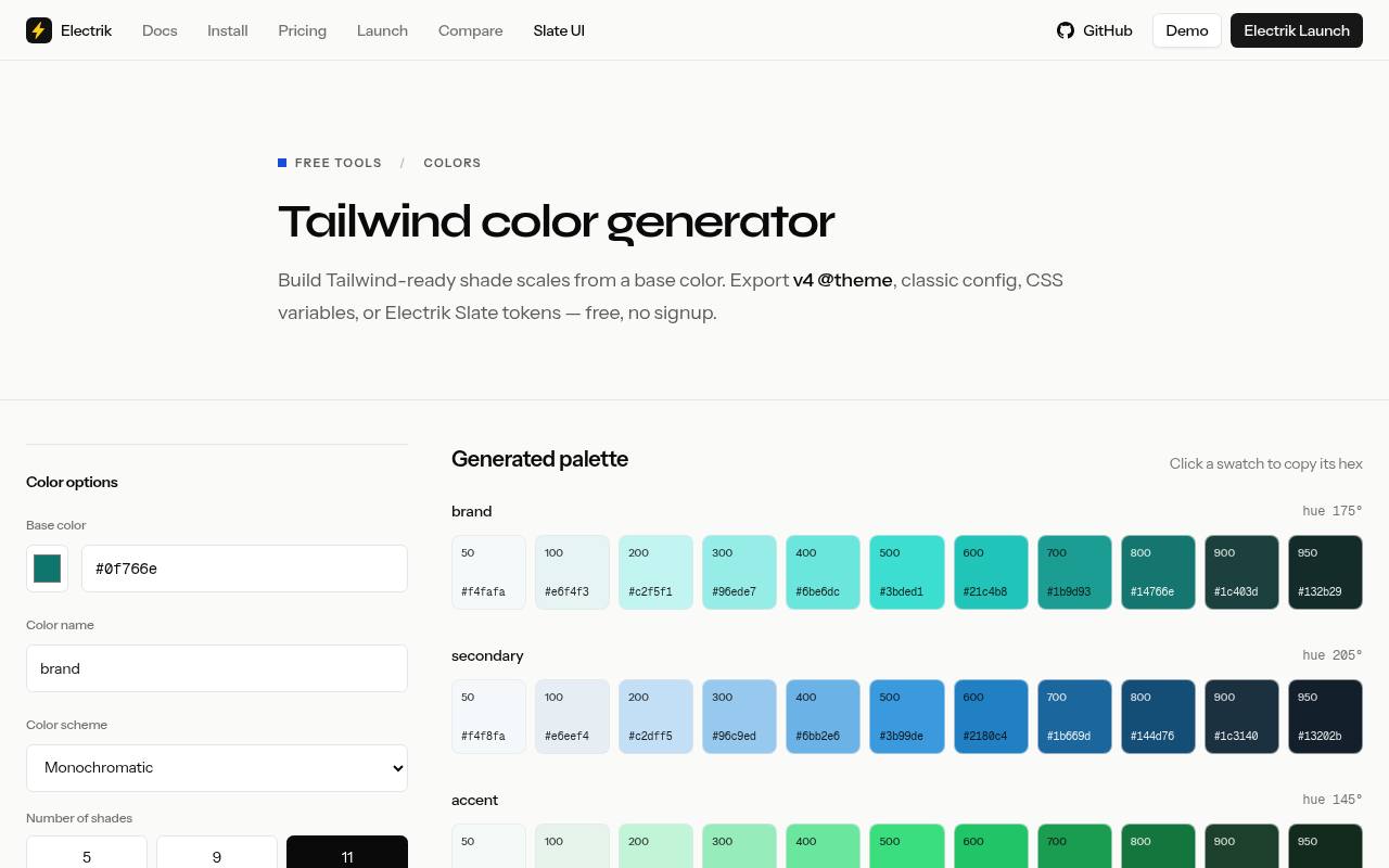
Electrik’s free Tailwind color generator combines a named base color with controls for shade count and saturation. Its Tailwind export options include a modern @theme block, a classic configuration snippet, plain CSS variables, and Electrik Slate token overrides.
That range is useful when the same brand needs to work across projects with different styling conventions. The page also shows light and dark previews and contrast readings for the middle shade against white and near-black. Generation requires no signup, and smaller shade counts are available when eleven steps would add unnecessary complexity.
- Type
- Web app
- Best for
- Exporting named scales across Tailwind and Slate workflows
- License
- Free tool; Electrik project identifies MIT licensing
- Price
- 100% free
Tailwind Shades
Web app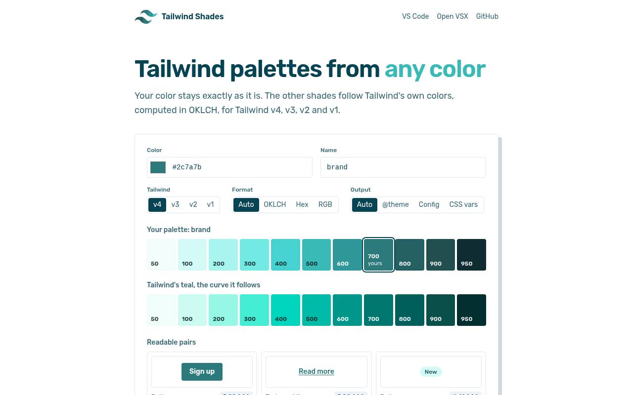
Tailwind Shades keeps your input color intact while computing the surrounding ramp in OKLCH color space using Tailwind’s own color families as a reference. Version controls cover different Tailwind generations, and output choices include @theme, configuration data, and CSS variables.
The interface shows readable color pairs with example utility classes, while explicitly limiting those checks to the displayed backgrounds. A command-line package and editor integration support repeatable implementation outside the browser. This free, MIT-licensed project suits teams that want a preserved brand anchor and a clearly versioned export workflow.
- Type
- Web app
- Best for
- Preserving a source color across Tailwind export versions
- License
- Free; MIT-licensed source
- Price
- 100% free
Choose the generator by the decision you need to make
For a quick Tailwind color scale, start with UI Colors, tints.dev, or Tailwind Shades. Choose ColorBox when you need control over the shape of a ramp, and Leonardo when contrast targets should drive generation.
Radix Colors and Material Theme Builder are stronger fits when their established role systems match your components. Export compatibility should break ties: a familiar interface is less valuable if every result needs extensive manual conversion.
Separate primitive scales from semantic tokens
A numbered value such as brand-600 is a primitive color token: it identifies a specific point in a family. A name such as action-background describes a purpose instead.
Map semantic names to primitives in a separate layer, then let components consume those roles. This keeps a future brand adjustment from becoming a component-by-component rewrite and makes light and dark mappings easier to review without changing the vocabulary used throughout the application.
Match the export to your actual styling stack
Check the generated syntax before copying a design token export into production. Tailwind @theme CSS and classic configuration objects are different integration paths, while ordinary CSS variables do not automatically create every framework utility.
JSON also needs inspection: a flat color dictionary is not necessarily compatible with your token compiler. Keep an untouched export for reference and test a small import before replacing the values used across a mature component library.
Preserve the brand anchor without forcing its role
An exact logo color may sit poorly at the midpoint of a usable shade and tint ramp. Preserve that value where necessary, but do not insist that it must also serve as button fill, link text, and focus indicator.
A neighboring darker shade may work better for readable text on white. Record which value is the brand reference and which values are approved for interface roles so later edits do not accidentally erase that distinction.
Review dark mode as a separate mapping problem
Reversing a light scale rarely creates a convincing dark mode theme. Dark surfaces need their own hierarchy, and saturated accents may need adjustment to avoid looking harsh against near-black backgrounds.
Inspect text, borders, selected states, overlays, and disabled elements together. Reuse the same semantic role names where practical, but map them to values selected for the dark context rather than assuming every light-mode shade has a simple numerical opposite.
Check accessibility in the finished component
A generated ramp does not make an interface automatically accessible. Test foreground and background pairs in the actual states users encounter, including hover, focus, and validation feedback.
Under WCAG AA, normal text generally needs 4.5:1 contrast and large text 3:1; relevant non-text interface indicators have separate requirements. Do not infer compliance from a numbered step or a tool’s isolated preview, and never make color the only way to communicate status.
Understand free access and source-code licensing
Using a free web generator is not the same transaction as redistributing its software. An open-source license usually describes obligations for copying or modifying the project code, while a hosted service may have separate terms.
Keep required notices if you bundle licensed code, and review current terms before automating heavy use of an API. For normal design handoff, record the selected tool, export settings, and any relevant usage restrictions with your project documentation.
Keep one editable source of truth
Store the approved color token definitions in version control and generate downstream files where your workflow allows it. Avoid independently editing the same ramp in CSS, a design file, and a configuration object, because those copies quickly drift.
Save the generator configuration or source link alongside the accepted values. Before approving an update, compare representative components in both modes and note intentional changes to roles, contrast, and brand fidelity in the review.